Framework Changes
| 24. April 2026 | New Application | The new BOM comparison utility enables a graphic and easy-to-use comparion of Bill of Materials |
| 25. March 2026 | Improved Cache | The setting sharedCache has been added, allowing to establish a cache being shared by users of the defined group. This helps reducing load times of BOM displays for example. |
| Improved Image Cache | Panels based on searches now load images faster. Same is true for Item Details panels. | |
| 24. February 2026 | Enhancement | New button in Landing Page can be used to download the Chrome Extension installer. This download will automatically update the manifest.json file for you and include the UX server's address in the list of permitted hosts. |
| 9. February 2026 | Update | The definition of available services has been simplified by changing the logic of exports.server.servicesEnabled and removing the property exports.server.servicesDisabled. When users try accessing a disabled service, the default 404 error message will be displayed now. The disabled services also will be removed from the start menu now. |
| 27. January 2026 | Enhancement | The start menu configuration now uses the property adminsOnly to recognize menu entries that should only be shown for Administrators. This property can be set on column level and also on command level. See the given menu configuration in the settings file for an example configuration. Users are considered as Administrator if they are assigned to group 'Administration [SYSTEM]'). This can only be validated after logging in, so the default start menu accessible via /start will always show all menu entries as it only requires a login once an appliation is started from within this menu. |
| 22. January 2026 | New Setting | The new setting exports.server.landingPage now can be used to set the landing page being opened when accessing /. If you set this value to /portal for example, the PLM Portal will be opened automatically when users do not define an application endpoint in the URL. The landing page with all applications and instructions still can be accessed using /landing. |
| New Setting | The new setting exports.server.servicesEnabled now can be used to control the available applications. Only application endpoints contained in this array will be accessible (i.e. servicesEnabled = ['portal', 'service', 'reviews']). If this settings does not match an empty array, all applications NOT contained in this array will not be accesible any longer and a 'page not found' message will be displayed instead. | |
| New Setting | The new setting exports.server.servicesDisabled now can be used to control the available applications. Application endpoints contained in this array will not be accessible any longer and a 'page not found' message will be shown instead. Example : servicesDisabled = ['insights', 'projects', 'users'] This setting will be ignored if servicesEnabled is not an empty array. | |
| 12. January 2026 | Framework Change | The definition of custom settings and usage with multiple environments has been improved. Connection data now is defined in specific environment files and dedicated settings files will only contain the custom settings. |
| Framework Enhancement | BOM panels now support bulk file downloads. This feature is enabled in the Service Portal and may be added to furher applications in future. | |
| Quality Improvement | The viewer now provides enhanced configuration settings, reliability and usability | |
| 5. December 2025 | *NEW* Asset BOM Editor | This new application creates a unique copy of an existing BOM to create an individual representation of an Asset |
| 4. December 2025 | *NEW* BOM Instances Editor | This new application enables management of properties specific for each instance of an item in a BOM (i.e. Serial Numbers) |
| 2. December 2025 | Major Enhancement | The Service Portal now supports Service BOMs and Asset with given Asset Services. This requires an update of your settings.js file. See the updated documentation of the Service Portal for details. |
| 27. October 2025 | New Feature | Initial release of the Chrome Extensions reducing implementation efforts and improving accessibiliy of the UX extensions both for Administrators and End Users |
| 10. October 2025 | Enhancement | Improved controls in create/edit forms |
| Enhancement | Full support of single and multi picklists in forms and grid | |
| Enhancement | Edit capabilities in grid views were added | |
| 19. August 2025 | Enhancements | User names now can be hidden in the Insights Dashboard by using parameter hideUserNames in the settings file |
| 29. July 2025 | *NEW* Administration Shortcuts | This new page for administrators provides quick access to key tenant administration utilities |
| June 21, 2025 | *NEW* Start Page | The utilities now are better discoverable with the new start page accessible via /start endpoint, reusing the main menu configuration |
| June 1, 2025 | *NEW* Outstanding Work Report | This utility made for administrators provides access to the Outstanding Work List of selected users to update the given processes if given users are not available. |
| May 28, 2025 | *NEW* Main Menu | Applications that do not require a specific dmsId in the URL now can be accessed with a new menu button in top left corner. This makes it easier to switch between the UX extensions. This menu can be configured and disbled with the new variable exports.menu = [] in the settings file. |
| May 26, 2025 | *NEW* Service BOM Editor | With this new editor, users can easily derive a Service BOM from an existing EBOM / MBOM and also define dedicated service offerings. |
| April 16, 2025 | *NEW* Addins | New addin pages enable seamless access to PDM & PLM data from within external applications. Using Chrome Webview technology, these addins even may interact with the host application. |
| April 2nd, 2025 | Framework | Additional information is shown in the server console when starting the server |
| March 7, 2025 | Framework | The new Data Manager utility helps administrators in cleaning up the data in PLM. This is especially helpful when changing existing workspaces or importing data. The utility can be used immediately without any configuration changes. |
| February 4, 2025 | Framework | A key update to all files, libraries, configuration files and settings has been applied. The applications now share much more common code and make use of extended & standardised configuration parameters for table views, list views and tab contents. See the gallery in the developer guide for examples. In addition, optional caching and Vault connectivity were added. |
| October 1, 2024 | Framework | Added parameter filters to insertMOW() enabling type and due date filtering |
| September 26, 2024 | New Utility | The new utility User Settings Manager enables definition of standards for new and existing users. This includes setting the theme, sharing workspace views and selection of dashboard charts. See the utility's documentation for additional installation steps required for this utility specifically. |
| September 20, 2024 | New Utility | The new utility PLM Portal provides quick access to PLM data for the shopfloor |
| September 17, 2024 | New Utility | The new utility Workspace Comparison helps keeping workspaces (in different tenants) in sync |
| Framework | Moved files files of Tenant Insights Dashboard to new admin subfolders | |
| 10. September 2024 | Enhancement | When components get hidden in the viewer, advanced controls now enable to unhide selected components or the last one |
| 16. July 2024 | Major Update | The UX server now uses PKCE for authentication instead of the former mechanism involving the Client Secret. This now requries an APS application of type "Desktop, Mobile, Single-Page App" for successful authentication. If not done so yet, create such an app at aps.autodesk.com and provide the given Client ID in file settings.js as in previous releases. The Client Secret now can be omitted. This new app must use the same callback URL as your previous app and end with "/callback" (i.e. http://localhost:8080/callback). If your login to the UX solutions fails with an error code 401, you most likely are still using an APS of another type. Do not forget to run npm install to download the additional module "crypto" if not doney yet after this update. |
| 2. May 2024 | Enhancement | Users can now switch between 3D and 2D viewables within the viewer if given files exist in the item's attachment tab and if this feature has not been disabled for the given user with setting selectFile |
| 29. April 2024 | Enhancement | Paramter path has been added to insertBOM() enabling quick navigation to currently selected component's parent(s). This feature now is available in the apps Design Review and Service Portal. |
| 18. April 2024 | Enhancement | insertAttachments() now can display folders as well, depending on parameter folders (true / false) |
| Enhancement | insertBookmarks() and insertRecentItems() now can display tile images for given records by reetrieving the first image field having a value. | |
| 11. April 2024 | Enhancement | Default theme now can be defined in settings.js. Select from light, dark and black. |
| 15. March 2024 | Framework | Most standard apps now can be extended easier thanks to dedicated css and js files in subfolders custom. Override standard javascript code and css by adding your custom contents to these empty files in /javascripts/custom as well as /stylesheets/custom. For example, if the styling of the MBOM-Editor should be adjusted, add your custom css styling to /public/stylesheets/custom/mbom.css. |
| 29. February 2024 | BOM Displays | New options have been added to collapse the BOM at startup and to prevent expansion of defined items (parameter endItem) |
| BOM Displays | If users do not have access to sub items, the parent item BOM will display a lock icon with tooltip | |
| Attachments | The attachments panels have been reworked and provide new configurable features like version information, various layouts and sizes. See the developer documentation for details. | |
| 15. February 2024 | BOM Displays | New options have been added to the BOM display (counters) and the Flat BOM display (filterEmpty) |
| 10. January 2024 | Theme Support | Use alternate color for this landing page and all the apps by passing the parameter 'theme' when accessing an application. You can choose from the following themes: dark,black and light. The latter one is default if no theme parameter is provided. |
| 13. December 2023 | File Management | To allow further additions, files in folders public and views have been moved to new folders. Some css and js files in folder public got renamed. |
| Settings Files | Alternate settings files enabling to switch between multiple tenants now must be stored in folder settings. These files no longer need the prefix 'settings.' but must keep the suffix '.js'. |
Features
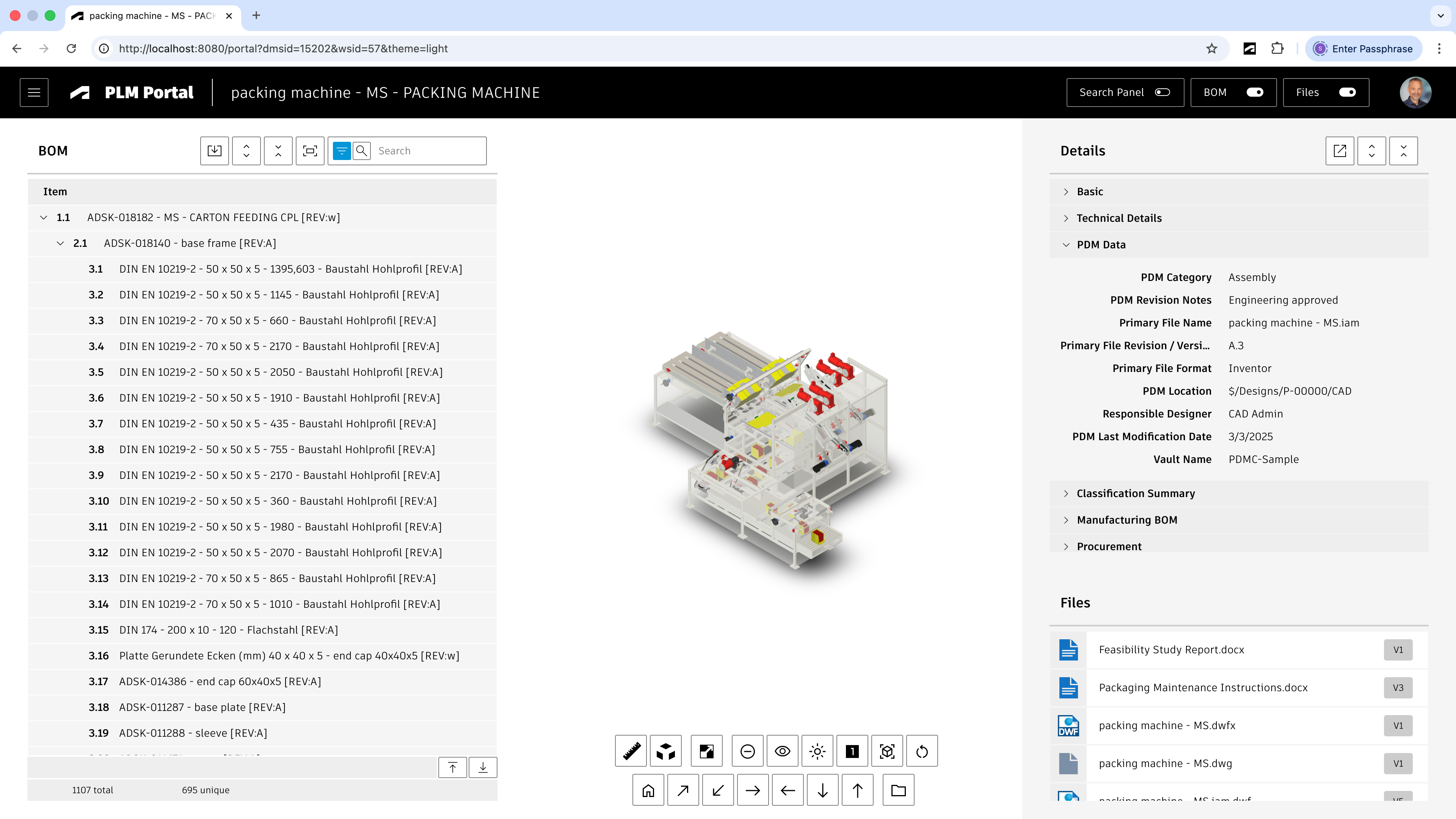
In this easy to use application, users can quickly search for any design or access most recent items to continue where they left.
Once a design is selected, the following features are available:
- 3D Viewer with exploded view
- Item Details
- Item Attachments
- BOM with cross-highlight
- Bulk BOM Files Download
Define Startup Item
You can pass the parameters dmsId and wsId in your URL to skip the search and let the portal open the given item direclty.
Searches are still possible by using the toggle button in the main toolbar.
Application Configuration Settings
The following application specific settings can be adjusted in your custom settings file in exports.applications.portal
In order to change any of these settings, copy the standard value from settings.js to your custom settings file in folder settings.
| Setting | Default Value | Description |
|---|---|---|
| workspaceId | null | The ID of the Items workspaces. This value is set to null per default to reuse the ID of settings common.workspaceIds.items |
| viewingFormats | null | The file formats to use when rendering the selected item in the viewer. This value is set to null per default to reuse the standard value of common.viewer.extensionsIncluded |
| autoClick | true | When set to true and the search returns one result only, the given item will be selected automatically |
| openMostRecent | true | When set to true the first item of the Recent Items list will be opened automatically |
| panels | { insertSearch : [], insertRecentItems : []} | This setting and its nodes can be used to adjust the various panels of the application based on the standard configuration capabilities of the given panels for Searches, the Recently Viewed list, BOM trees, Item Details pages and the Files panel. |
Common Configuration Settings
This utility uses the following common configuration settings
| Setting | Default Value | Description |
|---|---|---|
| exports.common.workspaceIds.items | 57 | The default ID of the Items workspace |
| exports.common.viewer.extensionsIncluded | ['dwf', 'dwfx', 'nwd', ...] | The sequence of file formats to use when rendering the items in the viewer. The first format being available will be used. |
| exports.common.workspaces.items.defaultBOMView | 'Tree Navigator' | The default BOM view to be used for the BOM display. If the defined view does not exist, the default BOM view will be used instead. For best performance, it is recommended to use a BOM view containing only the columns Descriptor, Number and Quantity. |
Viewer Configuration Settings
This application enables configuration of features within the viewer by using parameter viewerFeatures. By using the settings listed below, you can control the availability of given icons in the viewer toolbar. These feaatures can be enabled and disabled for all users in general by setting the value to true or false. As an alternative, you can also provide an array of groups to grant access. Only users being assigned to any of the defined groups will then get access to the feature. Examples:
- viewerFeatures.measure = true > Measurements will be possible for all users
- viewerFeatures.measure = false > Measurements will not be possible for any user
- viewerFeatures.measure = ['Employees','Service Technician'] > The measurements button will only be shown for users in group Employees or Service Technician
| Setting | Icon | Description |
|---|---|---|
| contextMenu | Enables / disables the viewer standard context menu | |
| cube | Enables the cube / home button in top right corner of the viewer. Parameter 'views' can be used instead, providing dedicated buttons. | |
| orbit | Enables the orbit controls | |
| firstPerson | Enables first person view | |
| camera | Enables camera interactions | |
| measure | Enables the measurements toolbar | |
| section | Enables sectioning | |
| explodedView | Enables exploded views | |
| modelBrowser | Enables browsing the model hierarchy within the viewer | |
| properties | Enables access to the selected component's properties stored in the viewable file | |
| settings | Enables viewer settings | |
| fullscreen | Enables fullscreen toggle | |
| markup | Enables markup toolbar | |
| hide | Enables easy hiding of (selected) components | |
| ghosting | Enables toggling ghosting mode on/off | |
| highlight | Enables toggling highlight of selected models on/off | |
| single | Enables fitting of first instance to viewer | |
| fitToView | Enables reframing all visible items | |
| reset | Enables to deselect all, invoking viewerClickReset() | |
| views | Enables toolbar to quickly access main views | |
| selectFile | Enables switching between multiple viewable files for the given item (3D and 2D) |
The viewer can further be adjusted by using common settings that apply to all applications. All settings listed below can be changed in exports.common.viewer:
| Setting | Icon | Description |
|---|---|---|
| numberProperties | ['Part Number', 'Name', 'label', 'Artikelnummer', 'Bauteilnummer'] | List of item properties to be considered as number properties. The first property found will be used to match components in the viewable file to items in the PLM system (based on field defined in exports.common.workspaces.items.fieldIdNumber). |
| suffixPrimaryFile | ['.iam.dwf', '.iam.dwfx', '.ipt.dwf', '.ipt.dwfx'] | Defines sequence of preferred file suffixes to identify the primary viewable file if multiple viewable files are available for the given item. |
| extensionsIncluded | ['dwf', 'dwfx', 'nwd', 'ipt', 'stp', 'step', 'sldprt', 'pdf'] | List of file formats to be considered as viewable formats. |
| extensionsExcluded | [] | List of file formats not to be considered as viewable formats. |
| splitPartNumberBy | ' v' | If the number property in the viewer does not match the item number exactly, its value can be split by the given string to remove suffixes like version information. |
| splitPartNumberIndexes | [0] | If the number property in the viewer does not match the item number exactly, its value can be split and selected indizes can be contatenated. This property defines the split elements to concatenate. |
| splitPartNumberSpacer | '' | If the number property in the viewer does not match the item number exactly, its value can be split and selected indizes can be contatenated. The concatenated strings will be separated by this spacer. |
| backgroundColor | [255, 255, 255, 255, 255, 255] | Default background color of viewer instances if not specified by theme. |
| cacheInstances | false | Enables / disables caching of instances data in the viewer for improved performance. Enabling this cache will incread initial load time. |
| antiAliasing | true | Enables / disables anti-aliasing in the viewer. |
| ambientShadows | true | Enables / disables ambient shadows in the viewer. |
| groundReflection | true | Enables / disables ground reflections in the viewer. |
| groundShadow | true | Enables / disables ground shadow in the viewer. |
| lightPreset | 4 | Changes the default light preset of the viewer. |
| conversionAttempts | 10 | If viewables need to be converted, this number of attempts will be made to check for the conversion completion status. |
| conversionDelay | 3000 | If viewables need to be converted, this delay (in milliseconds) will be applied before starting to check for the conversion completion status. |
PLM Portal Change Log
| 25. March 2026 | Bugfix | Prevent auto-selection of first item when refreshing the Recent Items list |
| Performance | When caching is eanbled, the application now uses cached data if available. A comparison with latest data will be performed in the background - and inform the user in case of a mismatch, allowing to reload from the refreshed cache. | |
| 19. March 2026 | Settings Update | Update configuration settings to offer more flexibility |
| 12. January 2026 | Enhancement | New settings downloadFiles enables BOM files download |
| Documentation | Documentation has been updated to match the new custom settings and environments management | |
| 5. December 2025 | Enhancement | New settings help improving performance (searchTileImages, bomLevels, viewingFormats) |
| 9. Oktober 2025 | Enhancement | Added setting 'openMostRecent' to optionally open the most recently viewed item automatically at startup |
| Quality | Various quality of life improvements (styling, labels, ...) | |
| 23. September 2025 | Enhancement | Added setting 'searchInputText' configuring the placeholder text in the search input field |
| Enhancement | Added setting 'suppressLinks' to enable / disable item details pages links | |
| September 23, 2024 | Enhancement | Added settings 'settionsOrder' that optionally allows for alternate orders of sections in the Item Details display |
| September 20, 2024 | Initial Release | Addition of this utility to the UX Extensions |
Prerequisites
Your tenant must have the Product Portfolio Management app installed (providing the workspaces Product Categories, Product Lines and Products).
If your tenant has been created after April 2021, changes are high that it meets this requirement.
Features
Users can navigate the various level of the portfolio from Product Categories down to Products in an easy manner. Once a product is selected, users can retrieve a couple of information:
- The Marketing Text managed in section 'Product Catalog Definition' can be used to describe the product's features
- The images managed in section 'Product Catalog Images' can be opened
- If Classification section is added to the Products workspace, the given technical specification can be seen
- The product attachments can be downloaded
- If an engineering BOM item is linked to the product, the given BOM can be accessed and the given root item's viewable will be rendered
Adjust Workspace Products
If your tenant has been created in 2023 or later, the Products workspace should meet the following requirements already, so the following changes might not be required!
Add the Classification section to the Products workspace. This enables the management of technical specification based on the product type. The given information will be displayed in the catalog as well.
Set the field Engineering BOM to be a pick list, enabling references to the workspace Items (if existent, otherwise use Items and BOMs). When using the app, only if an item is selected in this field, the product catalog will be able to render the 3D design of the product (as this will render the related item's dwf). Also, this given item will be used to retrieve the product Bill of Materials.
Application Configuration Settings
The following settings can be adjusted in your custom settings file within exports.applications to adjust the application's behavior. In order to change any of these settings, copy the standard value from settings.js to your custom settings file in folder settings.
| Setting | Description | Default Value |
|---|---|---|
| portfolio.hierarchy | If you renamed the standard workspaces of Product Portfolio Management, you can provide the new names here | ['Product Categories', 'Product Lines', 'Products'] |
| portfolio.bomLevels | Restrict the BOM expansion to the defined number of levels | 3 |
Common Configuration Settings
This utility also uses the following common configuration settings
| Setting | Description | Default Value |
|---|---|---|
| exports.common.workspaces.items.defaultBOMView | The default BOM view to be used for the BOM display. If the defined view does not exist, the default BOM view will be used instead. For best performance, it is recommended to use a BOM view containing only the columns Descriptor, Number and Quantity. | 'Tree Navigator' |
Viewer Configuration Settings
This application enables configuration of features within the viewer by using parameter viewerFeatures. By using the settings listed below, you can control the availability of given icons in the viewer toolbar. These feaatures can be enabled and disabled for all users in general by setting the value to true or false. As an alternative, you can also provide an array of groups to grant access. Only users being assigned to any of the defined groups will then get access to the feature. Examples:
- viewerFeatures.measure = true > Measurements will be possible for all users
- viewerFeatures.measure = false > Measurements will not be possible for any user
- viewerFeatures.measure = ['Employees','Service Technician'] > The measurements button will only be shown for users in group Employees or Service Technician
| Setting | Icon | Description |
|---|---|---|
| contextMenu | Enables / disables the viewer standard context menu | |
| cube | Enables the cube / home button in top right corner of the viewer. Parameter 'views' can be used instead, providing dedicated buttons. | |
| orbit | Enables the orbit controls | |
| firstPerson | Enables first person view | |
| camera | Enables camera interactions | |
| measure | Enables the measurements toolbar | |
| section | Enables sectioning | |
| explodedView | Enables exploded views | |
| modelBrowser | Enables browsing the model hierarchy within the viewer | |
| properties | Enables access to the selected component's properties stored in the viewable file | |
| settings | Enables viewer settings | |
| fullscreen | Enables fullscreen toggle | |
| markup | Enables markup toolbar | |
| hide | Enables easy hiding of (selected) components | |
| ghosting | Enables toggling ghosting mode on/off | |
| highlight | Enables toggling highlight of selected models on/off | |
| single | Enables fitting of first instance to viewer | |
| fitToView | Enables reframing all visible items | |
| reset | Enables to deselect all, invoking viewerClickReset() | |
| views | Enables toolbar to quickly access main views | |
| selectFile | Enables switching between multiple viewable files for the given item (3D and 2D) |
The viewer can further be adjusted by using common settings that apply to all applications. All settings listed below can be changed in exports.common.viewer:
| Setting | Icon | Description |
|---|---|---|
| numberProperties | ['Part Number', 'Name', 'label', 'Artikelnummer', 'Bauteilnummer'] | List of item properties to be considered as number properties. The first property found will be used to match components in the viewable file to items in the PLM system (based on field defined in exports.common.workspaces.items.fieldIdNumber). |
| suffixPrimaryFile | ['.iam.dwf', '.iam.dwfx', '.ipt.dwf', '.ipt.dwfx'] | Defines sequence of preferred file suffixes to identify the primary viewable file if multiple viewable files are available for the given item. |
| extensionsIncluded | ['dwf', 'dwfx', 'nwd', 'ipt', 'stp', 'step', 'sldprt', 'pdf'] | List of file formats to be considered as viewable formats. |
| extensionsExcluded | [] | List of file formats not to be considered as viewable formats. |
| splitPartNumberBy | ' v' | If the number property in the viewer does not match the item number exactly, its value can be split by the given string to remove suffixes like version information. |
| splitPartNumberIndexes | [0] | If the number property in the viewer does not match the item number exactly, its value can be split and selected indizes can be contatenated. This property defines the split elements to concatenate. |
| splitPartNumberSpacer | '' | If the number property in the viewer does not match the item number exactly, its value can be split and selected indizes can be contatenated. The concatenated strings will be separated by this spacer. |
| backgroundColor | [255, 255, 255, 255, 255, 255] | Default background color of viewer instances if not specified by theme. |
| cacheInstances | false | Enables / disables caching of instances data in the viewer for improved performance. Enabling this cache will incread initial load time. |
| antiAliasing | true | Enables / disables anti-aliasing in the viewer. |
| ambientShadows | true | Enables / disables ambient shadows in the viewer. |
| groundReflection | true | Enables / disables ground reflections in the viewer. |
| groundShadow | true | Enables / disables ground shadow in the viewer. |
| lightPreset | 4 | Changes the default light preset of the viewer. |
| conversionAttempts | 10 | If viewables need to be converted, this number of attempts will be made to check for the conversion completion status. |
| conversionDelay | 3000 | If viewables need to be converted, this delay (in milliseconds) will be applied before starting to check for the conversion completion status. |
Product Portfolio Catalog Change Log
| 12. January 2026 | Documentation | Documentation has been updated to match the new custom settings and environments management |
| 9. October 2025 | Enhancement | Added search capability and tree toggles to the BOM display of a product |
| 23. July 2025 | Enhancement | The catalog now displays english Marketing Text / Marketing Name if there is no data in the fields matching the user's browser language |
| 26. September 2023 | Enhancement | Once a product got selected, a new button in the toolbar enables to open the related Services Portal for this product |
| 7. July 2023 | Enhancement | Better demo datasets in the default tenant to match this app (i.e. Marketing Names and Marketing Texts on Product Lines and Product Categories) |
Features
Access data of relevance easily by having Workspaces Views, your Bookmarks, Recent Items and entries of your My Outstanding Work list combined in a single view. In these views, benefit from various additional features:
- Item style instead of table style
- Filter using type ahead
- Mass Edit Item Details
- Compare and highlight
- Hide / Unhide records in the views
- Perform Workflow Actions on multiple records
- Clone items from the overviews
- Archive multiple records in one action
- Navigate to workspace of interest
- Bookmarks view will be selected automatically if the user bookmarks contain items of the selected workspace
Limitations
You cannot modify fields of type Image and Multiple Picklists in this utility. Also, there are no options when cloning records.
Access the Dashboard
You can access the Workspace Navigator using the /navigator endpoint. You can also access the Workspace Navigator for a defined workspace directly by passing the given Workspace ID wihtin the URL. Changing the workspace then is still possible:
Workspace Navigator Change Log
| 7. July 2023 | Enhancement | Read-only fields are shown as read-only now |
| Enhancement | Button 'Toggle Panel' has been replaced with dedicated close buttons to improve usability |
Prerequisites
This solution does not require any changes to your tenant, all information is retrieved dynamically. However, in order to make the solution accessible on your mobile device, your server must be available from the Internet. For security reasons, it is highly recommended to https connections instead of http.
You can use this mobile client on any mobile platform (Android and Apple) as it does not require installation of an app. Instead, this client is provided as responsive web site that adapts to the screen size automatically.
Features
Users benefit from PLM features on a mobile device:
- Browse Workspaces and given views
- Access Bookmarks and Recently Viewed items
- Create & Search records
- Manage Item Details
- View 3D data
- Upload & download attachments
- Browse the flat BOM of items
- View relationships of a record
- Track related change processes
- Perform Workflow Actions
- Archive & Unarchive items
- Share links to items using mail
- Review the Change Log
The Mobile Client also can be used to navigate to a given record directly. This enables to scan a QR code to be directed to the matching record in PLM. See instructions for accesing the client below for details.
While a lot of features are supported, the client also has limitations. It does not provide access to the following tabs:
- Workflow
- Grid
- Project
Mobile Device Simulation
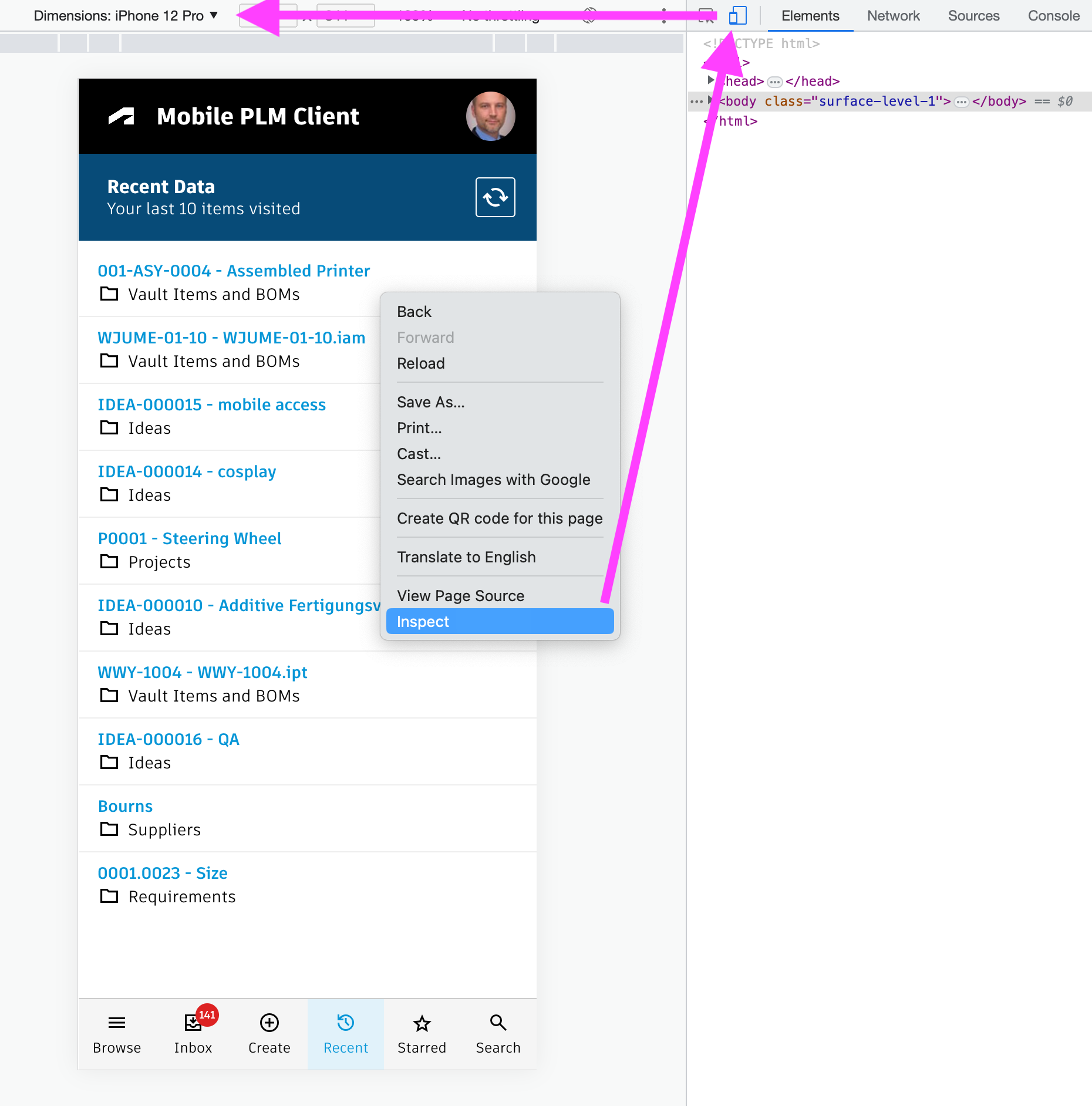
If you want to test this solutions, but cannot access the server online from your phone, your browser can be of help. Open the Mobile Client using the instructions shown below. Once opened, right click the page and select Inspect in Chrome. This will open the developer tools in which you can toggle the device for testing. Just select your preferred mobile device and reload the page. This enables to render the page like on a mobile device.
Access the Mobile Client
You can access the client with the /client endpoint, just click the first button. In order to navigate to a defined record, you can also pass the Workspace ID and DMS ID of a record as parameters. See the second button example which opens a demo dataset item automatically.
Mobile Client Change Log
| 26. October 2023 | Enhancement | Search performance has been improved and styling has been updated for better ease of use |
| 7. July 2023 | - | No changes in this release |
Features
Once the Chrome Extension of this UX server is installed, users can open the BOM comparison from any item. It will automatically open the comparison against the working version or latest released version, depending from where it is opened. Users can select another BOM to compare against by using searches, the revision list, bookmarks and recent items.
Learn about the Chrome ExtensionIf the Chrome Extension should or cannot be used, you can also add a Computed Field to the Items workspace in order to launch the BOM comparison.
However, this requires a (hidden) field DMS_ID being set by script to store the current item's dmsId.
The following field will render a button to launch the BOM comparison for the current item, but lets the user select the target BOM to compare against:
'<a style="border: 1px solid #bec8d2;border-radius:4px;padding:5px 16px;color: #0a131c;font-size:12px;font-weight:700;line-height:30px;text-align:center;text-decoration:none !important;white-space:nowrap;" target="_blank" href ="LOCATIONcompare?wsId=57&dmsId='||DMS_ID||'">BOM Comparison</a>'
If the comparison should be launched automatically against the latest released revision or the working version, simply append the parameter compareWith to the button's URL:
'<a style="border: 1px solid #bec8d2;border-radius:4px;padding:5px 16px;color: #0a131c;font-size:12px;font-weight:700;line-height:30px;text-align:center;text-decoration:none !important;white-space:nowrap;" target="_blank" href ="LOCATIONcompare?wsId=57&dmsId='||DMS_ID||'&compareWith=self">BOM Comparison</a>'
Once the comparison has been started, the following features are available:
- Select from multiple viewer sizes
- Filter the BOM trees by type of change
- Display item details for selected items
- Apply change type colors to the viewer
- Enable / disable viewer sync
This application does not require any configuration changes in the tenant.
Application Configuration Settings
The following settings can be adjusted in your custom settings file within exports.applications.compare to adjust the application's behavior.
In order to change any of these settings, copy the standard value from settings.js to your custom settings file in folder settings.
| Setting | Default Value | Description |
|---|---|---|
| panels.insertBOMLeft | {..} | Configures the left BOM tree display |
| panels.insertBOMRight | {..} | Configures the right BOM tree display |
| panels.insertDetailsLeft | {..} | Configures the left Item Details panel |
| panels.insertDetailsRight | {..} | Configures the left Item Details panel |
| panels.insertSearch | {..} | Configures the Search panel for selection of the BOM to compare |
| panels.insertRevisions | {..} | Configures the Revisions list for selection of the BOM to compare |
| panels.insertRecentItems | {..} | Configures the Recent Items panel for selection of the BOM to compare |
| panels.insertBookmarks | {..} | Configures the Bookmarks panel for selection of the BOM to compare |
Viewer Configuration Settings
This application enables configuration of features within the viewer by using parameter viewerFeatures. By using the settings listed below, you can control the availability of given icons in the viewer toolbar. These feaatures can be enabled and disabled for all users in general by setting the value to true or false. As an alternative, you can also provide an array of groups to grant access. Only users being assigned to any of the defined groups will then get access to the feature. Examples:
- viewerFeatures.measure = true > Measurements will be possible for all users
- viewerFeatures.measure = false > Measurements will not be possible for any user
- viewerFeatures.measure = ['Employees','Service Technician'] > The measurements button will only be shown for users in group Employees or Service Technician
| Setting | Icon | Description |
|---|---|---|
| contextMenu | Enables / disables the viewer standard context menu | |
| cube | Enables the cube / home button in top right corner of the viewer. Parameter 'views' can be used instead, providing dedicated buttons. | |
| orbit | Enables the orbit controls | |
| firstPerson | Enables first person view | |
| camera | Enables camera interactions | |
| measure | Enables the measurements toolbar | |
| section | Enables sectioning | |
| explodedView | Enables exploded views | |
| modelBrowser | Enables browsing the model hierarchy within the viewer | |
| properties | Enables access to the selected component's properties stored in the viewable file | |
| settings | Enables viewer settings | |
| fullscreen | Enables fullscreen toggle | |
| markup | Enables markup toolbar | |
| hide | Enables easy hiding of (selected) components | |
| ghosting | Enables toggling ghosting mode on/off | |
| highlight | Enables toggling highlight of selected models on/off | |
| single | Enables fitting of first instance to viewer | |
| fitToView | Enables reframing all visible items | |
| reset | Enables to deselect all, invoking viewerClickReset() | |
| views | Enables toolbar to quickly access main views | |
| selectFile | Enables switching between multiple viewable files for the given item (3D and 2D) |
The viewer can further be adjusted by using common settings that apply to all applications. All settings listed below can be changed in exports.common.viewer:
| Setting | Icon | Description |
|---|---|---|
| numberProperties | ['Part Number', 'Name', 'label', 'Artikelnummer', 'Bauteilnummer'] | List of item properties to be considered as number properties. The first property found will be used to match components in the viewable file to items in the PLM system (based on field defined in exports.common.workspaces.items.fieldIdNumber). |
| suffixPrimaryFile | ['.iam.dwf', '.iam.dwfx', '.ipt.dwf', '.ipt.dwfx'] | Defines sequence of preferred file suffixes to identify the primary viewable file if multiple viewable files are available for the given item. |
| extensionsIncluded | ['dwf', 'dwfx', 'nwd', 'ipt', 'stp', 'step', 'sldprt', 'pdf'] | List of file formats to be considered as viewable formats. |
| extensionsExcluded | [] | List of file formats not to be considered as viewable formats. |
| splitPartNumberBy | ' v' | If the number property in the viewer does not match the item number exactly, its value can be split by the given string to remove suffixes like version information. |
| splitPartNumberIndexes | [0] | If the number property in the viewer does not match the item number exactly, its value can be split and selected indizes can be contatenated. This property defines the split elements to concatenate. |
| splitPartNumberSpacer | '' | If the number property in the viewer does not match the item number exactly, its value can be split and selected indizes can be contatenated. The concatenated strings will be separated by this spacer. |
| backgroundColor | [255, 255, 255, 255, 255, 255] | Default background color of viewer instances if not specified by theme. |
| cacheInstances | false | Enables / disables caching of instances data in the viewer for improved performance. Enabling this cache will incread initial load time. |
| antiAliasing | true | Enables / disables anti-aliasing in the viewer. |
| ambientShadows | true | Enables / disables ambient shadows in the viewer. |
| groundReflection | true | Enables / disables ground reflections in the viewer. |
| groundShadow | true | Enables / disables ground shadow in the viewer. |
| lightPreset | 4 | Changes the default light preset of the viewer. |
| conversionAttempts | 10 | If viewables need to be converted, this number of attempts will be made to check for the conversion completion status. |
| conversionDelay | 3000 | If viewables need to be converted, this delay (in milliseconds) will be applied before starting to check for the conversion completion status. |
BOM Comparison Change Log
| 7. July 2023 | Release | This is the initial release of this application |
Features
Provide an online interface for service technicians to have latest product information at hand at anytime, anywhere.
- View the 3D design in context of the BOM
- Browse and filter the product BOM
- Select BOM items to retrieve all details
- Download item documentation
- Access list of defined Spare Parts
- Submit Spare Part Requests
- Capture Problem Reports
- Browse catalog of serviceable products and assets
- View and update assigned Asset Services
- Track progression of and update formerly created Spare Parts Requests
- Track progression of and update formerly created Problem Reports
Prerequisites
- This solution is based on the standard Items workspace and its standard properties.
- If the Service Portal should (also) be launched from the Fusion Manage standard user interface, the Chrome Exteionns provided with this package must be installed.
- Spare parts get identified by the standard field Spare Wear Part of workspace Items. If this property's value is set to Spare Part or Wear Part for an item, it will be treated as spare part in this portal. The list of valid values can be configured in the settings.js file.
- If the portal is opened in context of a Product or Asset having a related Service BOM defined, this Service BOM will be used instead.
- In order to create and manage the Spare Part Requests processes, the given workspace is required in your tenant. Recent demo and trial tenants include this workspace already. If the workspace does not exist, you can follow the steps described further down below for a basic configuration of this workspace - or download the Spare Parts Requests template from the library. In the latter case, make sure that the request's details tab and grid entries can link to your Items workspace in the given fields.
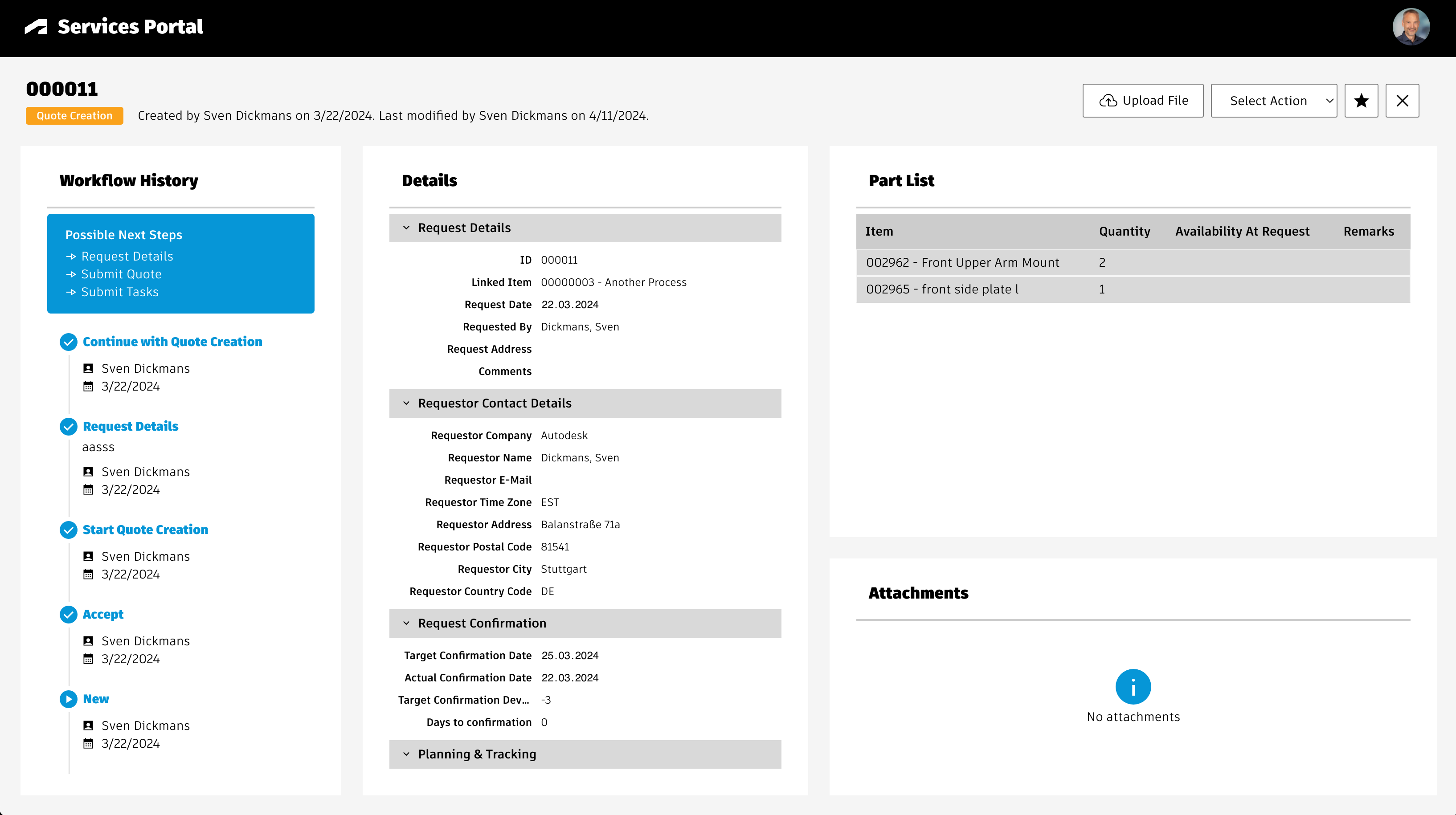
If Spare Parts Requests are used, users will be able to track and update these requests within the Service Portal as well:
Setup Instructions
The following workspaces configurations are included in test & trial tenants already, but you should review the following instructions in any case before launching the application.
Create BOM View 'Service' for workspace Items
Create a new BOM view Service for workspace Items and add at least the columns shown below. The sequence of columns does not matter.
You may add further fields if needed, but this may impact performance / load times of the portal.
| Source | Source Field | Display Name |
|---|---|---|
| System | Descriptor | Descriptor |
| Item Details / Basic | Number | Number |
| Item Details / Basic | Icon | Icon |
| Item Details / Basic | Type | Type |
| Item Details / Basic | Title | Title |
| Item Details / Technical Details | Spare / Wear Part | Spare / Wear Part |
| Item Details / Technical Details | Weight [grams] | Weight [grams] |
| BOM Fields | Quantity | Quantity |
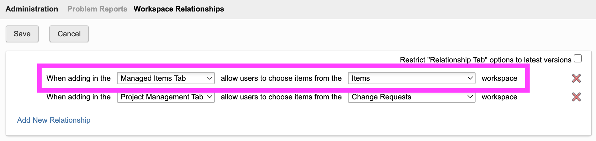
Configure Workspace Relationships of Problem Reports
Open the Workspace Relationships control for workspace Problem Reports in the Workspace Manager. In here, enable connections to workspace Items in Managed Items Tab in order to support creation of new PRs.
Modes
The Service Portal can be opened in different modes, it will automatically adapt to the given use case.
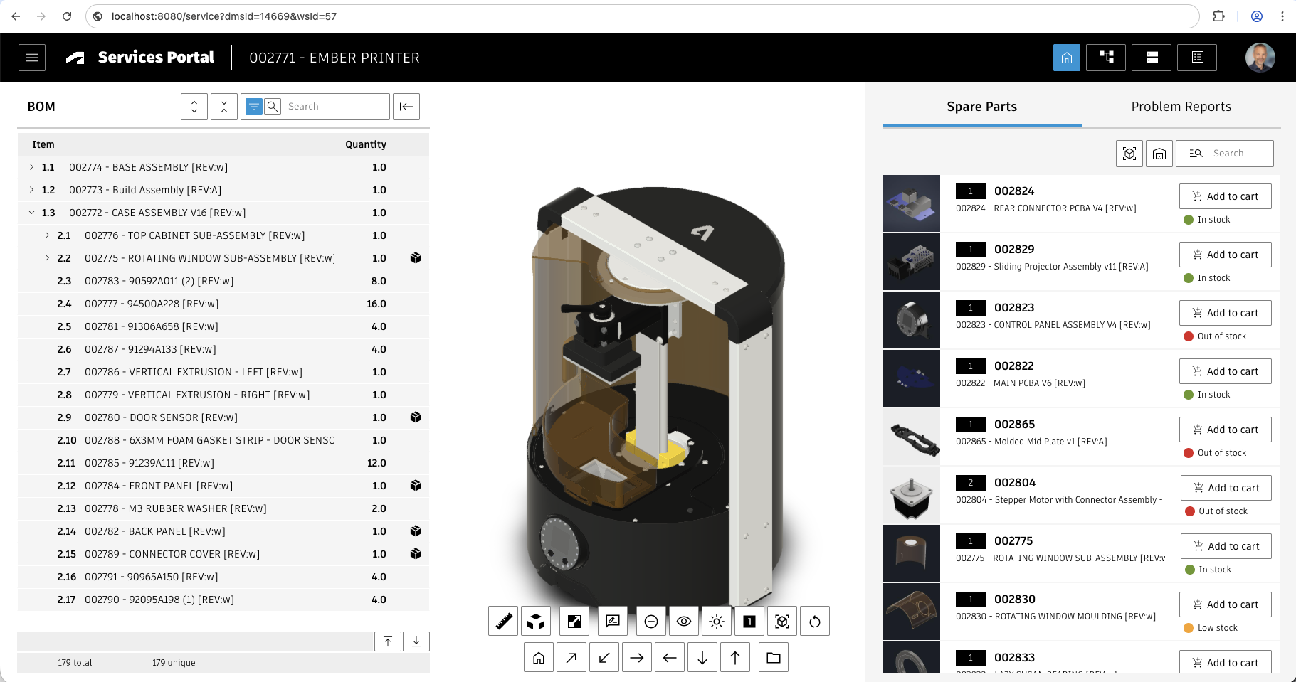
Mode #1 : In context of an Item defined by wsId/dmsId
When opening the portal with URL parameters wsId and dmsId pointing to an item record, the portal will retrieve the EBOM of the given item and display its structure. Service technicians can navigate through the BOM, select spare parts and create Spare Parts Requests or Problem Reports in context of the selected item. In this scenario, Spare Parts are determined by the defined property on the EBOM items.
See below the example layout of http://localhost:8080/service?wsId=57&dmsId=14669
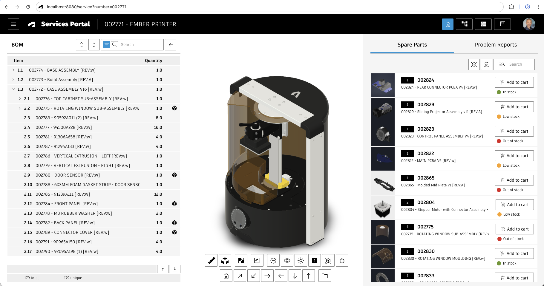
Mode #2 : In context of an Item defined by Part Number
Note that the same can be achieved by passing the URL parameter number followed by an item part number. In this case, the system will retreive the matching item first before then opening the related item's EBOM and viewable.
See belw the example layout of http://localhost:8080/service?number=002771
Mode #3 : Product Browser
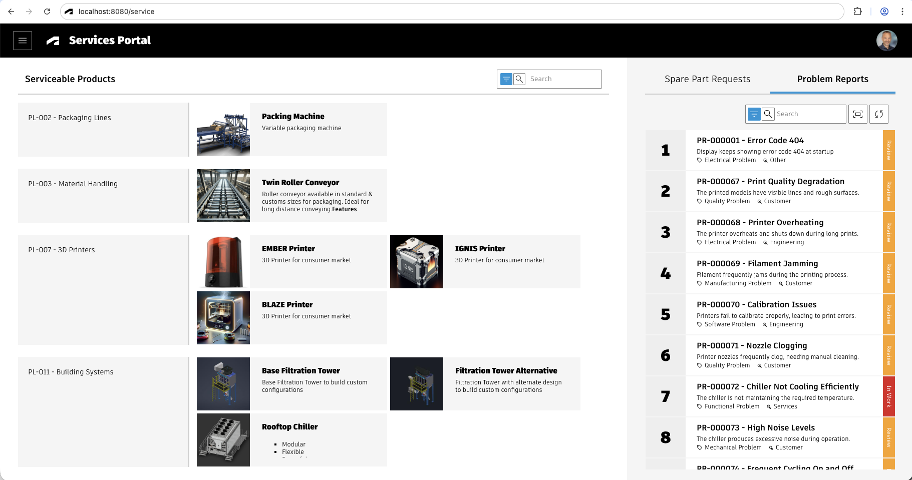
If no wsId and dmsId are provided, the portal will open a landing page showing a catalog of serviceable products. Users can navigate through this catalog, select a product of interest and open its BOM to create Spare Parts Requests or Problem Reports in context of the selected product. The list of products being shown in the landing page can be configured using settings.js. The Spare Parts will be determined by the Product's Service BOM if available - if not, the related EBOM and the defined Spare Part flag attribute will be used.
See below the example layout of http://localhost:8080/service
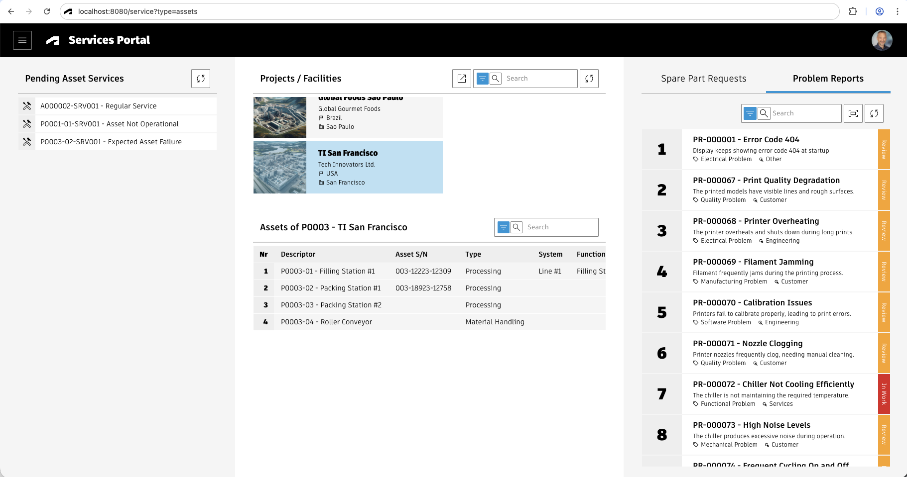
Mode #4 : Asset Browser
If no wsId and dmsId are provided and the URL parameter &type=assets is contained instead, the portal will open a landing page showing an Asset browser as well as assigned Asset Service Tickets. Users can open such a service ticket or an asset directly. In both cases, the asset's Service BOM or Engieering BOM will be used for the viewer, BOM and Spare Parts list generation. This mode requires the installation of the given template from the library for the Asset management.
See below the example layout of http://localhost:8080/service?type=assets
Add New Workspace Spare Parts Requests
The Service Portal can be used to initiate Spare Parts Requests processes with reference to the currently selected spare parts. However, this feature requires the given workspace to manage these requests. If you do not want to manage these requests in PLM or if this workspace is availalbe in your tenant already, please skip this chapter.
If the workspace does not exist, you can follow the steps below for a basic configuration of this workspace - or download the Spare Parts Requests template from the library. In the latter case, make sure that the request's details tab and grid entries can link to your Items workspace in the given fields.
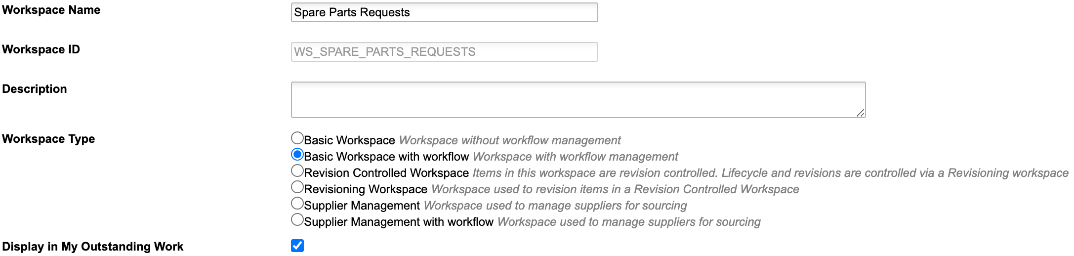
Add Workspace
Add a new workspace named Spare Parts Requests using the settings shown in the following screenshot:
Item Details Tab
Add the following fields to the new workspace. You may add further fields (non-mandatory) and sections when needed. You may also omit 'Requestor' in all the field labels, they are just used to keep the internal Field ID identical to the label to make the setup easier.
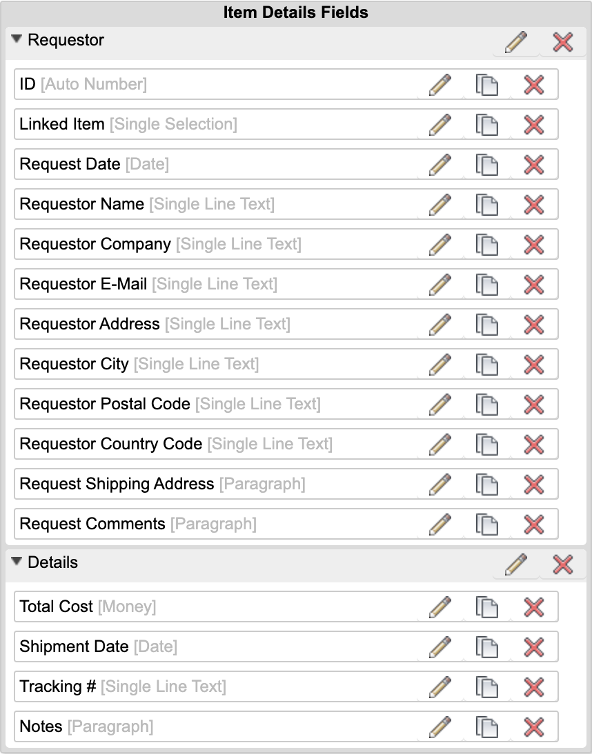
| Label | Field ID | Type | Details | Editable |
|---|---|---|---|---|
| ID | ID | Auto Number | Formula: AUTONUMBER('', ID__AUTO_INC, 6) | false |
| Linked Item | LINKED_ITEM | Pick List ([WS] Items, Single Selection) | length: 200 | Creation Only |
| Request Date | REQUEST_DATE | Date | - | false |
| Requestor Name | REQUESTOR_NAME | Single Line Text | length: 200 | true |
| Requestor Company | REQUESTOR_COMPANY | Single Line Text | length: 200 | true |
| Requestor E-Mail | REQUESTOR_EMAIL | Single Line Text | length: 200 | true |
| Requestor Address | REQUESTOR_ADDRESS | Single Line Text | length: 200 | true |
| Requestor City | REQUESTOR_CITY | Single Line Text | length: 200 | true |
| Requestor Postal Code | REQUESTOR_POSTAL_CODE | Single Line Text | length: 200 | true |
| Requestor Country Code | REQUESTOR_COUNTRY_CODE | Single Line Text | length: 200 | true |
| Request Shipping Address | REQUEST_SHIPPING_ADDRESS | Paragraph | Length: 100000 | true |
| Request Comments | REQUEST_COMMENTS | Paragraph | Length: 100000 | true |
| Total Cost | TOTAL_COST | Money | Length: 10, Field Precision: 0 | true |
| Shipment Date | SHIPMENT_DATE | Date | - | true |
| Tracking # | TRACKING | Single Line Text | Length : 200 | true |
| Notes | NOTES | Paragraph | Length: 100000 | true |
Descriptor
Set the descriptor for this workspace as you like (i.e. ID - Requestor Company)
Grid Tab
Add the following fields to the grid tab
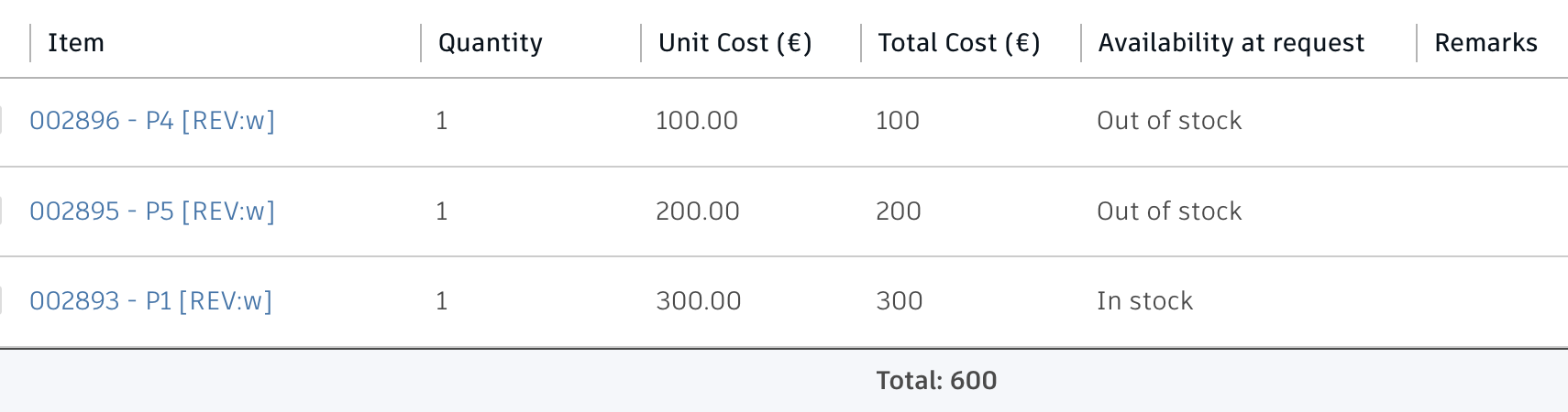
| Label | Field ID | Type | Details | Editable |
|---|---|---|---|---|
| Item | ITEM | Pick List | Pick List [WS] Items (Single Selection) | Creation Only |
| Quantity | QUANTITY | Integer | length: 10 | Creation Only |
| Unit Cost | UNIT_COST | Money | Length: 10, Field Precision: 2 | true |
| Total Cost | TOTAL_COST | Money | Formula: QUANTITY * UNIT_COST; Add aggregation type 'Sum' | false |
| Availability at request | AVAILABILITY_AT_REQUEST | Single Line Text | Length: 50 | true |
| Remarks | REMARKS | Single Line Text | Length: 200 | true |
Tab Names
Adjust the tab names for ease of use:
- Item Details > Request
- Grid > Part List
- Workflow Actions > Workflow
Scripts
Create a new Action script Spare Parts Requests WF Actions with the code shown below. Make sure to select library script getUserName in the script's imports.
item.REQUESTOR_NAME = getUserName();
item.REQUEST_DATE = new Date();
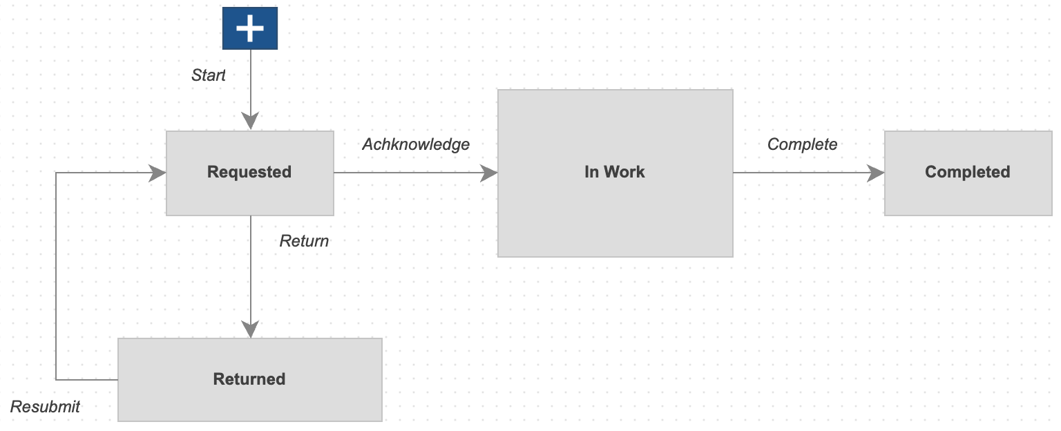
Workflow
Provide a workflow for this new workspace. While the workflow logic does not matter for this solution, make sure to attach the script Spare Parts Requests WF Actions as action script to the initial transition.
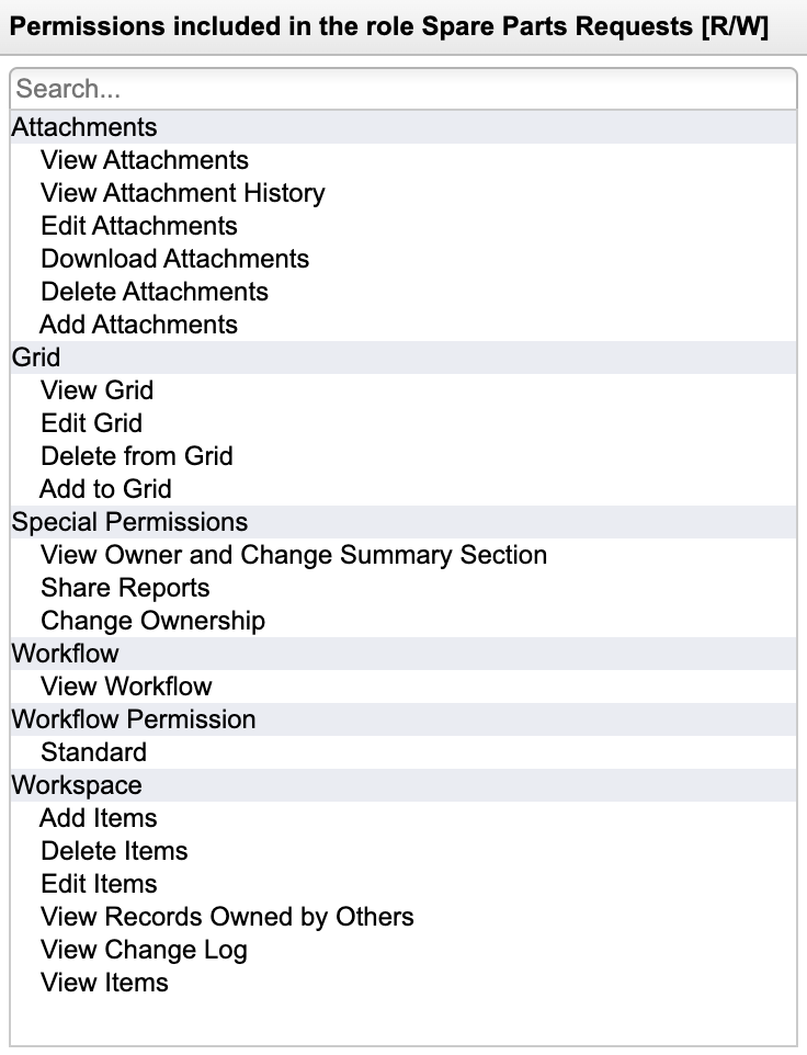
Access Permission
Add a role for this new workspace and assign this given role to your users to enable access. Grant full access (add, delete, edit and view) to the tabs Attachments, Grid, and Workflow.
Application Configuration Settings
The following settings can be adjusted in your custom settings file within exports.applications.service to adjust the application's behavior.
In order to change any of these settings, copy the standard value from settings.js to your custom settings file in folder settings.
Configuring Basic Settings
| Setting | Default Value | Description |
|---|---|---|
| labels.homeSparePartRequests | 'Spare Part Requests' | Sets label of side panel in landing page |
| labels.homeProblemReports | 'Problem Reports' | Sets label of side panel in landing page |
| products.workspaceId | 95 | Provide the workspace ID of |
| products.headerLabel | 'Serviceable Products' | Sets label of product navigator in landing page |
| products.icon | 'icon-product' | The icon to use for products in the landing page if no image is available |
| products.groupBy | 'PRODUCT_LINE' | This optional setting enables to group the prdoducts in the landing page based on the given field's values |
| products.contentSize | 'l' | Defines the size of tiles in the products landing page |
| products.tileImage | 'IMAGE' | The field ID to use for retrieving the products' images in the landing page |
| products.tileTitle | 'TITLE' | The field ID to use for the products' tiles title in the landing page |
| products.tileSubtitle | 'DESCRIPTION' | The field ID to use for the products' tiles subtitles in the landing page |
| products.filter | [..] | List of filters to determine the products displayed in the landing page. The default filter will search for all records having a value in field ENGINEERING_BOM. |
| products.fieldIDs.ebom | 'ENGINEERING_BOM' | Field of Products workspace that links the Engineering BOM being used to retrive product information (and viewable) once a user clicks on a product tile |
| products.fieldIDs.sbom | 'SERVICE_BOM' | Field of Products workspace that links the Service BOM being used to retrive Spare Parts information created by the Service BOM Editor |
| items.bomViewName | 'Service' | Provide name of the Engineering BOM view that has been created in the previous steps |
| items.bomRevisionBias | 'release' | Select the revision bias when expanding the Engineering BOM. Select 'working' or 'release'. |
| items.fieldIdSparePart | 'SPARE_WEAR_PART' | ID of field being used to identify Spare Parts in the Engineering BOM (the next setting defines the possible values of this field) |
| items.fieldValuesSparePart | ['spare part', 'yes', 'x', 'y', 'wear part'] | List of values (for the field defined by items.fieldIdSparePart) which are used to identify spare parts |
| items.endItemFilter | { 'fieldId' : 'SBOM_END_ITEM', 'value' : true } | BOM items having the given value in the defined field will be considered as end nodes. Users will not be able to see the items below. This filter only applies if the given fieldId is present in your Items workspace. If the field does not exist, this setting will be ignored automatically. Of course you can change this setting to make use of another field. In any case, this field must be included in the BOM view being used by the Service Portal (default is 'Service'). |
| items.sparePartTileTitle | 'NUMBER' | Select field ID of BOM view to use as Spare Part tile title |
| items.sparePartTileSubtitle | 'TITLE' | Select field ID of BOM view to use as Spare Part tile subtitle |
| sparePartsRequests.workspaceId | 241 | Provide the workspace ID of Spare Parts Requests to enable creation of new processes from within the application |
| sparePartsRequests.sectionsExpanded | [ 'Requestor Contact Details', 'Request Details' ] | Provide titles of sections to be expanded by default in Spare Parts Request details views |
| sparePartsRequests.sectionsExcluded | [ 'Planning & Tracking', 'Request Confirmation', 'Quote Submission & Response', 'Real Time KPIs', 'Workflow Activity', 'Quote Summary', 'Order Processing', 'Related Processes' ] | Provide titles of sections to be excluded in Spare Parts Request details views |
| sparePartsRequests.gridColumnsExcluded | [ 'Line Item Cost', 'Availability [%]', 'Manufacturer', 'Manufacturer P/N', 'Unit Cost', 'Total Cost', 'Make or Buy', 'Lead Time (w)', 'Long Lead Time'] | Provide titles of grid columns of the Spare Parts Requests workspace to be excluded in details view |
| sparePartsRequests.stateColors | [..] | Sets colors for defined states of Spare Parts Requests in landing page panel |
| problemReports.workspaceId | 82 | Provide the workspace ID of Problem Reportsto enable creation of new processes from within the application (82 matches the default tenant configuration) |
| problemReports.fieldIdImage | 'IMAGE_1' | ID of field to be used as preview image in Problem Reports panel in landing page |
| problemReports.stateColors | [..] | Sets colors for defined states of Spare Parts Requests in landing page panel |
BOM Display Configuration
The BOM tree on the left hand side can be configured with these options:
| Setting | Default Value | Description |
|---|---|---|
| paramsBOM.hideDescriptor | false | When enabled, the descriptor column will not be shown |
| paramsBOM.fieldsIn | [ 'Item', 'Quantity', 'Qty' ] | Columns of BOM view (defined in items.bomViewName) to be displayed (if existent) |
| paramsBOM.downloadFiles | true | Enables bulk file download in BOM tree |
| paramsBOM.downloadRequests | 5 | Sets maximum number of download requests for BOM bulk file download |
| paramsBOM.downloadFormats | [..] | Defines standard filters for BOM bulk file download |
Configuring Service BOM Support
The following settings are required if the Service Portal should use the related Service BOM for the Spare Parts list creation instead of the Engineering BOM items. These settings must be aligned with the given configuration settings of the Service BOM Editor. Multiple settings must be defined for each major item type in the Service BOM, especially the Type field value (fieldValue). Both groupLabel and icon impact the disply of given BOM entries in the Service Portal.
| Setting | Default Value | Description |
|---|---|---|
| serviceBOMTypes.sparePart | { fieldValue : 'Spare Parts List', groupLabel : 'Spare Parts', icon : 'icon-package' } | This will drive the list of items that can be ordered as single Spare Parts |
| serviceBOMTypes.kit | { fieldValue : 'Service Kit', groupLabel : 'Kits', icon : 'icon-list' } | This will drive the list of items that can only be ordered as part of a Maintenance Kit |
| serviceBOMTypes.offering | { fieldValue : 'Service Offering', groupLabel : 'Service Offerings', icon : 'icon-layers' } | This will drive the list of items that can only be ordered as part of Service Offerings |
Configuring support for Assets
The following settings are required if the Service Portal should support Assets and Asset Services based on the given template in the library (which is avaialble for testing only as of December 2025). They only apply when opening the portal with parameter &type=assets.
| Setting | Default Value | Description |
|---|---|---|
| assetServices | { workspaceId : 284, .. } | These settings define the support of Asset Services in the portal from the landing page display to fieldIDs for BOM retrieval to process display |
| projects | { workspaceId : 283, .. } | These settings define the support of Order Projects in the portal |
| assets | { workspaceId : 280, .. } | These settings define the support of Assets in the portal. The fieldIDs are specifically important as they determine how to retrieve the related Engineering BOM, Service BOM and Serial Numbers List of a selected Asset. |
| serialNumbers | {} | These settings define the support of serial numbers management of the selected Asset in the portal. Setting tableColumns defines the grid columns to be displayed in the given panel. The setting fieldIDs is used for locating the matching item instances in the BOM and viewer. |
Configuring Panels
The portal contains multiple configurable panels: the Documentation tabe, the Item Details panel and the related Item Attachmens. The following settings can be used to adjust these panels' contents and behaviors if needed:
- paramsItemDetails
- paramsItemAttachments
- paramsDocumentation
Configuring Application Features
Selected application features can be restricted using the applicationFeatures property in settings.js. In general, if a property equals true, the given feature will be available for the user. You can use basic boolean values, but also make use of groups to grant access for defined user groups only. Examples:
- applicationFeatures.homeButton = true > The home button is available for all users
- applicationFeatures.homeButton = false > The home button is not visible for any user
- applicationFeatures.homeButton = ['Employees','Service Technician'] > The home button will only be shown for users in group Employees or Service Technician
The following settings control features within the application:
| Setting | Description | Default Value |
|---|---|---|
| applicationFeatures.homeButton | Enables Home button in global toolbar to close a given product's spare parts view and to return to the landing page | true |
| applicationFeatures.itemDetails | Enables button 'Toggle Details' in global toolbar to toggle the selected item's details on/off | true |
| applicationFeatures.itemAttachments | When enabled, the Item Details panel enabled by features.itemDetails will contain an attachments section to download files attached to the selected item | true |
| applicationFeatures.contextDocumentation | Enables tab 'Documentation' next to the tab 'Spare Parts', enabling users to download files attached to the context product/asset. Note that this list will be empty if users access the Service Portal with a defined item dmsId. Only if users click on a product in the landing page of the Service Portal, this tab will contain data. | true |
| applicationFeatures.manageSparePartRequests | Enables the landing page panel to track Spare Parts Requests in progress | true |
| applicationFeatures.manageProblemReports | Enables tab 'Problem Reports' next to the tab 'Spare Parts', enabling users to reveal related PRs and also to create new ones. This also adds the given panel in the landing page to review processes in progress. | true |
| applicationFeatures.showStock | Enables display of stock information in spare parts list | true |
| applicationFeatures.requestWorkflowActions | Enables display of workflow actions menu when opening a Spare Parts Request from the landing page | true |
| applicationFeatures.problemWorkflowActions | Enables display of workflow actions menu when opening a Problem Report from the landing page | true |
| applicationFeatures.enableCustomRequests | When set to true, users can add non-spare-parts to service requests as well | true |
| applicationFeatures.openInPLM | Enables button 'Open in PLM' in panel toolbars to open the current selected item in the standard PLM user interface. Disable this property if users should not be aware of the PLM standard user interface. | true |
Common Configuration Settings
This utility also uses the following common configuration settings
| Setting | Description | Default Value |
|---|---|---|
| exports.common.workspaceIds.products | ID of Products workspace | 95 |
| exports.common.workspaceIds.sparePartsRequests | ID of Spare Parts Requests workspace | 241 |
| exports.common.workspaceIds.problemReports | ID of Problem Reports workspace | 82 |
| exports.common.workspaceIds.assets | ID of Assets workspace | 280 |
| exports.common.workspaceIds.orderProjects | ID of Order Projects workspace | 283 |
| exports.common.workspaceIds.assetServices | ID of Asset Services workspace | 284 |
Viewer Configuration Settings
This application enables configuration of features within the viewer by using parameter viewerFeatures. By using the settings listed below, you can control the availability of given icons in the viewer toolbar. These feaatures can be enabled and disabled for all users in general by setting the value to true or false. As an alternative, you can also provide an array of groups to grant access. Only users being assigned to any of the defined groups will then get access to the feature. Examples:
- viewerFeatures.measure = true > Measurements will be possible for all users
- viewerFeatures.measure = false > Measurements will not be possible for any user
- viewerFeatures.measure = ['Employees','Service Technician'] > The measurements button will only be shown for users in group Employees or Service Technician
| Setting | Icon | Description |
|---|---|---|
| contextMenu | Enables / disables the viewer standard context menu | |
| cube | Enables the cube / home button in top right corner of the viewer. Parameter 'views' can be used instead, providing dedicated buttons. | |
| orbit | Enables the orbit controls | |
| firstPerson | Enables first person view | |
| camera | Enables camera interactions | |
| measure | Enables the measurements toolbar | |
| section | Enables sectioning | |
| explodedView | Enables exploded views | |
| modelBrowser | Enables browsing the model hierarchy within the viewer | |
| properties | Enables access to the selected component's properties stored in the viewable file | |
| settings | Enables viewer settings | |
| fullscreen | Enables fullscreen toggle | |
| markup | Enables markup toolbar | |
| hide | Enables easy hiding of (selected) components | |
| ghosting | Enables toggling ghosting mode on/off | |
| highlight | Enables toggling highlight of selected models on/off | |
| single | Enables fitting of first instance to viewer | |
| fitToView | Enables reframing all visible items | |
| reset | Enables to deselect all, invoking viewerClickReset() | |
| views | Enables toolbar to quickly access main views | |
| selectFile | Enables switching between multiple viewable files for the given item (3D and 2D) |
The viewer can further be adjusted by using common settings that apply to all applications. All settings listed below can be changed in exports.common.viewer:
| Setting | Icon | Description |
|---|---|---|
| numberProperties | ['Part Number', 'Name', 'label', 'Artikelnummer', 'Bauteilnummer'] | List of item properties to be considered as number properties. The first property found will be used to match components in the viewable file to items in the PLM system (based on field defined in exports.common.workspaces.items.fieldIdNumber). |
| suffixPrimaryFile | ['.iam.dwf', '.iam.dwfx', '.ipt.dwf', '.ipt.dwfx'] | Defines sequence of preferred file suffixes to identify the primary viewable file if multiple viewable files are available for the given item. |
| extensionsIncluded | ['dwf', 'dwfx', 'nwd', 'ipt', 'stp', 'step', 'sldprt', 'pdf'] | List of file formats to be considered as viewable formats. |
| extensionsExcluded | [] | List of file formats not to be considered as viewable formats. |
| splitPartNumberBy | ' v' | If the number property in the viewer does not match the item number exactly, its value can be split by the given string to remove suffixes like version information. |
| splitPartNumberIndexes | [0] | If the number property in the viewer does not match the item number exactly, its value can be split and selected indizes can be contatenated. This property defines the split elements to concatenate. |
| splitPartNumberSpacer | '' | If the number property in the viewer does not match the item number exactly, its value can be split and selected indizes can be contatenated. The concatenated strings will be separated by this spacer. |
| backgroundColor | [255, 255, 255, 255, 255, 255] | Default background color of viewer instances if not specified by theme. |
| cacheInstances | false | Enables / disables caching of instances data in the viewer for improved performance. Enabling this cache will incread initial load time. |
| antiAliasing | true | Enables / disables anti-aliasing in the viewer. |
| ambientShadows | true | Enables / disables ambient shadows in the viewer. |
| groundReflection | true | Enables / disables ground reflections in the viewer. |
| groundShadow | true | Enables / disables ground shadow in the viewer. |
| lightPreset | 4 | Changes the default light preset of the viewer. |
| conversionAttempts | 10 | If viewables need to be converted, this number of attempts will be made to check for the conversion completion status. |
| conversionDelay | 3000 | If viewables need to be converted, this delay (in milliseconds) will be applied before starting to check for the conversion completion status. |
Services Portal Change Log
| 13. January 2026 | Enhancement | Additional configuration settings for BOM tree display |
| Bugfix | Updated Spare Part tile details configuration | |
| 12. January 2026 | Documentation | Documentation has been updated to match the new custom settings and environments management |
| 2. December 2025 | Changed Settings | To enable the new features of this release, the settings had to be updated. Please review the new settings.js file and update it accordingly. |
| Enhancement | Additional settings now provide more control of the application features, labels and icons | |
| Enhancement | The portal now is compliant with the Service BOM editor: If the context item has a Service BOM connected, this given BOM's spare part information will be used instead of the EBOM data. | |
| New Feature | Users will find their list of pending Problem Reports in the landing page of the portal now as well to easily track and update their formerly created PRs. | |
| New Feature | When opened with URL parameter 'type=assets', the portal will display pending Asset Services as well as a navigator for Assets instead of Products | |
| New Feature | Users can access pending Asset Services in the landing page now and open the related Asset's BOM to create Spare Part Requests or Problem Reports in context of the Asset. | |
| New Feature | The solution now can be launched in context of Assets as well and with this is compliant with the upcoming template library solution. When accessing an Asset or Asset Service, users can update the list of Serial Numbers as well as the service ticket. | |
| 23. September 2025 | Quality | When a new model gets opened, the markup toolbar and elements will get removed before if needed |
| 17. July 2025 | Enhancement | If the portal is opened in context of a product (for example from the landing page), the new Problem Reports being created will also be connected to this product using the standard field 'AFFECTED_PRODUCT' |
| New Settings | The configuration settings of this solutions have been changed to improve the Products landing page. | |
| April 16, 2025 | Enhancement | Added configuration setting 'revisionBias' to allow for expansion of the BOM with working or release configuration |
| 10. September 2024 | Enhancement | When components get hidden in the viewer, advanced controls now enable to unhide selected components or the last one |
| 1. July 2024 | Enhancement | This solution is now compatible with the Spare Parts Requests template being available as preview for trial and demo tenants. This required adjustment of some fieldIDs, please review the installation instructions for the new Spare Parts Requests workspace and align with your setup if you used this solution before already. |
| 5. June 2024 | Enhancement | When opening the Service Portal from the landing page by selecting a product, a new Documentation tab provides access to the given product's attachments next to the list of Spare Parts. This tab can be disabled using the setting applicationFeatures.productDocumentation. |
| 2. May 2024 | Enhancement | The configuration of viewer features has been aligned with other apps using the dedicated settings viewerFeatures |
| 26. April 2024 | Enhancement | Added setting features.viewer.hide to support easy hiding of components in viewer |
| Enhancement | When there is no spare part for the current selected BOM item, the portal will now validate if any of the parents is defined as spare part. If so, the first given parent will be shown in the list of available spare parts. | |
| 11. April 2024 | Enhancement | New setting requestSectionsExcluded enables hiding defined sections from the Spare Part Request Details. The details display is still driven by the user permissions and sections can be hidden based on their access permissions defined in the Workspace Manager. |
| Enhancement | New setting requestColumnsExcluded enables hiding defined columns from the Parts List of a Spare Part Request shown in the portal. | |
| Quallity | Change some CSS setting to improve display of given requests witin the portal | |
| 8. April 2024 | Enhancement | Behavior for item selection in viewer has been changed. When users click in item, remaining geometry will no longer be ghosted to allow for follow-up seleciton. The selected item still gets highlighted in BOM and matching spare part list as well as Item Details and Item Attachments get refreshed to match the selection. |
| Enhancement | Added new controls in viewer to reframe visible items and to fit only first visible instance in viewer. Both can be disabled by new options in settings.js. | |
| 20. March 2024 | Enhancement | Selected spare parts will be moved to a new cart panel now and not only be highlighted in blue. From this cart, users can filter the viewer for cart items and also trigger the spare part request creation. |
| Enhancement | Option endItemFilter has been added to settings file to prevent expansion of defined BOM nodes. | |
| Enhancement | The request creation dialog has been enhanced to capture more information, including contact details These contact details will be filled auotmatically based on the user's Autodesk Account data. | |
| Enhancement | New feature toggle has been added to prevent display of stock information for spare parts : features.showStock | |
| Enhancement | New feature toggle has been added to prevent workflow actions for spare parts requests : features.requestWorkflowActions | |
| Enhancement | A new function has been added to set the stock information for all spare parts. Override this function setSparePartStockStatus in file /javascripts/custom/service.js to implement your custom logic. | |
| 19. March 2024 | Enhancement | Feature control: Restrict access to application features for all users or specific user groups using the settings file |
| Enhancement | Routing has been enabled : Browser URL gets updated when users switch between landing page and item context to enable refresh of the current screen | |
| 14. March 2024 | Enhancement | When users open an existing spare parts request in the landing page, this request will no longer be shown in PLM, but the portal instead. Users can still perform workflow actions and upload additional files in this view. |
| Bugfix | When users closed the dialog for creation of a new spare parts request and reopened the dialog afterwards, the quantities were reset for each line. Now, these quantities are preserved. | |
| Bugfix | Users can no longer submit an empty request | |
| Enhancement | A new icon is used for the button to submit the spare parts request | |
| 29. February 2024 | Enhancement | The BOM display will be collapsed at startup automatically |
| Enhancement | Spare parts in the BOM tree will no longer be highlighted by bold / orange font, but with a dedicated icon and matching tooltip | |
| Enhancement | If BOM items are not accessible due to access permission restrictions, this will be indicated by red lock icons in the BOM tree | |
| 9. February 2024 | Enhancement | A new toolbar on top of the Spare Parts list enables searches, filtering and deselection |
| Enhancement | Viewer behavior upon BOM item selection and Spare Part Zoom has been adjusted for better usability | |
| Enhancement | A new button in the viewer toolbar enables toggling ghosting on and off | |
| Enhancement | Additional options now can be configured in settings.js (i.e. enabling a filter for the products in the landing) | |
| Quality | Global toolbar icon sequence has been adjusted | |
| 26. January 2024 | Enhancement | The following buttons got removed from the viewer toolbar: Model Structure, Properties and Settings |
| Enhancement | The BOM tree now highlights spare parts with orange text | |
| 10. January 2024 | New Feature | The portal can be opened without context item to let users browse for the product of interest |
| New Feature | Users now can track previously created spare part requests from within the portal | |
| New Feature | Users can submit requests for items which are not flagged as spart part. This feature can be disabled with new option 'enableCustomRequests' in settings file. | |
| 26. September 2023 | Enhancement | Display root item name in web page title |
| 3. August 2023 | Bugfix | Improved behavior of markup toolbar at lower resolutions |
| Bugfix | Width of markups and font size of markup text can now be set properly | |
| 7. July 2023 | Enhancement | When spare parts get zoomed in, they will be highlighted in red within the viewer |
| New Feature | Users can click items in the viewer to get it selected in the spare parts list and to retrieve item details as well as attachments | |
| Enhancement | The Options button in main toolbar has been replaced by dedicated toggles | |
| Enhancement | All spare parts selected in the panel to the right will now be highlighted in blue within the viewer to continuously indicate the selection | |
| Enhancement | The (fake) stock information now is also shown with a colored border in the spare parts list | |
| Enhancement | When users click on BOM entries, geometry not being in context will be hidden (before, it was still shown transparently) | |
| 30. June 2023 | New Feature | The spare parts list now indicates the total quantity of the given component (qty is shown in white with black background) |
| New Feature | The entries in the spare parts list will automatically adjust its style in case of longer lists (tile height get reduced) |
Features
Users can track progression of processes, update existing processes and create new processes with ease using this dashboard. The dashboard provides access to a single workspace only to reduce complexity.
- Create new processes by providing basic data only (only if create permission is granted)
- Review history of selected processes
- Update status of a given process
- Download and upload process attachments
- Use 3D markups to document process
- Access bookmarked and recent processes
- Track proces progression in Kanban
- Review process updates in a chart
- Access defined dashboard directly (by providing valid wsId as parameter) or select from configured profiles
Configuration Settings
This dashboard can be used with any workspace, but requires the matching configuration profile. The configuration profiles are managed in the standard settings file and/or the custom settings file by using the array exports.applications.dashboard.
The default configuration provides profiles for the following workspaces:
- Change Requests
- Change Orders
- Change Tasks
- Non Conformances
- Problem Reports
- Project Tasks
- Supplier Packages
Each profile requires the settings listed below.
| Setting | Example Value | Description |
|---|---|---|
| title | 'Problem Reporting Dashboard' | Sets the application title shown in the main toolbar and tab name |
| workspace | 'problemReports' | References the workspace ID to be used for this dashboard profile, based on the list of workspaces defined in exports.common.workspaceIds |
| newHeader | 'Create new Problem Report' | The header text shown in the create panel when opening the dashboard |
| newMessage | 'You encountered an issue? Help ...' | The message shown in the create panel when opening the dashboard' |
| className | 'problem-report' | This class name will be added to the item-element in the HTML page when opening the details of a selected process. This enables custom styling per process type. |
| icon | 'icon-problem' | The icon to be used for the processe and the profile selector in the Dashboard Landing Page (which opens if no process profile is defined). See the developer guide for available icons. |
| fieldIdSubtitle | 'DESCRIPTION' | The field ID of the field to be used as tile subtitle in the process list |
| contents | [..] | Defines the panels being displayed when opening a selected process. See the developer guide about insertItemSummary for configuration options. |
| progress | [..] | Maps the business process workflow states to a linear sequene of steps to provide a better overview of the process progression. Each entry of this array must contain a label that will be used in the applcation, a color code to use for this state as well as the list of workflow 'states' that match to this step. |
Access the Dashboard
You can access the process dashboard with the /dashboard endpoint by providing the workspace profile to use. The value of parameter wsId has to match the wsId property value of the configuration profile to use. If you're connected to a default tenant of 2023 or later, you can use these links:
You can also omit the workspaceId and select from the list of configured profiles instead:
Process Dashboard ProfilesProcess Dashboard Change Log
| 12. January 2026 | Documentation | Documentation has been updated to match the new custom settings and environments management |
| 14. October 2025 | Enhancement | Added new dashboard configuration for Change Orders enabling creation of Change Tasks with markups on the CO's Affected Item |
| 30. July 2025 | Enhancement | Users can open the dashboard of a defined process by providing the given dmsID together with the wsID parameter |
| Enhancement | The browser URL will be updated when opening a process, allowing for a refresh of the process dashboard of the currently selected process | |
| 8. March 2024 | Extension | Users now can access a landing page with all available dashboard configurations by omitting the wsId parameter |
| 6. March 2024 | Extension | The dashboard now validates the user's access permissions and only shows the create panel if the 'Add Items' permission is granted to the user in PLM |
| Extension | Added a new configuration profile in settings.js to support the 'Supplier Deliverables' workspace of the 2023 default tenants | |
| 16. November 2023 | Extension | Added configuration profile for management of Non Conformances (incl. given button in documentation) |
| 6. October 2023 | Release | Initial release of this new app |
Features
- Navigate and visualize BOM of a given item
- Filter BOM and 3D view by text and dynamic KPIs
- Apply colours to BOM and viewer to visualise KPIs
- Combine multiple KPI filters in drill down mode
- Access and download attachments of all / selected BOM items
- Review & edit details of selected items
- Manage item details and attachments of selected items
- Mass edit properties of multiple items in the BOM
- Review Problem Reports related to a selected item
- Perform markups and initate new Problem Reports for given items
- Create new Supplier Packages for selected items
- Open the explorer from an item of interest in PLM or by using a landing page
Prerequisites
This app works best with the Items workspace, but can also be used with the former Items and BOMs workspaces.
It is recommended to be used with a workspace where the items have viewable files (dwf) attached.
Layout Toggle
The Layout button in the main toolbar can be used to switch between multiple predefined layouts, changing the size and placement of the BOM:
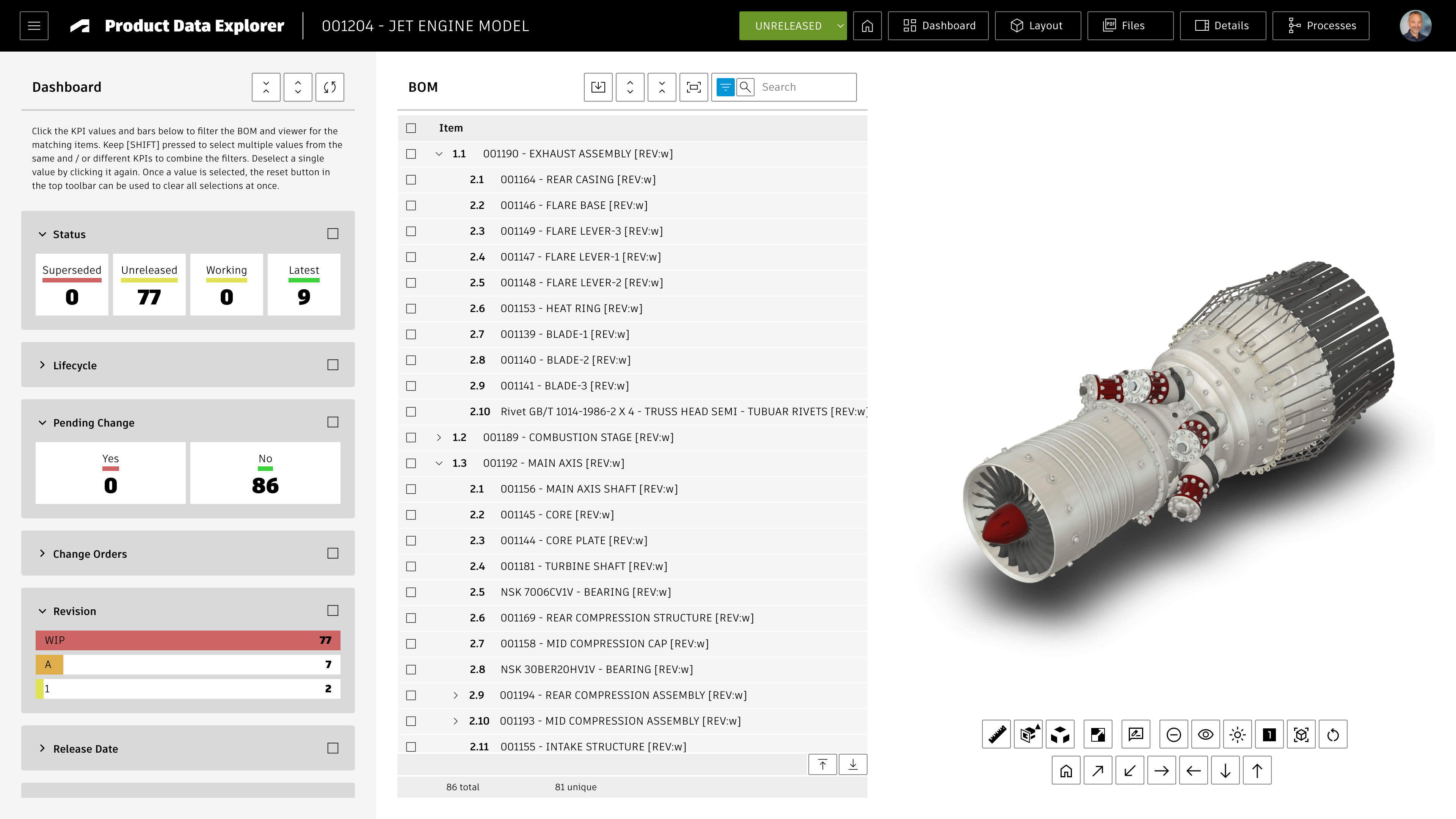 | 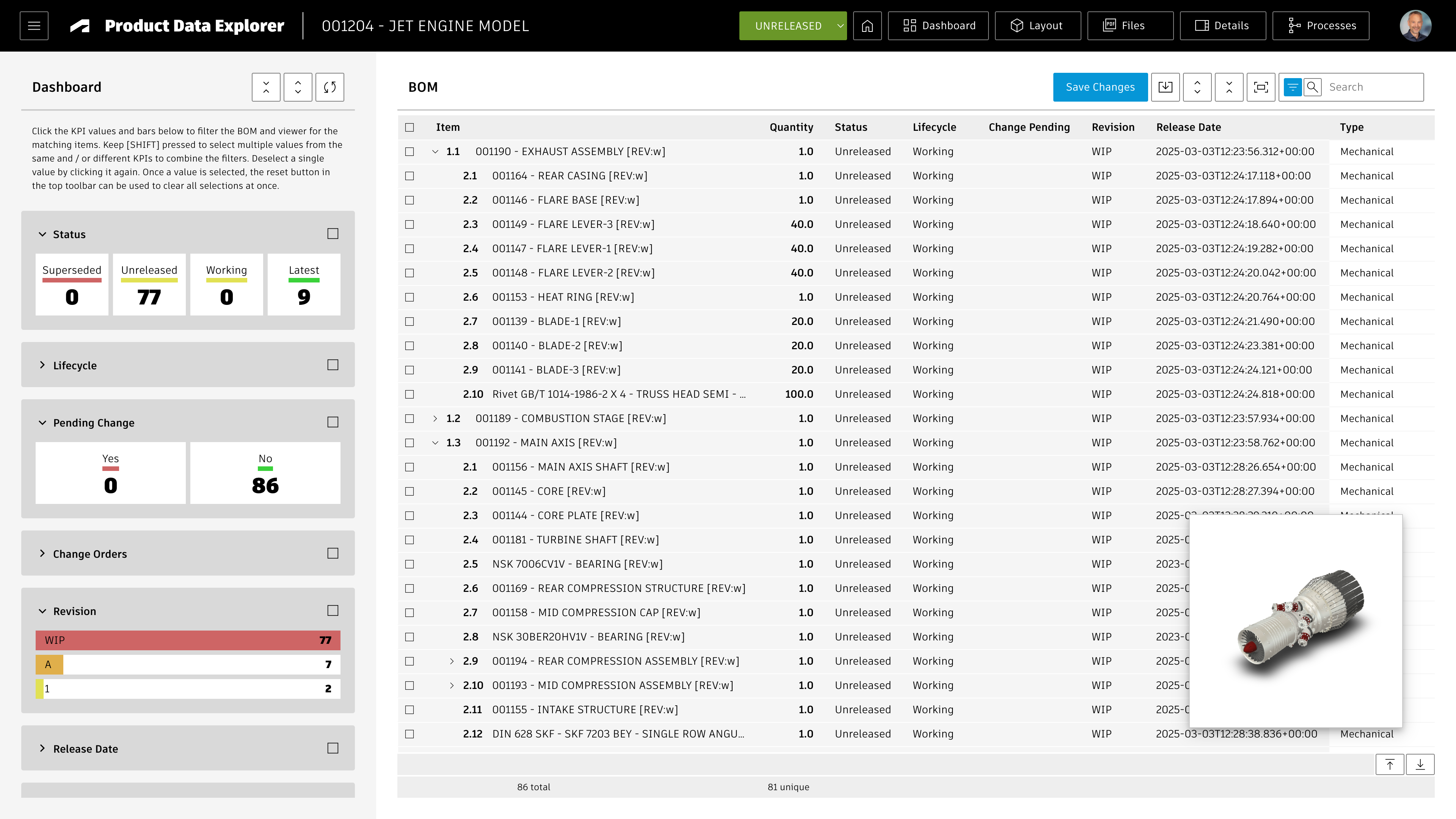 | 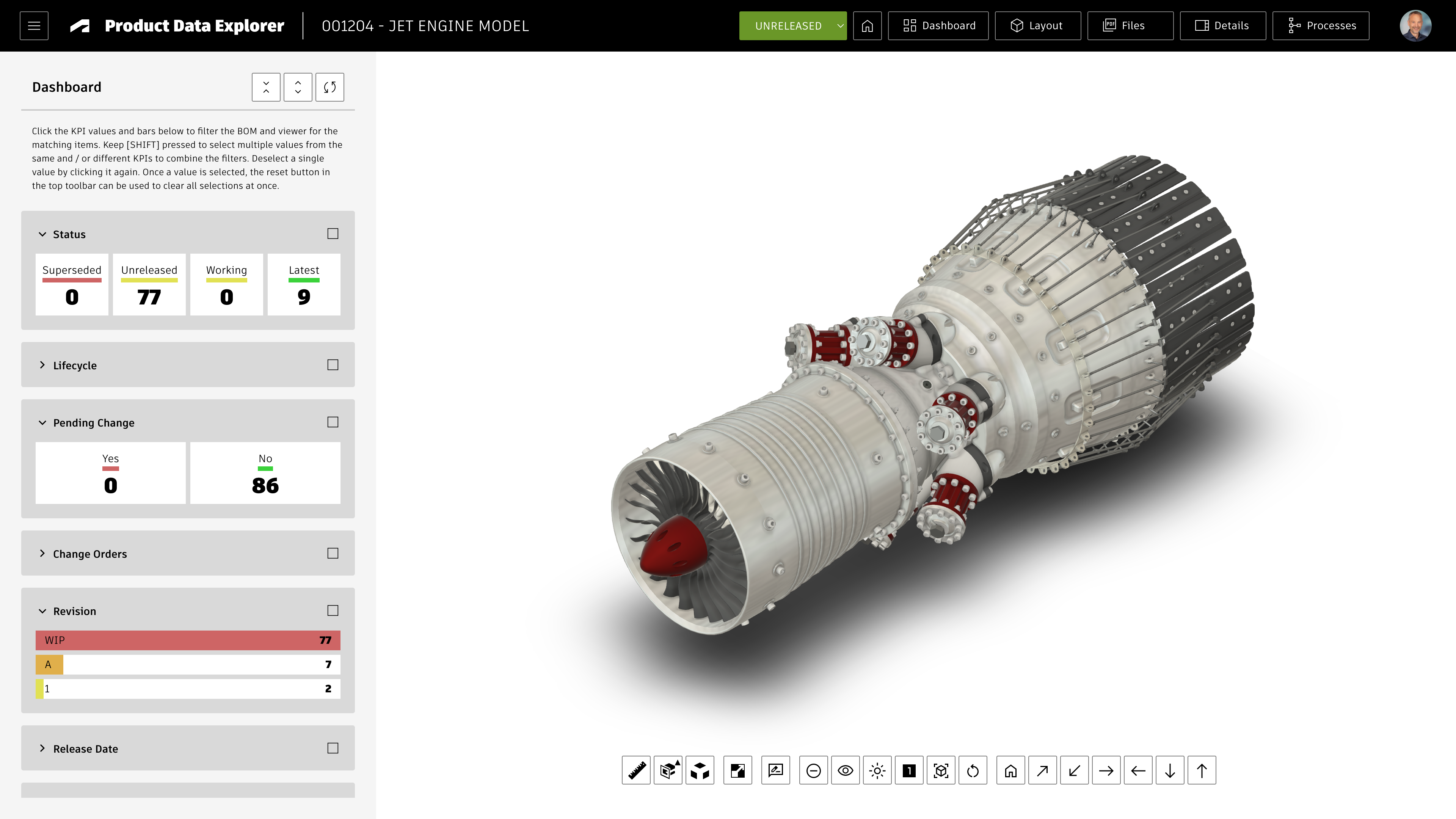 |
By also using the Dashboard toggle, users can have a full screen view of the BOM at hand for mass updates while still benefiting from a 3D preview: 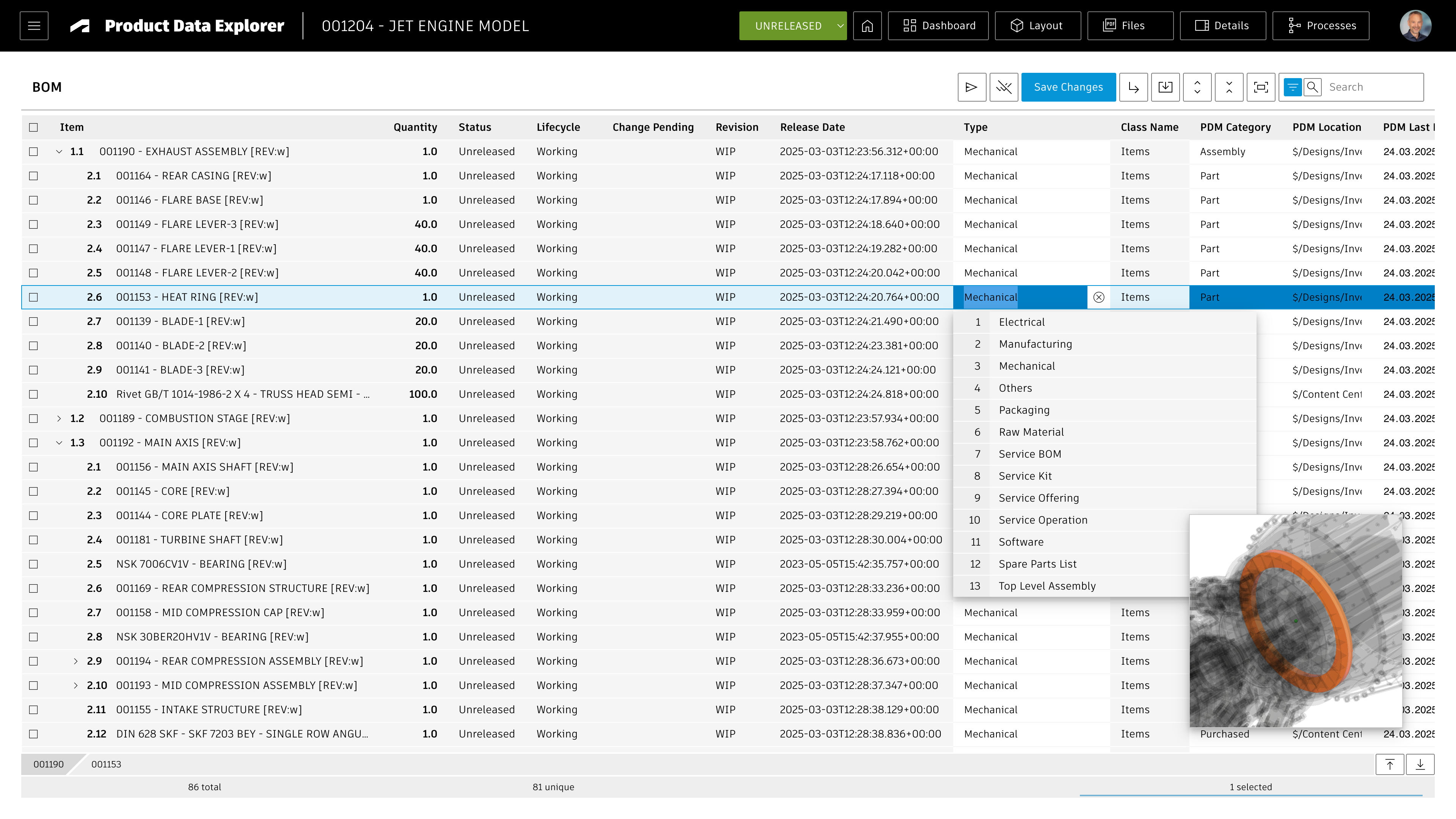
Setup Instructions
Configure Items Workspace BOM View
This application requires a BOM view that contains all fields required to determine the KPIs for the dashboard shown on the left hand side of the application. This BOM view will also used for the BOM tree display. It is recommended to create a new BOM view named Details for workspace Items if it does not exist yet. If you want to reuse an existing BOM view instead, you can change the view's name in the application configuration settings as described in the given chapter.
Include all the columns listed below in this BOM view to match it with the predefined KPIs. If you omit some of these columns (as they might not exist in your tenant), the given KPIs will be hidden automatically and the dashboard will still work.
- Descriptor
- Number
- Quantity (BOM Fields)
- Status (System Field)
- Lifecycle (System Field)
- Change Pending (System Field)
- Revision (System Field)
- Release Date (System Field)
- Type
- Class Name
- PDM Category
- PDM Location
- PDM Last Modification Date
- Responsible Designer
- Spare / Wear Part
- Make or Buy
- Vendor
- Country
- Long Lead Time
- Has Pending Packages
- Weight
- Material
- REACH
- RoHS
- Carbon Emissions
- Inspection Required
- Latest QI Result
Configure Workspace Relationships
Make sure that Items can be connected to Problem Reports as affected items.
The retrieval of related PRs and also creation of new PRs will fail otherwise.
Starting the application
Users can access this application standalone using the start menu (/start) or by using the app's endpoint directly (/explorer). However, this application also can be started in context of a given item from PLM. It can be opened in context by passing either the item number or both the wsId and dmsId in the request URL. The latter capability can be used to launch the application from PLM in context of an item.
Opening the application from an item in PLM can be achieved in two ways:
- By using the framework's Chrome Extension that adds an Explorer button in the PLM item's header toolbar.
This option is recommneded and does not require any further configuration. - If the Chrome Extension cannot be used, a computed field must be added to the details page to render a button opening the Explorer.
See the required configuration steps below only if this option is needed.
Adding an Explorer button to Item Details page
If the field DMS_ID does not exist yet in your Items workspace, add it as Single Line Text (length 20, not visible) in tab Item Details.
Let this field be set upon item creation using the following script code in your item creation script:
item.DMS_ID = dmsID;
In addition, add a computed field Actions to Item Details that renders a button to open the explorer for the current record. Use the formula shown below. In this formula, adjust the workspace ID to match your environment if needed (57 matches the standard Items workspace).
'<a style="border: 1px solid #bec8d2;border-radius:3px;color: #0a131c;font-weight:600;line-height:32px;padding:4px 20px;text-align:center;text-decoration:none !important;white-space:nowrap;" target="_blank" href =" explorer?wsId=57&dmsId='||DMS_ID||'">Explorer</a>'
Application Configuration Settings
Multiple settings can be adjusted in your custom settings file within exports.applications.explorer to adjust the application's behavior.
To change any of these settings, copy the standard value from settings.js to your custom settings file in folder settings. Do not change the values in the master settings file directly as these changes may get lost with the next update and require rework to preserve these changes.
Core Settings
Review the following settings driving the core features of this application
| Setting | Description | Default Value |
|---|---|---|
| workspaces.problemReports.workspaceId | The management of Problem Reports in context of selected items requires definition of the given workspace's id. This value is set to null per default to reuse the id defined in common.workspaceIds.problemReports. So define a value in this application specific settings only if a different workspace should be used. | null |
| workspaces.problemReports.fieldIdImage | The field being used for saving the markup image when creating a new Problem Report | 'IMAGE_1' |
| workspaces.problemReports.fieldIdAffectedItem | The field being used to link the new Problem Report with the currently selected item | 'AFFECTED_ITEM' |
| workspaces.supplierPackages.workspaceId | The creation of new Supplier Packages for selected items requires definition of the given workspace's id. This value is set to null per default to reuse the id defined in common.workspaceIds.supplierPackages. So define a value in this application specific settings only if a different workspace should be used.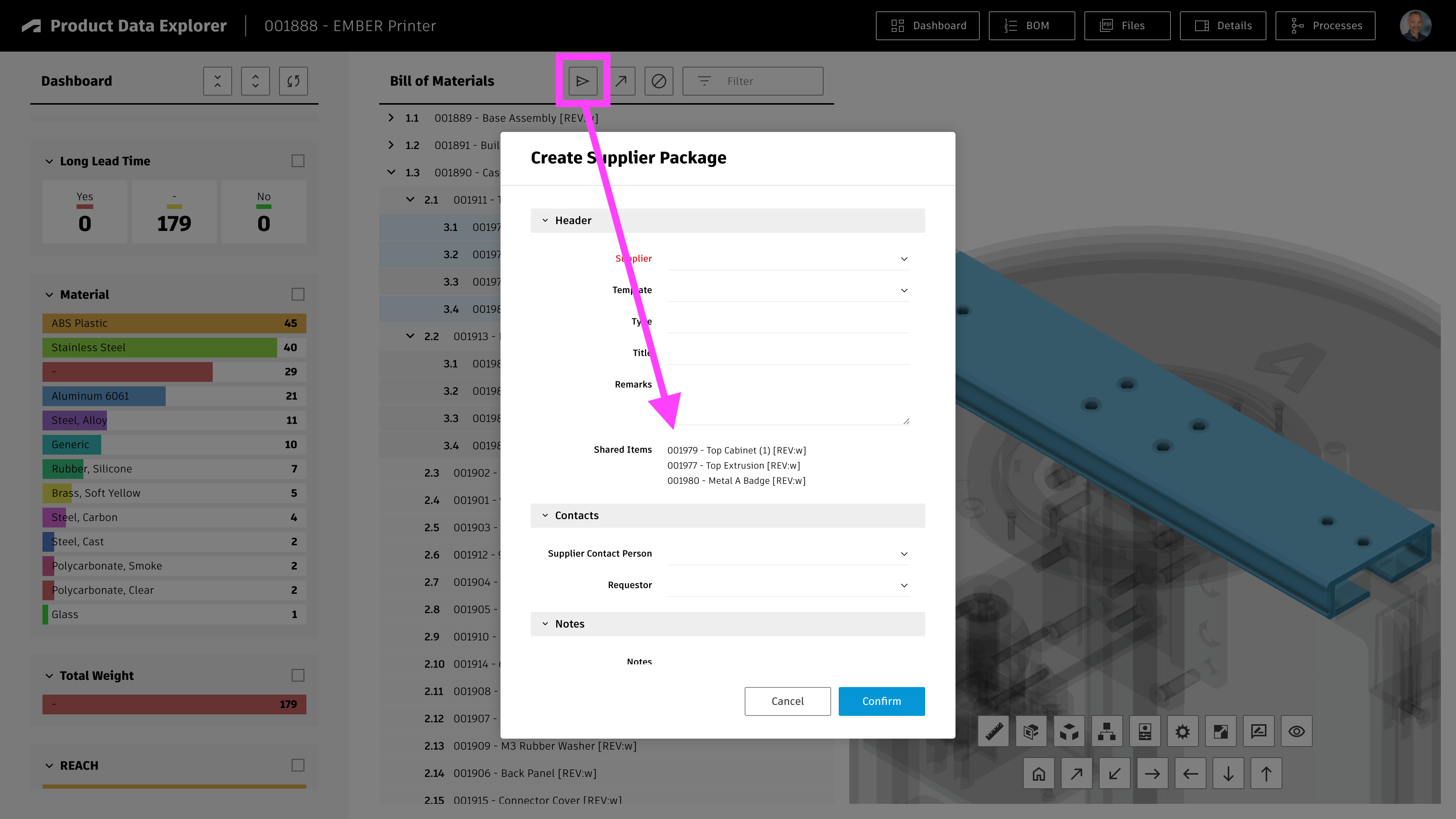 | null |
| kpiDrillDown | Then set to true, selection of KPI values will update the counters of other KPIs by considering the matching items only | true |
Panel Contents
The application makes use of standard framework panels for the display of item details, attachments, BOM and so on. By adjusting the elements within the panels parameter, these panels can be changed to individual needs. Required parameters will receive default values if you ever delete them.
| Setting | Description |
|---|---|
| panels.insertBOM | This element drives the BOM tree display. Its bomViewName setting also is used for the KPI data retrieval. |
| panels.insertDetails | This element drives the Detials panel on the right side being used to display the properties of the selected item |
| panels.insertAttachments | This element drives the Attachments panel at bottom being used to display the attachments of the selected item |
| panels.insertChangeProcesses | This element drives the Processes panel on the right side being used to display the related Change Processes of the selected item |
| panels.createSupplierPackage | This drives the Supplier Package creation dialog |
KPI Definition
Parameter exports.applications.explorer.kpis defines the KPIs being displayed in the explorer's dashboard to the left. You may change these kpis, but keep in mind that all KPIs require you to include the given field as column to the BOM view of this application. The more fields you add, the lower the performance will be.
Standard KPIs are preconfigured to match the standard Items workspace and the BOM view columns listed in the Setup Instructions. For example, the dasboard will display counters to reveal items undergoing a change, and also display bars to indicate the PDM category:
{id : 'change',title : 'Pending Change',fieldId : 'WORKING_CHANGE_ORDER',type : 'non-empty',style : 'counters',data : [{ value : 'Yes', color : 0, vector : 'red' },{ value : 'No' , color : 4, vector : 'green' } ]},{id : 'pdm-category',title : 'PDM Category',fieldId : 'PDM_CATEGORY',type : 'value',style : 'bars',data : []}
Each KPI is configured with the same set of parameters:
| Property | Description |
|---|---|
| id | Unique identifier for each KPI |
| title | The title being displayed for the given KPI in the dashboard |
| digits | In case of float properties, this parameter defines the digits being displayed |
| sortBy | Defines the sorting of KPI values. Select from the following options:
|
| sortDirection | Select ascending or descending. Default is descending. |
| type | Defines if the KPI should be based on the given value (value) or if it should just indiate if the given field is not empty (non-empty). Use 'days' instead when comparing date fields. |
| style | Select if the KPI should be presented as counters or colored bars with value. No matter which style you choose, users will be able to filter using the given KPI anyway. |
| data | Leave this array blank for a dynamic range of values. If you want to predefine the range of values and matching colors, define the given datapoints in this array as shown for the Pending Changes. |
Common Configuration Settings
This utility also uses the following common configuration settings
| Setting | Description | Default Value |
|---|---|---|
| exports.common.workspaceIds.problemReports | ID of Problem Reports workspace which will be used if problemReports.workspaceId is not defined | 82 |
| exports.common.workspaceIds.supplierPackages | ID of Supplier Packages workspace which will be used if supplierPackages.workspaceId is not defined | 147 |
| exports.common.workspaceIds.items | ID of Items workspace | 57 |
| exports.common.workspaces.items.fieldIdNumber | Field ID of the Item Number field in Items workspace | 'NUMBER' |
Viewer Configuration Settings
This application enables configuration of features within the viewer by using parameter viewerFeatures. By using the settings listed below, you can control the availability of given icons in the viewer toolbar. These feaatures can be enabled and disabled for all users in general by setting the value to true or false. As an alternative, you can also provide an array of groups to grant access. Only users being assigned to any of the defined groups will then get access to the feature. Examples:
- viewerFeatures.measure = true > Measurements will be possible for all users
- viewerFeatures.measure = false > Measurements will not be possible for any user
- viewerFeatures.measure = ['Employees','Service Technician'] > The measurements button will only be shown for users in group Employees or Service Technician
| Setting | Icon | Description |
|---|---|---|
| contextMenu | Enables / disables the viewer standard context menu | |
| cube | Enables the cube / home button in top right corner of the viewer. Parameter 'views' can be used instead, providing dedicated buttons. | |
| orbit | Enables the orbit controls | |
| firstPerson | Enables first person view | |
| camera | Enables camera interactions | |
| measure | Enables the measurements toolbar | |
| section | Enables sectioning | |
| explodedView | Enables exploded views | |
| modelBrowser | Enables browsing the model hierarchy within the viewer | |
| properties | Enables access to the selected component's properties stored in the viewable file | |
| settings | Enables viewer settings | |
| fullscreen | Enables fullscreen toggle | |
| markup | Enables markup toolbar | |
| hide | Enables easy hiding of (selected) components | |
| ghosting | Enables toggling ghosting mode on/off | |
| highlight | Enables toggling highlight of selected models on/off | |
| single | Enables fitting of first instance to viewer | |
| fitToView | Enables reframing all visible items | |
| reset | Enables to deselect all, invoking viewerClickReset() | |
| views | Enables toolbar to quickly access main views | |
| selectFile | Enables switching between multiple viewable files for the given item (3D and 2D) |
The viewer can further be adjusted by using common settings that apply to all applications. All settings listed below can be changed in exports.common.viewer:
| Setting | Icon | Description |
|---|---|---|
| numberProperties | ['Part Number', 'Name', 'label', 'Artikelnummer', 'Bauteilnummer'] | List of item properties to be considered as number properties. The first property found will be used to match components in the viewable file to items in the PLM system (based on field defined in exports.common.workspaces.items.fieldIdNumber). |
| suffixPrimaryFile | ['.iam.dwf', '.iam.dwfx', '.ipt.dwf', '.ipt.dwfx'] | Defines sequence of preferred file suffixes to identify the primary viewable file if multiple viewable files are available for the given item. |
| extensionsIncluded | ['dwf', 'dwfx', 'nwd', 'ipt', 'stp', 'step', 'sldprt', 'pdf'] | List of file formats to be considered as viewable formats. |
| extensionsExcluded | [] | List of file formats not to be considered as viewable formats. |
| splitPartNumberBy | ' v' | If the number property in the viewer does not match the item number exactly, its value can be split by the given string to remove suffixes like version information. |
| splitPartNumberIndexes | [0] | If the number property in the viewer does not match the item number exactly, its value can be split and selected indizes can be contatenated. This property defines the split elements to concatenate. |
| splitPartNumberSpacer | '' | If the number property in the viewer does not match the item number exactly, its value can be split and selected indizes can be contatenated. The concatenated strings will be separated by this spacer. |
| backgroundColor | [255, 255, 255, 255, 255, 255] | Default background color of viewer instances if not specified by theme. |
| cacheInstances | false | Enables / disables caching of instances data in the viewer for improved performance. Enabling this cache will incread initial load time. |
| antiAliasing | true | Enables / disables anti-aliasing in the viewer. |
| ambientShadows | true | Enables / disables ambient shadows in the viewer. |
| groundReflection | true | Enables / disables ground reflections in the viewer. |
| groundShadow | true | Enables / disables ground shadow in the viewer. |
| lightPreset | 4 | Changes the default light preset of the viewer. |
| conversionAttempts | 10 | If viewables need to be converted, this number of attempts will be made to check for the conversion completion status. |
| conversionDelay | 3000 | If viewables need to be converted, this delay (in milliseconds) will be applied before starting to check for the conversion completion status. |
Access the Explorer
If your tenant contains the default demo datasets and once you have the BOM view configured as described above, you can open the explorer using the link below:
You can also open the explorer's landing page by omitting the dmsId parameter:
Product Data Explorer Change Log
| 25. March 2026 | Performance | When caching is eanbled, the application now uses cached data if available. A comparison with latest data will be performed in the background - and inform the user in case of a mismatch, allowing to reload from the refreshed cache. |
| 18. March 2026 | New Feature | The BOM tree view now is displayed in edit mode, allowing for mass update of item master data |
| Enhancement | The layout toggle has been updated to provide better layouts for the BOM and viewer display side by side | |
| New Feature | The KPI filters now work in drill down mode: Once a KPI has been selected, the other KPIs will be updated to only consider the matching data. This also applies when selecting multiple KPI values. A new setting can be used to enable / disable this behavior. | |
| New Feature | Files can be downloaded for all or selected BOM items in batch. Configuration settings can be used to enable or even adjust this functionality (i.e. by defining standard file format filters) | |
| Enhancement | The app now uses the framework's standard BOM panel, offering advanced and configurable features such as the BOM path toolbar at bottom | |
| Enhancement | The configuration settings have been reworked for better clarity and to offer advanced configuration capabilities. Now, each panel can be fully configured: BOM tree, Item Details, Attachments and more. | |
| Enhancement | The size of BOM elements now can be toggled using a configurable list of size profiles | |
| 11. March 2026 | Documentation | For better application performance, the list of BOM view columns has been reduced in alignment with the updated KPI definition in the settings file |
| 12. January 2026 | Documentation | Documentation has been updated to match the new custom settings and environments management |
| April 3, 2025 | Enhancement | Added configuation setting rollupTotalCost to display a total cost bar in the BOM tree. This requires to have the BOM column 'Total Cost' of the sourcing tab in the given BOM view. |
| 5. March 2025 | Enhancement | The definition of KPIs now also supports parameters sortBy and sortDirection. With these settings, KPIs can be sorted in ascending order (see Release Date in example configuration). |
| 18. December 2024 | Enhancement | A new button in the header toolbar indicates the current revision of the item. By clicking this button, users can switch to another revision of the given item. |
| 26. April 2024 | Enhancement | Added setting viewer.hide to support easy hiding of components in viewer |
| 22. April 2024 | Enhancement | Added a search panel to the new landing page, enabling users to quickly access any item |
| 18. April 2024 | Enhancement | The explorer now can be opened without providing a dmsId. In this case, the explorer will display a landing page where users can navigate to the item of interest using recently viewed items, bookmarked items and workspace views. If a dmsId is provided, users can click the Home button to access this landing page in order to switch to another design. |
| Enhancement | Viewer features now can be configured in settings.js, enabling to hide / show toolbar icons of interest. Documentation has been extended accordingly. | |
| Enhancement | Landing page now display images for recent and bookmark items | |
| 12. April 2024 | Enhancement | The Affected Items field of new Problem Reports will link the currently selected item automatically. |
| 28. November 2023 | Enhancement | Added RoHS to standard KPI configuration |
| 15. September 2023 | Enhancement | Added further KPIs to standard configuration |
| 3. August 2023 | Bugfix | Improved behavior of markup toolbar at lower resolutions |
| Bugfix | Width of markups and font size of markup text can now be set properly | |
| 7. July 2023 | New Feature | When switching to the flat BOM view, users can modify properties for multiple records (given the fields in the defined BOM are editable) |
| Enhancement | Enhanced KPI definition to match standard properties and BOM view of new default tenant |
Features
- The dashboard makes use of the reports defined in PLM. Make sure that you have valid reports defined in the reports panel.
- The first two out of these reports will get displayed in the dashboard automatically.
- The button Select Reports enables users to select a different set of reports for the dashboard. Note: This given selection will not be saved.
- Users can click on the rows in table based reports to navigate to the given record in PLM.
Limitations
This solution only supports non-stacked column charts and pie charts. All other charts require further developoments.
Configure Startup Reports
The following settings can be adjusted in your custom settings file within exports.applications to adjust the application's behavior.
The dashboard will automatically load a defined set of reports at startup before users can select their preferred reports using the Select Reports button. These startup reports can be defined in the settings.jsfile.
reports : {startupReportNames : ['Audits by Workflow State', 'CR approval status', 'DR: Rework Required', 'EX: Change Requests'],startupReportNames : 5}
The list of startup repports can be defined by their names using the setting startupReportNames. In addition, startupReportNames can be set to define a minimum number of reports to be loaded if none of the report names match for the current user. In this case, when set to 5, the system will display the first five reports (in alphabetical order) if none of the report names were found.
Reports Dashboard Change Log
| 12. January 2026 | Documentation | Documentation has been updated to match the new custom settings and environments management |
| 9. January 2023 | Library Update | The charting library chart.js has been update to most recent version |
| 7. July 2023 | New Feature | Reports can be removed from the dashboard with a new X icon |
| 7. July 2023 | New Feature | Automatic pagination has been enabled for table reports to improve usability |
Prerequisites
Your tenant must have the latest NPI solution installed (providing the workspaces Projects, Project Tasks, Teams and so on).
Features
The dashboard will provide insights in all projects that are accessible to the current user and display the following reports:
- The timeline of each projects by showing all Gates' target dates
- The Status Reports of each projects
- Current progress, project budget and progress of current phase of each project
- The planned effort for each project's phase
- Deviations of project end dates
Application Configuration Settings
The following settings can be adjusted in your custom settings file within exports.applications to adjust the application's behavior. In order to change any of these settings, copy the standard value from settings.js to your custom settings file in folder settings.
| Setting | Description | Default Value |
|---|---|---|
| projects.workspaceId | The Projects workspace ID. If this parameter is not defined, the default Projects workspace ID will be used based on exports.common.workspaceIds.projects | null |
| projects.query | Filter the list of projects by defining a query string. If this parameter is not defined, all projects accessible to the user will be displayed. | '*' |
Projects Dashboard Change Log
| 12. January 2026 | Documentation | Documentation has been updated to match the new custom settings and environments management |
| 21. November 2023 | Enhancement | Add configuration setting config.projects.query to settings file, enabling to filter of projects |
| 7. July 2023 | - | No changes in this release |
Features
- Add EBOM items to the MBOM easily with clicks
- Add further items to the MBOM using drag & drop
- Use the Disassemble mode to quickly define the MBOM by reversing the order
- Use color codes to identify mismatches in EBOM and MBOM
- Access details of selected items in right hand side panel whenever needed
- Manage multiple MBOMs per EBOM item (i.e. site specific BOMs)
- Define manufacturing instructions per item (including attachments and viewer screenshots)
- Set the Make/Buy flag for all items in the MBOM
- Export the list of purchased parts to Excel
Important - Read before proceeding
This editor helps in transitioning an Engineering BOM to a Manufacturing BOM. This may involve one or two item workspaces, depending on your tenant configuration and preference. If your tenant only has the single Items (or Items and BOMs) workspace, this workspace can be used to manage both the EBOMs and the MBOMs. In this case, all installation steps referring to EBOM or MBOM must be applied to this workspace. You can skip all steps referring to the 2 Workspaces setup.
On the other hand, if you have two workspaces, you can use one for the EBOM and the other one for the MBOM. In this case, you will most likely use the standard Items (or Items and BOMs) workspace as the EBOM workspacee and a custom workspace for the MBOM. This setup is referred to as the 2 Workspaces setup in the instructions below.
Note that the viewer inside the MBOM Editor will only work if the rott EBOM item has a viewable file attached (dwf).
Copy New Settings
With the release of November 2025, this editor requires new settings in the settings.js file.
So if you used a previous version of this editor, make sure to copy the latest default settings from the master file to your copy of the settings file.
The editor will fail to launch when being used with old settings.
Setup Step #1 : Add Picklist for Make / Buy
In order to define the components to be purchased within the MBOM, a picklist with the given possible values is required. This picklist will be used in the following steps for both the EBOM and MBOM. Tenants created after 2023 contain the picklist below already. If such a picklist does not exist in your tenant, create it first. Note that the picklist name / ID must be provided in the setting mbom.picklistIDMakeOrBuy. So if your picklist has another internal name than CUSTOM_LOOKUP_ITEM_MAKE_OR_BUY, make sure to update the given parameter in the settings file.
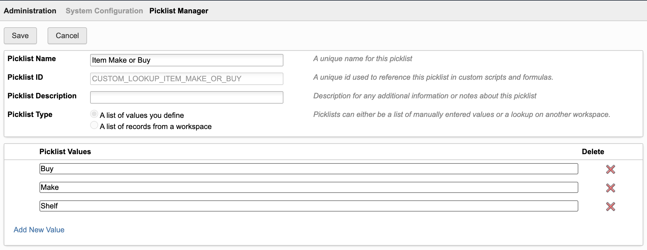
In the screenshot above, the standard picklist got extended by the new value Shelf allowing to flag standard components that are always in stock and do not require a dedicated procurement process. This option is not required for the MBOM Editor to work, but might be useful in your environment.
Setup Step #2 : Enable Operations & Suppliers tab
If setting mbom.displayOptions.tabOperations is set to true, the editor will display the tab Operations & Suppliers, allowing for management of manufacturing operations and access to the selected item's sources. This feature requires additional configuration as described next.
Configure Grid tab for EBOM and MBOM workspace
The tab will display the selected item's grid tab in edit mode for management of related manufacturing operations - which must be configured before. The grid tab must be configured for both the EBOM and MBOM workspace - which might be the same, but also different. Also, users require edit permission for the grid tab in both workspaces.
You can add the columns listed below to the grid tab, but you can also choose different columns. The list below just explains an example configuration.
The editor does not require specific fields to work and the columns can be changed at anytime without the need of changes in the settings file.
| Field Name | Field ID | Data Type | Options |
|---|---|---|---|
| ID | ID | Single Line Text | Length : 20 |
| Title | TITLE | Single Line Text | Length : 200 |
| Instructions | INSTRUCTIONS | Paragraph | Length : 10.000 |
| Duration | DURATION | Integer | Unit : seconds |
| Repetitions | REPETITIONS | Integer | No unit |
| Tools | TOOLS | Single Line Text | Length : 200, Unit : seconds |
| Materials | MATERIALS | Single Line Text | Length : 200 |
| Lead Time | LEAD_TIME | Float | Decimals : 1, Unit : days |
Rename Grid tab
For consistency in the standard user interface, you may want to rename the grid tab to Manufacturing Instructions and move it in between the BOM tabs and the Sourcing tab.
Remember to do this for both the EBOM and MBOM workspace in a 2-workspaces setup.
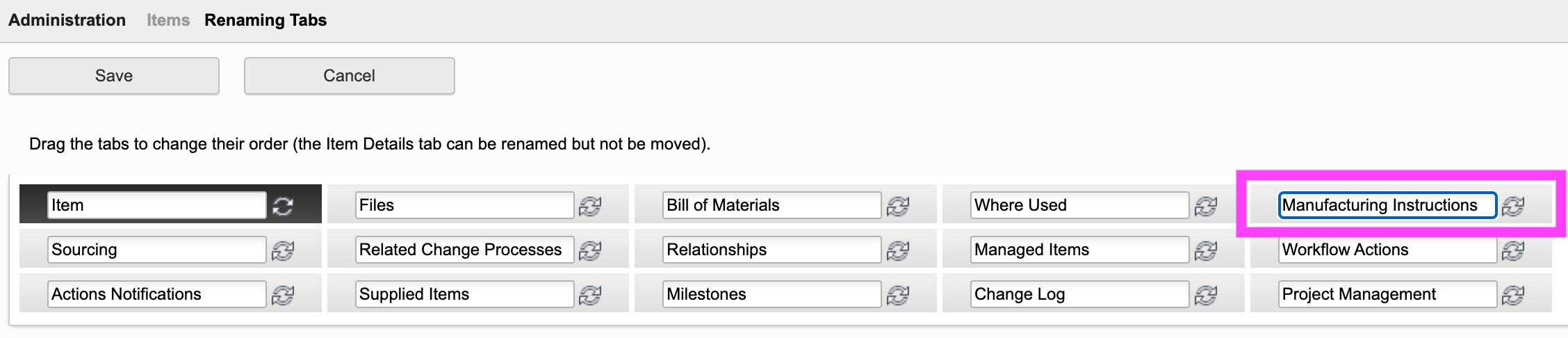
Grant access to Grid tab
The MBOM editor relies on the user's access permission. In order to enable modifications of data in the grid tab, you will therefore have to grant edit permissions for the uers in both items workspaces (EBOM and MBOM). Add the following permissions to the editor roles:
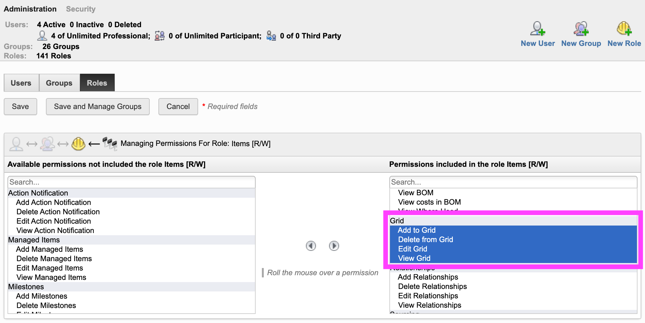
Grant access to Sourcing tab
When defining the manufacturing instructions of items, users can access the item's sourcing information at the same time for proper make/buy decision. This feature requires view access to the Sourcing tab. Make sure that uers have access to the given tab in the EBOM and MBOM workspace, by granting at least the permission View Sourcing as shown below
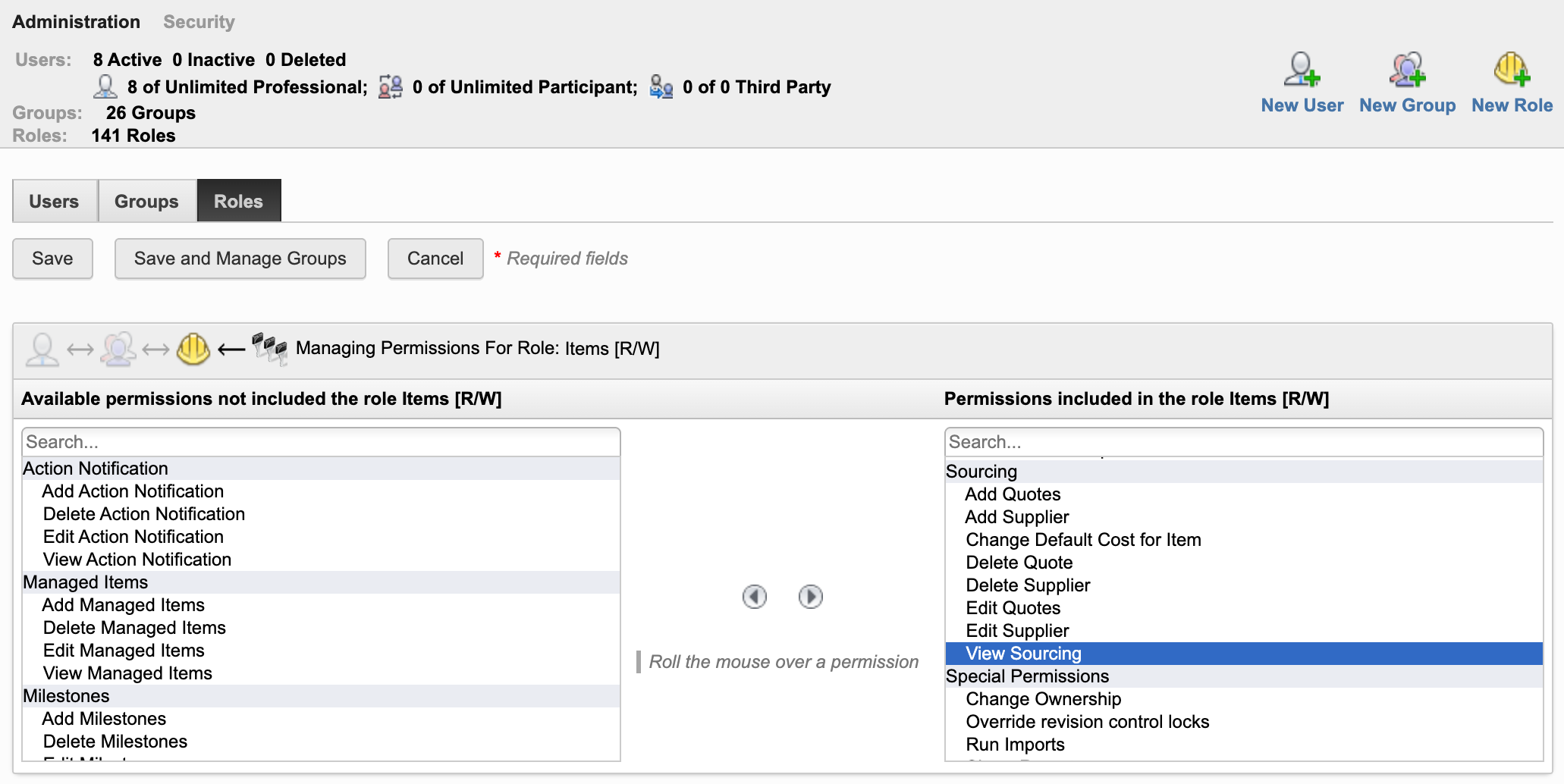
Setup Step #3 : Configure EBOM Workspace
Extend Item Details Tab
Add a new section Manufacturing BOM with the following fields to this workspace:
| Field Name | Field ID | Data Type | Options | Visibility | Editable |
|---|---|---|---|---|---|
| DMS_ID | DMS_ID | Single Line Text | Length : 20 | Never | False |
| End Item | END_ITEM | Check Box | Always | True | |
| Matches MBOM | MATCHES_MBOM | Check Box | Always | True | |
| Ignore in MBOM | IGNORE_IN_MBOM | Check Box | Always | True | |
| Process Code | PROCESS_CODE | Single Line Text | Length : 10 | Always | True |
| Last MBOM User | LAST_MBOM_USER | Single Line Text | Length : 100 | Always | True |
| Last MBOM Sync | LAST_MBOM_SYNC | Date | Always | True | |
| MBOM | MBOM | Pick List | To MBOM workspace ([WS] Items), Single Selection | Always | True |
If your EBOM workspace does not contain the Make/Buy property yet, add this one also to the Item Details. You can add this field to any section. Tenants created in 2024 or later have such a field already as shown below. Note that this field's ID is referenced by the applicaiton settings as described further down below, so it is recommend (but not required) to reuse the one shown below for ease of administration.
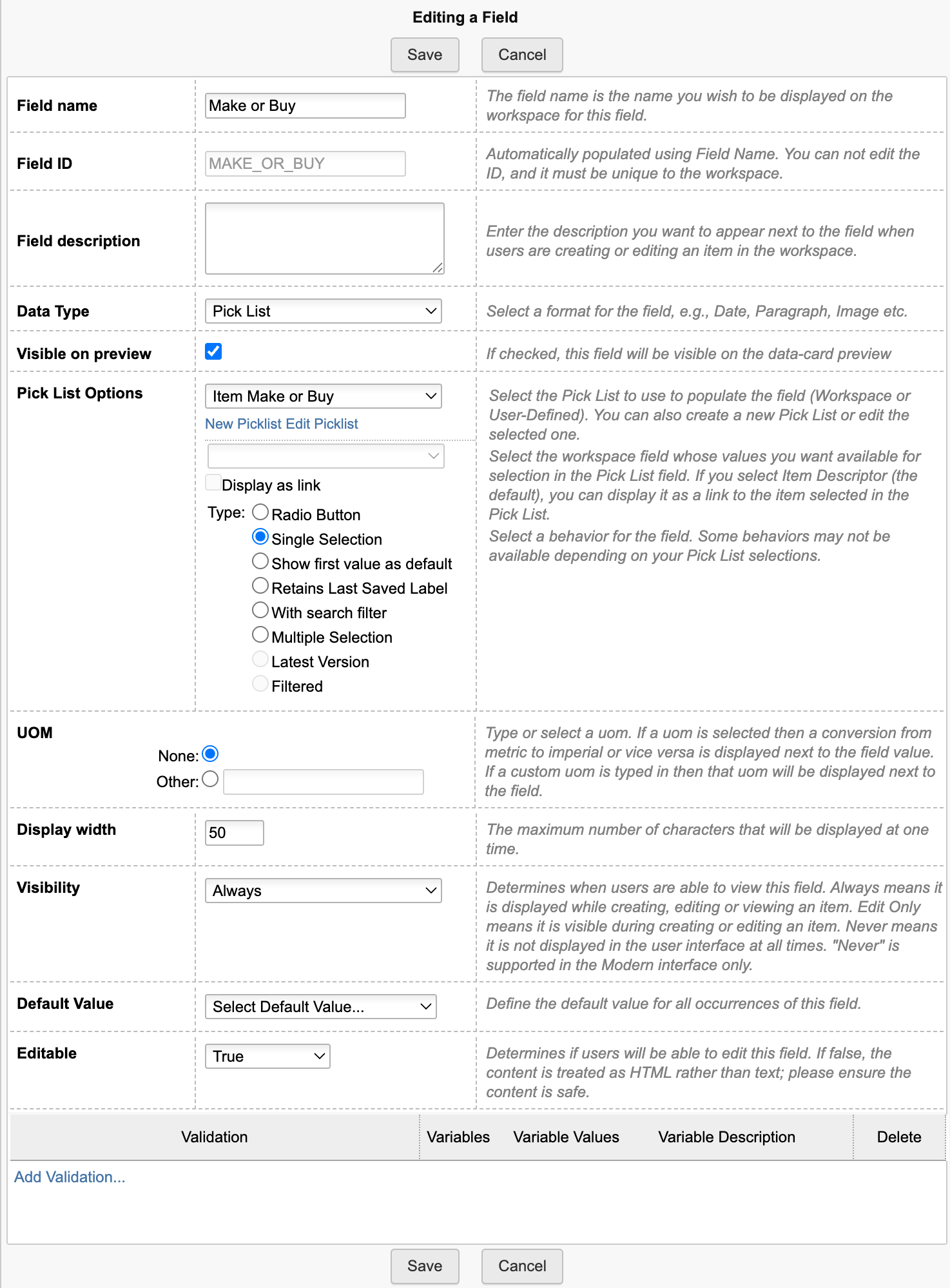
Finally, add a computed field 'MBOM_EDITOR' with the following formula. Make sure to provide the right workspace ID (...?wsId=57...). It has to match the EBOM workspace ID (57 matches the standard Items workspace).
CASE WHEN (DMS_ID is null) THEN 'Item ID is not set'WHEN (END_ITEM = true) THEN 'Not available for end items'WHEN (MATCHES_MBOM = true) THEN 'EBOM matches MBOM'ELSE '<a style="color: #0a131c;border: 1px solid #bec8d2;border-radius:3px;text-align:center;text-decoration:none !important;line-height:32px;white-space:nowrap;padding:4px 20px;width:140px;font-weight:600;" target="_blank" href ="LOCATIONmbom?wsId=57&dmsId='||DMS_ID||'">Edit MBOM</a>'END
While the layout does not matter, it is recommended to combine the given fields in a Matrix within this section as shown below.
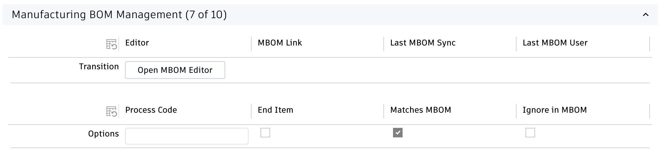
New BOM View
Add a new BOM view MBOM Transition to the EBOM workspace. Add all the fields that were created in the step before to this view - plus a few others. You may also add any further column as you like. The sequence of columns does not matter. You can also use a different name for this BOM view - just make sure to update the setting accordingly.
| Field | Source (default tenant) | Required |
|---|---|---|
| Descriptor | System Fields | Yes |
| Revision | System Fields | Yes |
| Quantity | BOM Fields | Yes |
| Number | Item Details Fields / Basic | Yes |
| Type | Item Details Fields / Basic | No, is used to set the right type icon |
| PDM Category | Item Details Fields / PDM Data | No, is used to set the right type icon color |
| Make or Buy | Item Details Fields / Procurement | Only if displayOptions.bomColumnMakeBuy is enabled |
| MBOM | Item Details Fields / Manufacturing BOM | Yes |
| Process Code | Item Details Fields / Manufacturing BOM | Only if displayOptions.bomColumnCode is enabled |
| End Iem | Item Details Fields / Manufacturing BOM | Yes |
| Matches MBOM | Item Details Fields / Manufacturing BOM | Yes |
| Ignore in MBOM | Item Details Fields / Manufacturing BOM | Yes |
Setup Step #4 : Configure MBOM Workspace
The following steps must be performed in the workspace managing the MBOM - which can be the same one as in the previous steps or a second one (2 workspaces setup).
Adjust Item Details
Make sure that the NUMBER field of your MBOM workspace is editable (always or at item creation). Next, add the following fields to the MBOM workspace:
| Type | Label | ID | Visibility | Editability | Details |
|---|---|---|---|---|---|
| Picklist Single Select | EBOM | EBOM | visible | editable | Link to EBOM workspace |
| Checkbox | Is Process | IS_PROCESS | hidden | editable | |
| Single Line Text | EBOM Root Item | EBOM_ROOT_ITEM | hidden | editable | Length : 200 |
Additional Item Details (2 workspaces setup only)
If you will use two different workspaces for the EBOM and MBOM, you also have to add the following fields to the MBOM workspace:
- If it does not exist yet, add Single Line Text field 'DMS_ID' (DMS_ID, length 20, not editable, hidden)
- Add date field 'Last MBOM Sync' (LAST_MBOM_SYNC, visible, editable)
- Add Single Line Text field 'Process Code' (PROCESS_CODE, length 10, visible, editable)
- Add computed field 'MBOM_EDITOR' with the following formula. Make sure to provide the right workspace ID (...?wsId=57...). It has to match the MBOM workspace ID (57 matches the standard Items workspace).
CASE WHEN (DMS_ID is null) THEN 'Item ID is not set'WHEN (END_ITEM = true) THEN 'Not available for end items'ELSE '<a style="color: #0a131c;border: 1px solid #bec8d2;border-radius:3px;text-align:center;text-decoration:none !important;line-height:32px;white-space:nowrap;padding:4px 20px;width:140px;font-weight:600;" target="_blank" href ="LOCATIONmbom?wsId=57&dmsId='||DMS_ID||'">Edit MBOM</a>'END
These fields once again can be managed in a dedicated section and matrix when using two distinct workspaces:
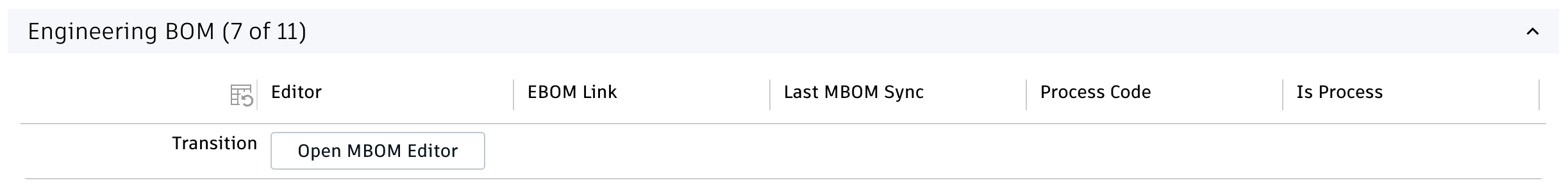
Add new fields to Bill of Materials tab
Add the following fields to the Bill of Materials tab in your MBOM workspace. These fields will be required for the next step and added to the given BOM view.
| Type | Label | ID | Options | Visibility | Editable |
|---|---|---|---|---|---|
| Picklist Single Select | BOM Make or Buy | BOM_MAKE_OR_BUY | Use picklist 'Item Make or Buy' that was created at the very beginning | Always | True |
| Checkbox | Is EBOM Item | IS_EBOM_ITEM | Never | True |
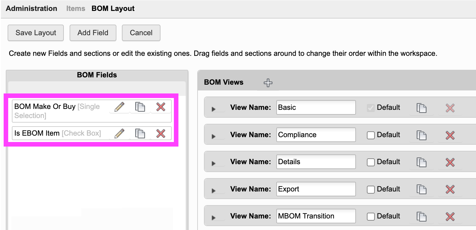
BOM View
If you use the same workspace for both the EBOM and MBOM, add the following fields to the existing BOM view MBOM Transition:
| Field | Source | Required |
|---|---|---|
| EBOM | Item Details / Manufacturing BOM | Yes |
| Is Process | Item Details / Manufacturing BOM | Yes |
| EBOM Root Item | Item Details / Manufacturing BOM | Yes |
| Is EBOM Item | BOM Fields | Yes |
| BOM Make or Buy | BOM Fields | Yes |
If you will use two different workspaces, you have to add a new BOM view MBOM Transition with at least the following columnns:
| Field | Source | Required |
|---|---|---|
| Descriptor | System Fields | Yes |
| Revision | System Fields | Yes |
| Quantity | BOM Fields | Yes |
| Process Code | Item Details / Manufacturing BOM | Yes |
| EBOM | Item Details / Manufacturing BOM | Yes |
| Is Process | Item Details / Manufacturing BOM | Yes |
| EBOM Root Item | Item Details / Manufacturing BOM | Yes |
| Is EBOM Item | BOM Fields | Yes |
| BOM Make or Buy | BOM Fields | Yes |
Workspace Relationships (2 workspaces setup only)
Make sure that the MBOM workspace allows for BOM connections to the EBOM workspace:
Setup Step #5 : Scripts
For both the EBOM and MBOM workspace, the system has to store the dmsID for new records in field DMS_ID. Add the following script code to the creation event of both workspaces. If your tenant is based on the template released in April 2023, this field exists in your tenant and will be set by script already.
item.DMS_ID = dmsID;
Setup Step #6 : Defaults for new MBOM Items
MBOM Root Item
If the MBOM Editor is launched from an EBOM item which does not have a MBOM item defined yet, the editor will automatically create the MBOM root node and link both items. While doing so, the utility can copy defined properties from the source EBOM item to the MBOM item. The list of properties to copy is defined in settings mbomRootFieldsToCopy. This list of fields also is used when creating the MBOM sub assemblies in the editor. With the default settings enabled, only the fields TITLE and DESCRIPTION will be copied from the EBOM item to the matching MBOM item. Update this list if needed.
If the MBOM workspace has required fields defined, make sure that these fields are mapped to a valid source field. The MBOM root creation will fail otherwise and prevent the MBOM editor from launching properly.
MBOM Processes / Nodes
When users add processes to the MBOM, these new items may receive default values for defined fields (for example the type field). You can define such default values for new processes in setting newProcessDefaults. You can provide an array of all the fields to be populated with default values. The default settings file provides a placeholder example to explain the required structure. As shown in the example below, each default value requires the field's ID (TYPE) and given value property.
Application Configuration Settings
The following application specific settings can be adjusted in your custom settings file in exports.applications.mbom
In order to change any of these settings, copy the standard value from settings.js to your custom settings file in folder settings.
The default configuration matches the standard tenant template, uses the Items workspace only and matches the setup instructions above. If other field names, BOM views or workspaces should be used, you can achieve this by updating the settings listed below. As always, after changing the given settings file, a restart of your server is required.
EBOM Workspace
| Setting | Default Value | Description |
|---|---|---|
| workspaceEBOM.workspaceId | null | ID of workspace containing EBOM items. If set to null, value of export.common.workspaceIds.items will be used. |
| workspaceEBOM.bomView | 'MBOM Transition' | BOM view for EBOM expansion |
| workspaceEBOM.depth | 10 | EBOM levels to expand |
| workspaceEBOM.fieldIDs | {..} | List of item details tab fieldIDs to use in EBOM workspace |
MBOM Workspace
| Setting | Default Value | Description |
|---|---|---|
| workspaceMBOM.workspaceId | null | ID of workspace containing EBOM items. If set to null, value of export.common.workspaceIds.items will be used. |
| workspaceMBOM.bomView | 'MBOM Transition' | BOM view for MBOM expansion |
| workspaceMBOM.depth | 10 | MBOM levels to expand |
| workspaceMBOM.fieldIDs | {..} | List of item details tab fieldIDs to use in MBOM workspace |
| workspaceMBOM.bomFieldIDs | {..} | List of BOM tab fieldIDs to use in MBOM workspace |
MBOM Root Node Creation
| Setting | Default Value | Description |
|---|---|---|
| mbomRoot.fieldsToCopy | [..] | Defines fields to copy from root ebom item to root mbom item when new MBOM item gets craeted |
| mbomRoot.defaultValues | [..] | Defines list of default values for the new MBOM item being created |
Additional Settings
| Setting | Default Value | Description |
|---|---|---|
| newProcessDefaults | [..] | Defines default property values when creating new MBOM processes items / nodes |
| matchNewProcessNumber | true | When set to true, new MBOM proces items / nodes will reuse the root MBOM item's number together with the defined code as suffix |
| switchEBOMRevision | 'no' | When set to 'latest' or 'working', the editor will switch the base EBOM to the given EBOM's revision automatically at startup |
| picklistIDMakeOrBuy | 'CUSTOM_LOOKUP_ITEM_MAKE_OR_BUY' | ID of picklist containing Make / Buy options |
| labelInsertNode | 'Add Process' | Sets text to display next to the input for creating of new MBOM process items / nodes |
| pinEBOMItemsInMBOM | true | When set to true, the revision pin will be set for EBOM items being added to the MBOM |
| suffixMBOMNumber | '-M' | The suffix to add to the root MBOM item when the given item get created at MBOM Editor startup |
| predefinedSearchesInAddItems | [..] | Defines predefined filters in 'Add Items' panel on left hand side |
| sectionsInCreateForm | [ 'Basic', 'Technical Details' ] | Defines sections being displayed when creating new items in 'Add Items' paneö |
Display Options
| Setting | Default Value | Description |
|---|---|---|
| displayOptions.bomColumnNumber | true | Enables display of BOM find number column |
| displayOptions.bomColumnCode | true | Enables display of code column in the BOM trees |
| displayOptions.bomColumnMakeBuy | true | Enables display of Make / Buy column and controls |
| displayOptions.tabDisassemble | true | Enables tab 'Disassemble Mode' |
| displayOptions.tabOperations | true | Enables tab 'Operations & Suppliers' |
| displayOptions.excelExport | true | Enables export of MBOM items with Buy flag |
Common Configuration Settings
This utility uses the following common configuration settings
| Setting | Default Value | Description |
|---|---|---|
| exports.common.workspaceIds.items | 57 | ID of workspace Items being used as default for EBOM and MBOM workspace if the given workspaces IDs are not defined in the application specific settings |
Viewer Configuration Settings
This application enables configuration of features within the viewer by using parameter viewerFeatures. By using the settings listed below, you can control the availability of given icons in the viewer toolbar. These feaatures can be enabled and disabled for all users in general by setting the value to true or false. As an alternative, you can also provide an array of groups to grant access. Only users being assigned to any of the defined groups will then get access to the feature. Examples:
- viewerFeatures.measure = true > Measurements will be possible for all users
- viewerFeatures.measure = false > Measurements will not be possible for any user
- viewerFeatures.measure = ['Employees','Service Technician'] > The measurements button will only be shown for users in group Employees or Service Technician
| Setting | Icon | Description |
|---|---|---|
| contextMenu | Enables / disables the viewer standard context menu | |
| cube | Enables the cube / home button in top right corner of the viewer. Parameter 'views' can be used instead, providing dedicated buttons. | |
| orbit | Enables the orbit controls | |
| firstPerson | Enables first person view | |
| camera | Enables camera interactions | |
| measure | Enables the measurements toolbar | |
| section | Enables sectioning | |
| explodedView | Enables exploded views | |
| modelBrowser | Enables browsing the model hierarchy within the viewer | |
| properties | Enables access to the selected component's properties stored in the viewable file | |
| settings | Enables viewer settings | |
| fullscreen | Enables fullscreen toggle | |
| markup | Enables markup toolbar | |
| hide | Enables easy hiding of (selected) components | |
| ghosting | Enables toggling ghosting mode on/off | |
| highlight | Enables toggling highlight of selected models on/off | |
| single | Enables fitting of first instance to viewer | |
| fitToView | Enables reframing all visible items | |
| reset | Enables to deselect all, invoking viewerClickReset() | |
| views | Enables toolbar to quickly access main views | |
| selectFile | Enables switching between multiple viewable files for the given item (3D and 2D) |
The viewer can further be adjusted by using common settings that apply to all applications. All settings listed below can be changed in exports.common.viewer:
| Setting | Icon | Description |
|---|---|---|
| numberProperties | ['Part Number', 'Name', 'label', 'Artikelnummer', 'Bauteilnummer'] | List of item properties to be considered as number properties. The first property found will be used to match components in the viewable file to items in the PLM system (based on field defined in exports.common.workspaces.items.fieldIdNumber). |
| suffixPrimaryFile | ['.iam.dwf', '.iam.dwfx', '.ipt.dwf', '.ipt.dwfx'] | Defines sequence of preferred file suffixes to identify the primary viewable file if multiple viewable files are available for the given item. |
| extensionsIncluded | ['dwf', 'dwfx', 'nwd', 'ipt', 'stp', 'step', 'sldprt', 'pdf'] | List of file formats to be considered as viewable formats. |
| extensionsExcluded | [] | List of file formats not to be considered as viewable formats. |
| splitPartNumberBy | ' v' | If the number property in the viewer does not match the item number exactly, its value can be split by the given string to remove suffixes like version information. |
| splitPartNumberIndexes | [0] | If the number property in the viewer does not match the item number exactly, its value can be split and selected indizes can be contatenated. This property defines the split elements to concatenate. |
| splitPartNumberSpacer | '' | If the number property in the viewer does not match the item number exactly, its value can be split and selected indizes can be contatenated. The concatenated strings will be separated by this spacer. |
| backgroundColor | [255, 255, 255, 255, 255, 255] | Default background color of viewer instances if not specified by theme. |
| cacheInstances | false | Enables / disables caching of instances data in the viewer for improved performance. Enabling this cache will incread initial load time. |
| antiAliasing | true | Enables / disables anti-aliasing in the viewer. |
| ambientShadows | true | Enables / disables ambient shadows in the viewer. |
| groundReflection | true | Enables / disables ground reflections in the viewer. |
| groundShadow | true | Enables / disables ground shadow in the viewer. |
| lightPreset | 4 | Changes the default light preset of the viewer. |
| conversionAttempts | 10 | If viewables need to be converted, this number of attempts will be made to check for the conversion completion status. |
| conversionDelay | 3000 | If viewables need to be converted, this delay (in milliseconds) will be applied before starting to check for the conversion completion status. |
Launching the MBOM Editor in context
The editor cannot only be launched from an item, but also from context records which refer to both an Engineering BOM and a Manufacturing BOM. For example, you may want to launch the MBOM Editor from a Product, a Project or an Asset to transform its EBOM to a MBOM. This can be accomplished by adding the link for starting the MBOM Editor to the Item Details of the given workspace as well.
The given context workspace only requires the two fields to link the EBOM and MBOM. It does not require any adjustments to the BOM tab and its permissions as the editor will determine the base EBOM and from there use the Items workspace configuration settings. Note that the editor can only be launched in context if either the EBOM or MBOM is selected for the context object (Product, Project, Asset). If the EBOM item is found, but the matching MBOM item does not exist yet, the latter one will be created and linked to the context object automatically.
Assuming your context workspace (Products, Projects or Asset) uses the same fields defined for linkig the E/MBOM items as your Items workspace (EBOM + MBOM), simply use the folloowing computed field formlua for adding an Action field which launches the MBOM Editor (this time, pass the workspace ID of your context object, for example 95 for Products).
'<a style="color: #0a131c;border: 1px solid #bec8d2;border-radius:3px;text-align:center;text-decoration:none !important;line-height:32px;white-space:nowrap;padding:4px 20px;width:140px;font-weight:600;" target="_blank" href ="LOCATIONmbom?wsId=95&dmsId='||DMS_ID||'">Edit MBOM</a>'
However, if your context object uses other fields for the E/MBOM links than defined by the settings fieldIdEBOM and fieldIdMBOM, you will instead have to also pass these given fieldIds using additional parameters in the URL. See the following example including the parameters contextFieldIdEBOM=ENGINEEERING_BOM and contextFieldIdMBOM=MANUFACTURING_BOM :
'<a style="color: #0a131c;border: 1px solid #bec8d2;border-radius:3px;text-align:center;text-decoration:none !important;line-height:32px;white-space:nowrap;padding:4px 20px;width:140px;font-weight:600;" target="_blank" href ="LOCATIONmbom?wsId=95&dmsId='||DMS_ID||'&contextFieldIdEBOM=ENGINEERING_BOM&contextFieldIdMBOM=MANUFACTURING_BOM">Edit MBOM</a>'
Support for multiple sites
With the standard configuration steps above, there will be only one MBOM per EBOM. However, the setup can be changed to support multiple MBOMs, for example to have site specific MBOMs. To achieve this setup, the fields that were created formerly must be cloned for each site.
By following the steps below, the existing fields will be kept in order to have a 'standard' base MBOM. In addition, further fields will be added to capture the MBOM for 'Site 1' and 'Site 2'.
Each site requires a unique id that you can define yourself. This id must be used to name the new fields and it will be passed to the MBOM editor to define the site context. In this setup, 'G' will be used for the generic MBOM while '1' and '2' are used for the site specific MBOMs. Keep in mind that these suffixes will get appended to all site specific MBOM item numbers.
- In the EBOM workspace, adjust the layout of the MBOM transition section as shown below, by adding a second matrixes to hold all the site specific contents:
- Create new fields for the 2nd matrix. You have to create the same fields multiple times, one for each site. Always append the site index (G, 1, 2) to each field while keeping the field base name identical. Here are the fields for the Generic MBOM:
- MBOM_G: Linking picklist to MBOM item workspace (single selection, editable)
- LAST_MBOM_SYNC_G: Date field (editable)
- LAST_MBOM_USER_G: Single Line Text (length 100, editable)
- MBOM_EDITOR_G: Computed field with the following formula. Note that the URL contains a parameter to identify the site (G)
CASE WHEN (DMS_ID is null) THEN 'Item ID is not set'WHEN (END_ITEM = true) THEN 'Not available for end items'WHEN (MATCHES_MBOM = true) THEN 'EBOM matches MBOM'ELSE '<a style="color: #0a131c;border: 1px solid #bec8d2;border-radius:3px;text-align:center;text-decoration:none !important;line-height:32px;white-space:nowrap;padding:4px 20px;width:140px;font-weight:600;" target="_blank" href ="LOCATIONmbom?wsId=57&dmsId='||DMS_ID||'&options=site:G">Edit MBOM</a>'END
Repeat these steps for site 1 and 2 accordingly.
- If you followed the setup instructions for a single MBOM before, remove the following fields as they are no longer required:
- MBOM
- Last MBOM Sync
- Last MBOM User
- MBOM Editor
- In the end, the MBOM section should look like this:
Note that you can choose other field labels of course. This documentation only reuses the field ID to better describe the setup process.
- In the EBOM workspace's BOM view MBOM Transition add the following columns:
- MBOM_G
- MBOM_1
- MBOM_2
Note that your bom view might be named differently. Check for the name in use by validating setting mbom.bomViewNameEBOM in settings.js
Users are now able to open the editor for a specific site. Each site will receive a specific MBOM with a dedicated part number (the site suffix gets appended at the end):
MBOM Editor Change Log
| 8. April 2026 | Configuration Settings Update | It is now possible to define default values for the root MBOM node being created automatically by using the setting mbomRoot.defaultValues . The formerly used settings typeValue got replaced by this new setting and is no longer taken into account. |
| 6. March 2026 | Documentation Update | Fixed an error in the documentation preventing the MBOM Editor from working properly (color indicator in MBOM failed to identify consumption of matching EBOM items) |
| 12. January 2026 | Changed Settings | For easier administration, the settings of the mbom application got changed. Please review your settings file when upgrading to this new version. |
| Enhancement | The styling and layout of the editor have been changed to allow for new features and a better user experience. The MBOM now is always displayed to the left, no matter which other tab / edit mode is selected. | |
| New Feature | New options were added to the settings file to enable / disable new features like the Make/Buy column and the management of manufacturing instructions | |
| New Feature | If the given display option is enabled the position numbers are displayed both the EBOM and the MBOM (enabled per default) | |
| New Feature | If the given display option is enabled, users can now manage manufacturing instructions per item, including file attachment and viewer screenshots with markup (enabled per default) | |
| New Feature | If the given display option is enabled, users can now select the Make/Buy flag in the MBOM, based on the EBOM's default value (enabled per default) | |
| New Feature | To support the Make/Buy decision, the sourcing information is displayed for the selected item in the new tab Instructions | |
| New Feature | A new button in the main toolbar will export all items with the Buy flag to an Excel file (if not disabled with the given option) | |
| New Feature | Quantities can now be set for the sub nodes / processes in the MBOM | |
| Enhancement | The items' revisions now are displayed as separate column | |
| Enhancement | The comparison of total quantities of the selected item in both the EBOM and MBOM got improved | |
| New Setting | The setting switchEBOMRevision now can be used to automatically switch to the given item's latest working or released revision | |
| Documentation | Setup instructions were updated to reflect the new features and settings | |
| September 27, 2024 | Bugfix | The setting newDefaults only got applied to new processes, not the MBOM root item. This has been fixed. |
| September 26, 2024 | Bugfix | If pick list fields were defined in fieldsToCopy, the MBOM editor failed to load. Now the given field values get copied properly. |
| September 11, 2024 | New Feature | Add new button to EBOM actions enabling to set given assembly as end item |
| New Feature | A new button in EBOM Alignment can be used to hide the viewer | |
| New Feature | In tab EBOM Alignment, users can now hide components in the viewer | |
| 11. June 2023 | Enhancement | Enabled configuration of viewer features using the settings file and parameterviewerFeatures |
| 13. Dezember 2023 | Bugfix | When clicking button Add All, only visible items were taken into account. Subcomponents of assemblies that were collapsed were not added to the MBOM. |
| 21. September 2023 | New Feature | When items in MBOM get selected, the adjacent items get highlighted in the viewer as well (red and green) |
| 3. August 2023 | Bugfix | Switch to latest version automatically (i.e. if editor is opened from Rev A, the editor will locate matching working version first and then open data for this working version item) |
| 21. July 2023 | New Feature | Insert EBOM as is to MBOM (supported by checkbox Matches MBOM) |
| New Feature | Insert EBOM as MBOM node (this creates the matching MBOM for the given EBOM in the editor and inserts the node) | |
| 7. July 2023 | New Feature | Support of multiple Manufacturing BOMs per item |
| Enhancements | Better alignment with new default client: ready-to-use settings and replacement of 'operations' with 'processes' reflected by a dedicated item type | |
| Bugfix | Items that are added from outside the EBOM will no longer be taken into account in item matching / coloring | |
| Bugfix | When items get added to a location twice, its quantity will be increased accordingly; there will be no second node in the BOM any |
Features
- Creates a new Service BOM when needed during editor startup
- Reuses EBOM items with dedicated property as Spare Parts
- Manages Service Kits to define parts which can only/also be ordered as part of kits
- Users can change item sequence using drag & drop
- When pressing the [Shift] during drag & drop, items will get copied and not moved
- Viewer can be used to review Service BOM item selection
- Items can be selected in viewer to be highlighted in BOM
- Users can add non-EBOM items to the Service BOM using Bookmarks, Searches and further tabs
- The SBOM Editor can be launched from a Product of the Product Portfolio Management
- Details panel can be toggled to explore details of selected items
Important: This editor is not compliant with the Service Portal yet. The portal will not use the Service BOM created by this editor.
Configuration Changes for Items Workspace
Extend Picklist Item Types
This editor uses the existing Items workspace to store the Service BOM. It uses the field Type in item details to distinguish between the various item types used by the Service BOM. The picklist of this property Type must be adjusted to inlcude the required options as shown below. If your tenant does not contain the picklist Item Types and the matching field in Item Details, you must add this list and field - or use the configuration settings described further below to use another list and field that might exist in your tenant already.
Open the Picklist Manager from within Administration | System Configuration and locate the list Item Types. Click the Edit command to the very right to open this list's editor.
Add the following types to this list and click Save:
- Service BOM
- Service Kit
- Service Offering
- Service Operation
- Spare Parts List
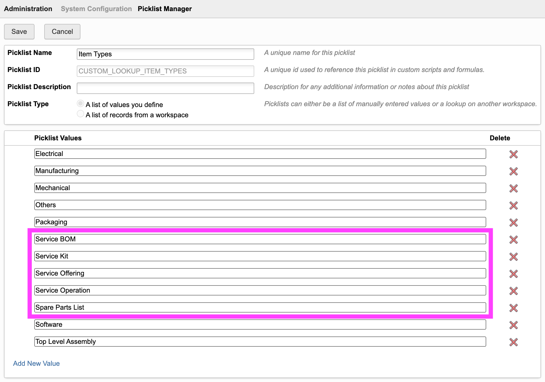
With this change, you should now be able to select from these types when creating an item:
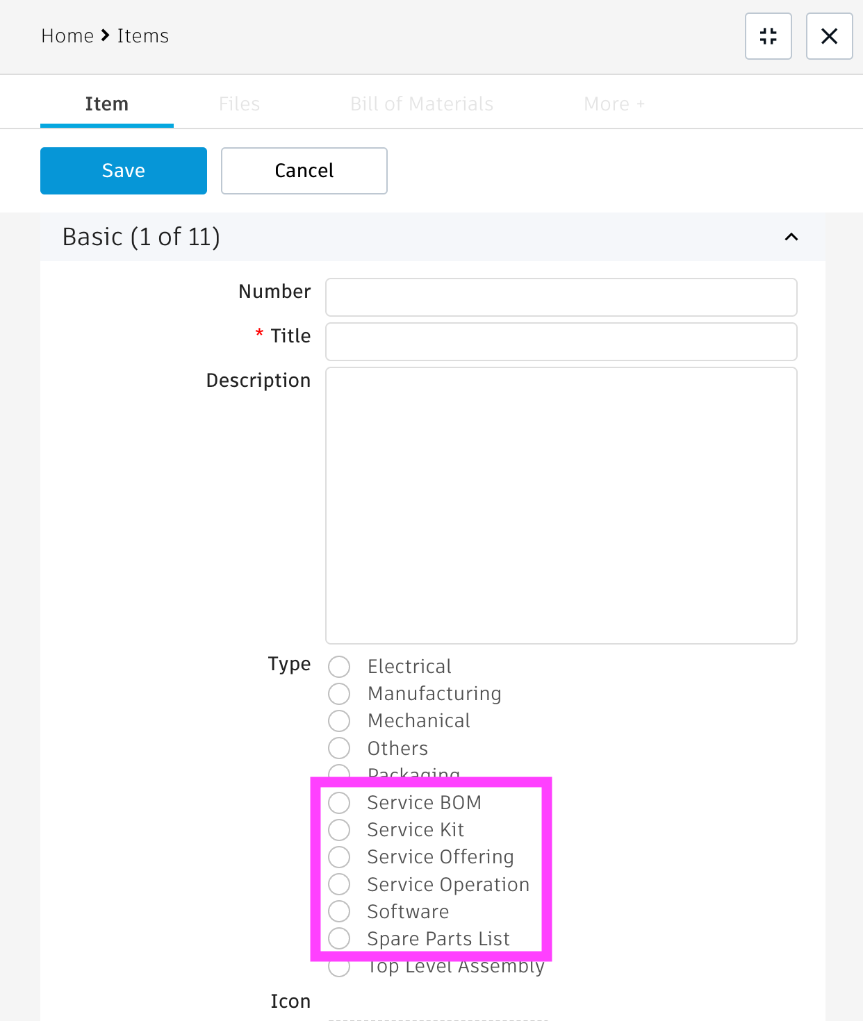
Adjust Icon Field Formula (Optional)
To let users esily recognize Service BOM items, it is recommended (but not required) to adjust the computed field formula of the field Icon. Add when-conditions for the new types as shown below. Note that the new IDs used below (100-103) will not match your tenant. You will have to determine the IDs for your tenant specifically. To do so, you can print the value of TYPE in another temporary computed field to determine the right values for the new possible property values.
'<div style="width:48px;line-height:18px;height:18px;border-radius:3px;text-align:center;font-weight:600;font-size:10px;color:#FFF;background-color:'||CASEWHEN (TYPE = 1) THEN '#AD4E7E">SW</div>'WHEN (TYPE = 2) THEN '#8c714d">PKG</div>'WHEN (TYPE = 3) THEN '#299BA6">E/E</div>'WHEN (TYPE = 4) THEN '#A68932">OTH</div>'WHEN (TYPE = 5) THEN '#8256BF">MCAD</div>'WHEN (TYPE = 34) THEN '#6a9728">MBOM</div>'WHEN (TYPE = 67) THEN '#222222">TLA</div>'WHEN (TYPE = 101) THEN '#0696D7">KIT</div>'WHEN (TYPE = 103) THEN '#BFA34D">SBOM</div>'WHEN (TYPE = 100) THEN '#BFA34D">sOFFER</div>'WHEN (TYPE = 102) THEN '#BFA34D">sOPER</div>'WHEN (TYPE = 104) THEN '#BFA34D">SPL</div>'ELSE '#c2cdd3">?</div>'END
BOM View
The Service BOM editor requires a BOM view in workspace Items with at least the following columns:
- Descriptor
- Number
- Title
- Type
- Quantity
- Spare / Wear Part (This field provided by standard tenants can be used by engineering to predefine spare parts within the EBOM)
You may add the column Icon as well as this helps users to better understand the structure, but this is not required.
Your tenant may contain the view Service with these columns already, which will be used automatically. If not, please create this view or provide the name of an existing BOM view to reuse in the configuration settings (see given chapter further below).
Schema Changes for Products Workspace
Techincally, the editor can be opened from any context record that has a reference to both an Engineering BOM and a Service BOM. The following steps explain how to configure the editor for the Products workspace, but you can also adapt this setup to your workspace of preference.
The Products requires two fields for the editor to work: One field containing the EBOM reference and another one referring to the matching Service BOM. Please create these two fields as shown in the screenshot below and place them anywhere in the details page. Please note that the standard Products workspace already contains the given field for the Engineering BOM so you can clone it to create the matching field for the Service BOM easily.
Both fields must be of type
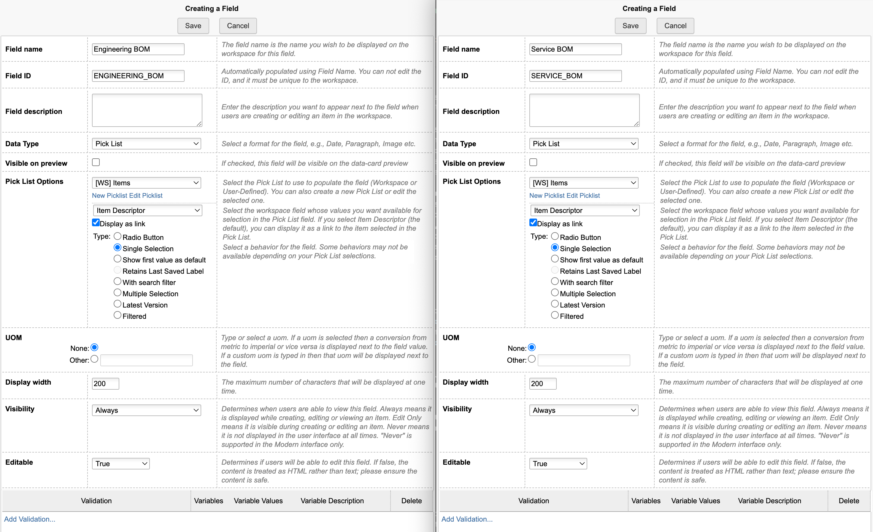
Place these field anywhere in the details page of your Products workspace:
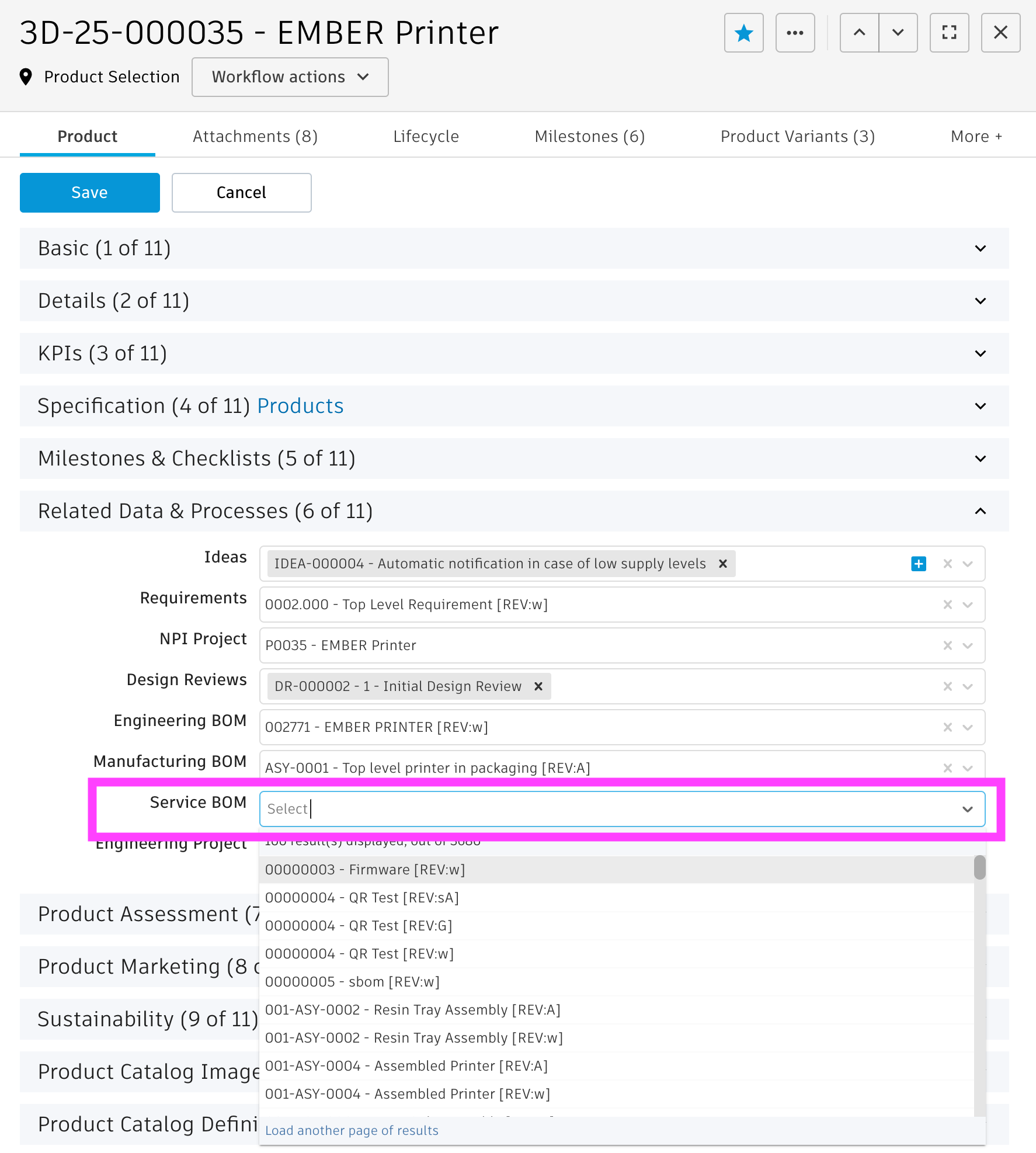
Starting the application
Opening the application from a Product in PLM can be achieved in two ways:
- By using the framework's Chrome Extension that adds a given button in the Product's header toolbar.
This option is recommneded and does not require any further configuration. - If the Chrome Extension cannot be used, a computed field must be added to the details page to render the given button for launching the application.
See the required configuration steps below only if this option is needed.
Adding application button to Product details
If the field DMS_ID does not exist yet in your Products workspace, add it as Single Line Text (length 20, not visible) to the item details tab
.
Let this field be set upon creation using the following script code in your product creation script or the initial workflow transition:
item.DMS_ID = dmsID;
Pro Tipp: If you have existing Products in your tenant already and want to store the dmsID in this new field for the existing products as well, you can use the Data Manager . This utility provides a matching batch processing action and can be used immediately without any further setup.
Open Data Manager in new windowIn order to launch the Service BOM editor from a Product, a computed field can be used to render the matching link as button:
CASE WHEN (ENGINEERING_BOM is not null) THEN '<a style="margin-right:10px;border: 1px solid #bec8d2;border-radius:3px;color: #0a131c;font-weight:600;line-height:32px;padding:4px 20px;text-align:center;text-decoration:none !important;white-space:nowrap;" target="_blank" href ="LOCATIONsbom?wsId=95&dmsId='||DMS_ID||'">Edit Service BOM</a>'ELSE ''END
You can either create a new field for this button specifically or add it to the standard Actions field provided with the standard Product workspace. In the latter case, append the formula to the existing field using the pipe symbol twice:
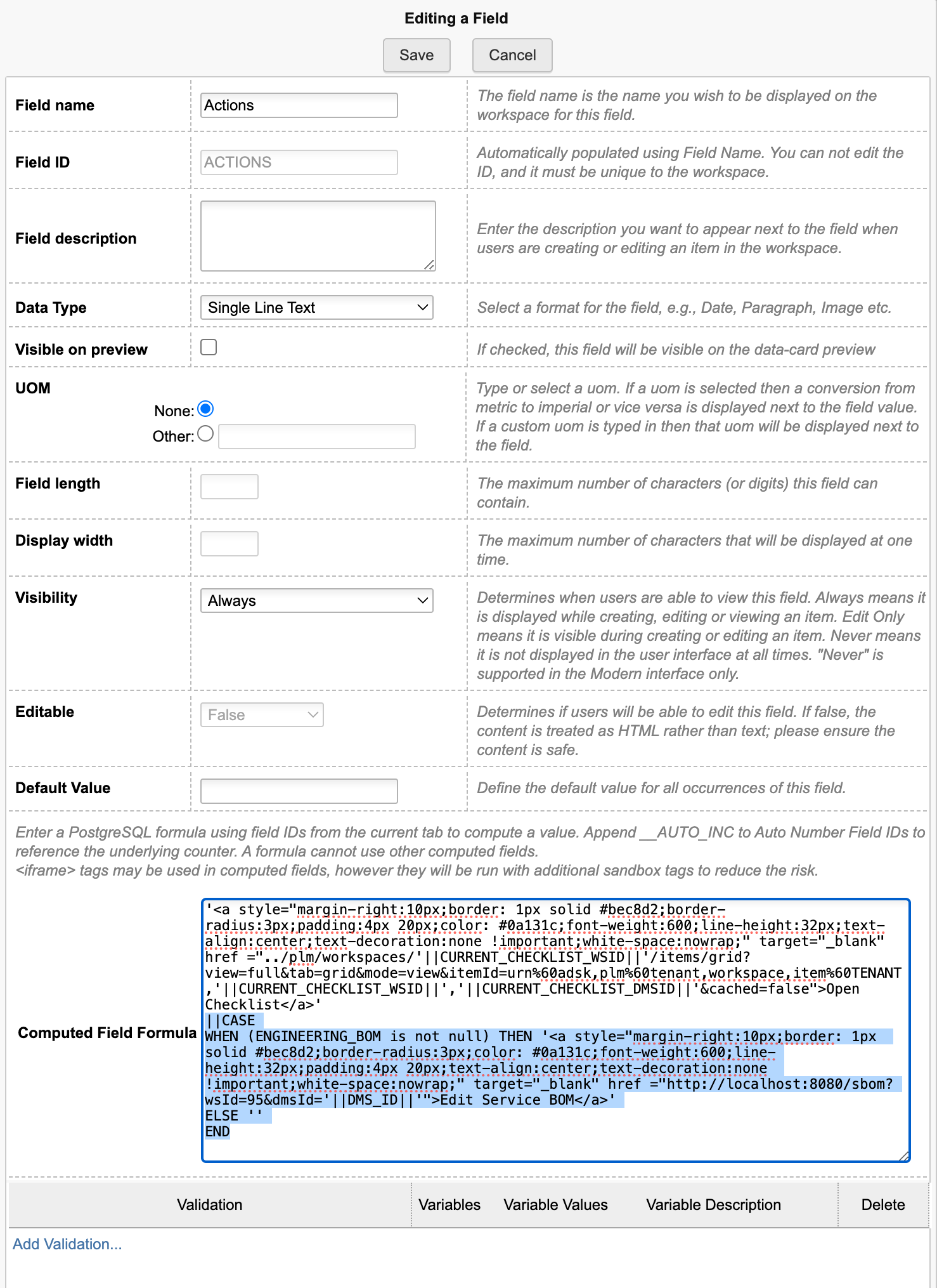
Now you're ready to use the editor with default settings
Application Configuration Settings
The following application specific settings can be adjusted in your custom settings file in exports.applications.sbom
In order to change any of these settings, copy the standard value from settings.js to your custom settings file in folder settings.
If you followed the setup instructions above, there is no need to change any of these settings. Anyway, you may want to change labels, fieldIds or BOM views using the settings listed below. However, you can also even apply the editor's capabilities to other type of BOMs if needed. Using the bomTypes property, it is not only possible to adjust the tabs being displayed in the editor, but also the matching filters and type values to use.
| Setting | Default Value | Description |
|---|---|---|
| appTitle | 'Service BOM Editor' | Sets the applications title shown in the main toolbar. This overrides the setting defined in /routes/landing.js to provide more flexibility. |
| sourceBOM.fieldId | 'ENGINEERING_BOM' | The fieldID of the context record containing the Source / Engineering BOM. This given BOM will be displayed as base BOM of the editor and its viewable will be used for the viewer. |
| sourceBOM.bomViewName | 'Service' | The BOM of workspace Items with the required fields to display the base BOM tree |
| sourceBOM.headerLabel | 'Engineering BOM', | The label to display above the base BOM |
| targetBOM.fieldId | 'SERVICE_BOM' | The fieldID of the context record to use in order to retrieve the matching Service BOM root node |
| targetBOM.bomViewName | 'Service' | The BOM of workspace Items with the required fields to display the Sourcing BOM |
| targetBOM.itemTypeValue | 'Service BOM' | The value of field Type to set for the Target BOM root node if it will be created by the Service BOM Editor |
| targetBOM.filterLabelIn | 'Show items contained in Service BOM only' | Provide a name for the filter option above the BOM tree enabling users to filter for items contained in the target BOM (optional) |
| targetBOM.filterLabelEx | 'Hide items contained in Service BOM' | Provide a name for the filter option above the BOM tree enabling users to filter for items NOT contained in the target BOM (optional) |
| targetBOM.defaults | {..} | This property defines default values for the creation of the new target BOM root node which will be created automatically if it does not exist yet. The Number, Title and Description can be copied from the context product or the related BOM item and be extended by a prefix and/or suffix. Leave the properties copyFrom blank to disable this capability. |
| itemsFieldIds.number | 'NUMBER', | The Item's workspace fieldID for the item Number |
| itemsFieldIds.title | 'TITLE', | The Item's workspace fieldID for the item Title. This field must be included in the BOM view defined by targetBOM.bomViewName. |
| itemsFieldIds.description | 'DESCRIPTION', | The Item's workspace fieldID for the item Description |
| itemsFieldIds.type | 'TYPE', | The Item's workspace fieldID to use for determining the type of items. This field must be included in the BOM view defined by targetBOM.bomViewName. |
| picklistIdItemType | 'CUSTOM_LOOKUP_ITEM_TYPES' | The Item's workspace picklistID related to the type field |
| itemHighlight.fieldId | 'SPARE_WEAR_PART' | If source BOM entries should be highlighted in a dedicated BOM column, provide the fieldID which determines if an item should be highlighted |
| itemHighlight.fieldValues | ['spare', 'spare part', 'yes', 'x', 'y', 'true'] | If source BOM entries should be highlighted in a dedicated BOM column, provide the values of the defined field to recognize items to highlight |
| itemHighlight.bomColumnTitle | 'Spare/Wear' | Sets the highlight BOM column's title |
| itemHighlight.filterLabelIn | 'Show Recommended Spare Parts Only' | Provide a name for the filter option above the BOM tree enabling users to filter for items being highlighted in the source BOM (optional) |
| itemHighlight.filterLabelEx | 'Hide Recommended Spare Parts' | Provide a name for the filter option above the BOM tree enabling users to filter for items NOT being highlighted in the source BOM (optional) |
| enableBOMPin | false | When set to true, all new BOM relationships will be created with the BOM revision pin enabled |
The standard configuration of this utility enables users to define the Service BOM consisting of
- Spare Parts List
- Maintenance Kits
- and Service Offerings
This is achieved by providing the matching list of bomTypes in the settings file. These settings can be adjusted to change / remove existing tabs, but also to adopt the capabilities of this editor to other use cases. Below, you can find the default settings being used by the 3 standnard tabs as reference.
| Setting | Description | Values for Spare Parts List | Values for Maintenance Kits | Values for Service Offerings |
|---|---|---|---|---|
| mode | Enables management of a 2-level BOM, 1-level BOM or just a flat list | 'list' | '1-level-bom' | '2-levels-bom' |
| tabLabel | The name of the tab being displayed in the UI's panel on the right hand side of the screen, | 'Spare Parts' | 'Maintenance Kits' | 'Services' |
| icon | The icon to use in the BOM display to indicated usage of given items to this type of BOM | 'icon-details' | 'icon-product' | 'icon-service' |
| color | The background color to use for the icons defined before | colors.red | colors.green | colors.yellow |
| buttonLabels | Array of labels for the various create buttons on the various levels of this tab | ['Add all recommended'] | ['New Kit'] | ['New Service', 'New Operation'] |
| bomItemTypes | The matching value of the Type property to identify the right Service BOM items for the given tab | ['Spare Parts List'] | ['Service Kit'] | ['Service Offering', 'Service Operation'] |
| filterLabelIn | If a label is provided, users can filter the BOM for items contained in the matching panel using the label in the drop down | 'Show Spare Parts List Items Only' | 'Show Maintenance Kit Items Only' | 'Show Services Items Only' |
| filterLabelEx | If a label is provided, users can filter the BOM for items NOT contained in the matching panel using the label in the drop down | 'Hide Spare Parts List Items' | 'Hide Maintenance Items' | 'Hide Services Items' |
| hideQuantity | When set to true, the quantity input will not be displayed in the given tab and all BOM quantities will be set to 1.0 | true | - | - |
Common Configuration Settings
This utility also uses the following common configuration settings
| Setting | Default Value | Description |
|---|---|---|
| exports.common.workspaceIds.items | 57 | ID of workspace Items |
Viewer Configuration Settings
This application enables configuration of features within the viewer by using parameter viewerFeatures. By using the settings listed below, you can control the availability of given icons in the viewer toolbar. These feaatures can be enabled and disabled for all users in general by setting the value to true or false. As an alternative, you can also provide an array of groups to grant access. Only users being assigned to any of the defined groups will then get access to the feature. Examples:
- viewerFeatures.measure = true > Measurements will be possible for all users
- viewerFeatures.measure = false > Measurements will not be possible for any user
- viewerFeatures.measure = ['Employees','Service Technician'] > The measurements button will only be shown for users in group Employees or Service Technician
| Setting | Icon | Description |
|---|---|---|
| contextMenu | Enables / disables the viewer standard context menu | |
| cube | Enables the cube / home button in top right corner of the viewer. Parameter 'views' can be used instead, providing dedicated buttons. | |
| orbit | Enables the orbit controls | |
| firstPerson | Enables first person view | |
| camera | Enables camera interactions | |
| measure | Enables the measurements toolbar | |
| section | Enables sectioning | |
| explodedView | Enables exploded views | |
| modelBrowser | Enables browsing the model hierarchy within the viewer | |
| properties | Enables access to the selected component's properties stored in the viewable file | |
| settings | Enables viewer settings | |
| fullscreen | Enables fullscreen toggle | |
| markup | Enables markup toolbar | |
| hide | Enables easy hiding of (selected) components | |
| ghosting | Enables toggling ghosting mode on/off | |
| highlight | Enables toggling highlight of selected models on/off | |
| single | Enables fitting of first instance to viewer | |
| fitToView | Enables reframing all visible items | |
| reset | Enables to deselect all, invoking viewerClickReset() | |
| views | Enables toolbar to quickly access main views | |
| selectFile | Enables switching between multiple viewable files for the given item (3D and 2D) |
The viewer can further be adjusted by using common settings that apply to all applications. All settings listed below can be changed in exports.common.viewer:
| Setting | Icon | Description |
|---|---|---|
| numberProperties | ['Part Number', 'Name', 'label', 'Artikelnummer', 'Bauteilnummer'] | List of item properties to be considered as number properties. The first property found will be used to match components in the viewable file to items in the PLM system (based on field defined in exports.common.workspaces.items.fieldIdNumber). |
| suffixPrimaryFile | ['.iam.dwf', '.iam.dwfx', '.ipt.dwf', '.ipt.dwfx'] | Defines sequence of preferred file suffixes to identify the primary viewable file if multiple viewable files are available for the given item. |
| extensionsIncluded | ['dwf', 'dwfx', 'nwd', 'ipt', 'stp', 'step', 'sldprt', 'pdf'] | List of file formats to be considered as viewable formats. |
| extensionsExcluded | [] | List of file formats not to be considered as viewable formats. |
| splitPartNumberBy | ' v' | If the number property in the viewer does not match the item number exactly, its value can be split by the given string to remove suffixes like version information. |
| splitPartNumberIndexes | [0] | If the number property in the viewer does not match the item number exactly, its value can be split and selected indizes can be contatenated. This property defines the split elements to concatenate. |
| splitPartNumberSpacer | '' | If the number property in the viewer does not match the item number exactly, its value can be split and selected indizes can be contatenated. The concatenated strings will be separated by this spacer. |
| backgroundColor | [255, 255, 255, 255, 255, 255] | Default background color of viewer instances if not specified by theme. |
| cacheInstances | false | Enables / disables caching of instances data in the viewer for improved performance. Enabling this cache will incread initial load time. |
| antiAliasing | true | Enables / disables anti-aliasing in the viewer. |
| ambientShadows | true | Enables / disables ambient shadows in the viewer. |
| groundReflection | true | Enables / disables ground reflections in the viewer. |
| groundShadow | true | Enables / disables ground shadow in the viewer. |
| lightPreset | 4 | Changes the default light preset of the viewer. |
| conversionAttempts | 10 | If viewables need to be converted, this number of attempts will be made to check for the conversion completion status. |
| conversionDelay | 3000 | If viewables need to be converted, this delay (in milliseconds) will be applied before starting to check for the conversion completion status. |
Service BOM Editor Change Log
| 12. January 2026 | Documentation | Documentation has been updated to match the new custom settings and environments management |
| 6. August 2025 | Enhancement | Rework of the configuration settings to enable adoption of this utility for other BOM types |
| Change | The Spare Part List items will no longer be connected to the Service BOM root item directly. Instead, the editor will create and use a dedicated node in the Service BOM (identified by given type) to manage all generic Spare Parts. | |
| 26. May 2025 | Initial Release | Addition of the first version to the UX Extensions |
Features
- Manage variant items that inherit master data from the base item
- 3D viewer helps to identify the right items
- Keep multiple BOM structures in sync
- Manage multiple variants at the same time or focus a single variant only
- Dynamically define the properties that define a variant
New Workspace Item Variants
A new workspace is required to manage the item variants and their BOMs. These item variants in this new workspace will refer to the given base item to allow for data reuse by using derived fields, but will also have additional fields that define a variant (i.e. color, material, dimeions, serial #, ...). Customers can choose any properties they like for these variant specific properties, the application will adjust accordingly.
Create new workspace
Use the Workspace Manager to create new workspace Item Variants as revision controlled workspace. 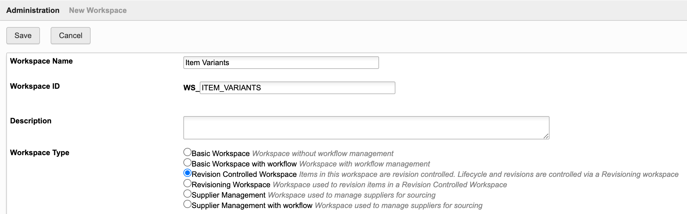
Set Item Details of new workspace
Create the following 3 sections in tab Item Details :
- Header
- Variant Definition
- Base Item Details
Add the following fields to section Header:
| Field name | Field ID | Data Type | Visible on preview | Field Length / Options | Visibility | Editable |
|---|---|---|---|---|---|---|
| Base Item | BASE_ITEM | Picklist to [WS] Items | true | Single Selection | Always | True |
| Title | TITLE | Single Line Text | true | 200 | Always | True |
| BASE_ROOT_DMS_ID | BASE_ROOT_DMS_ID | Single Line Text | false | 20 | Never | True |
Add a field that derives the Number of the selected Base Item in section Base Item Details:
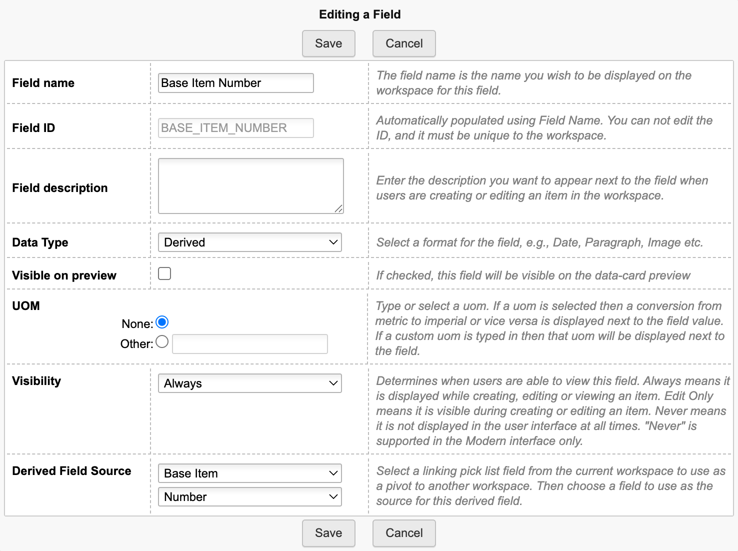
Additionally, add all further data that should be derived from the Base Item in this section. You can add any derived field you want in order to copy data from the given Base Item. This may for example include Type and Description. However, Image fields are not supported.
Finally, add all the fields that will be used to define a variant (for example Colour and Material) in section Variant Definition. This section may include any type of field, including pick lists (with single selection) but not Images. The fields of this section later on will be used to automatically generate a title for the new variant items being created. See the follwoing properties in file settings.js as described in a later step.
variants.newItemVariantsTitle.fieldsToConcatenate : ['COLOUR', 'MATERIAL']variants.newItemVariantsTitle.separator : ' / '
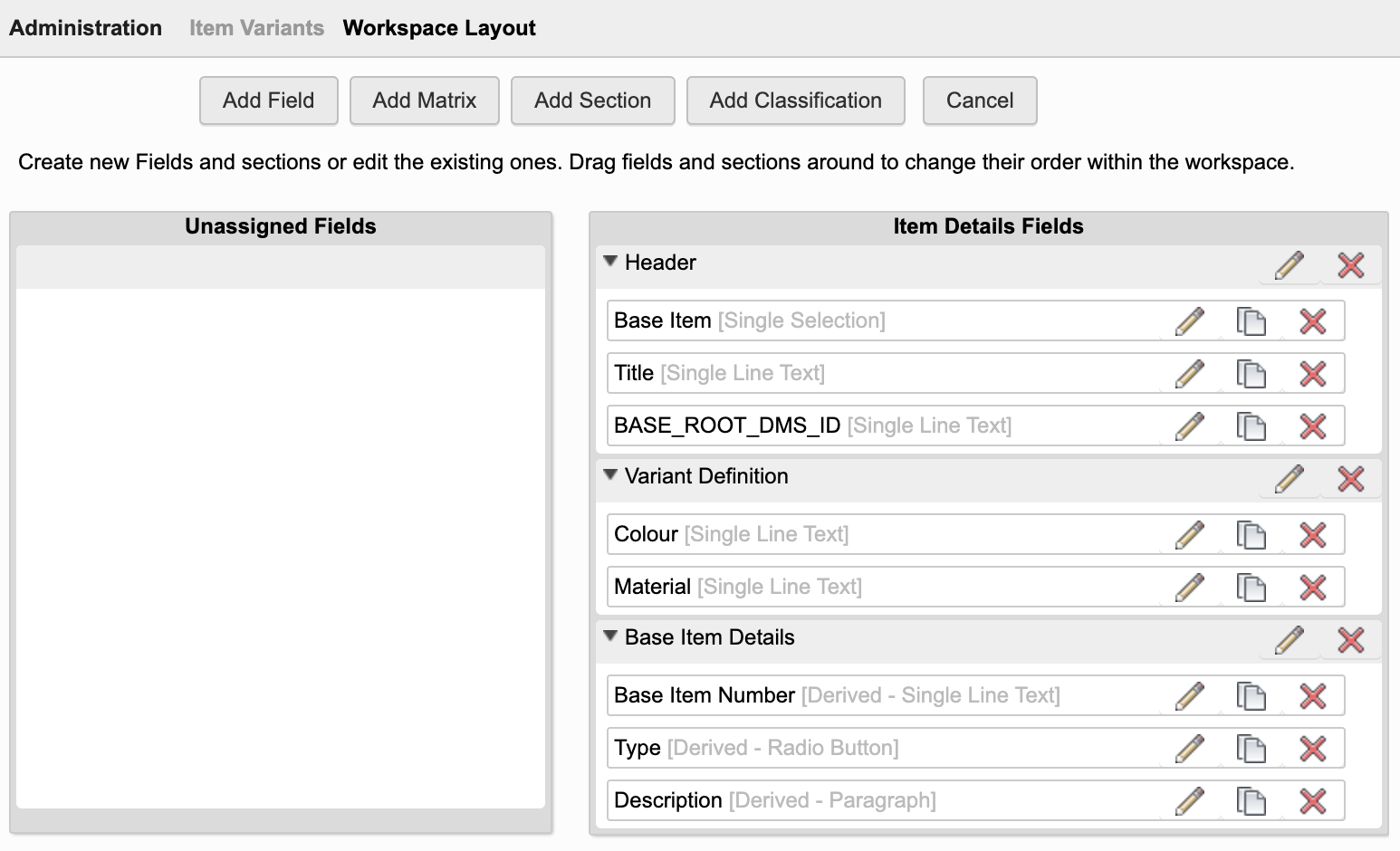
Descriptor
Set the workspace's Descriptor to display the fields Base Item Numberand Title:
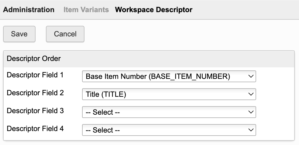
Bill of Materials tab
Add a new BOM field BASE_BOM_PATH of type Single Line Text. This field should have a length of 1000 characters and not be visible, but editable.
Clone the Default View to create a new BOM view with name Variant Manager. This view should contain the following columns only (sequence does not matter):
| Field ID | Field Source | Remarks |
|---|---|---|
| Descriptor | System Fields | Included per default |
| Quantity | BOM Fields | Included per default |
| Base Item Number | Item Details Fields | Custom field created in previous step |
| BASE_BOM_PATH | BOM Fields | Custom field just created before |
| BASE_ROOT_DMS_ID | Item Details Fields | Custom field created in previous step |
Add all the Item Details fields of section Variant Definition to this table as they are used to define the varians (for example Colour and Material).
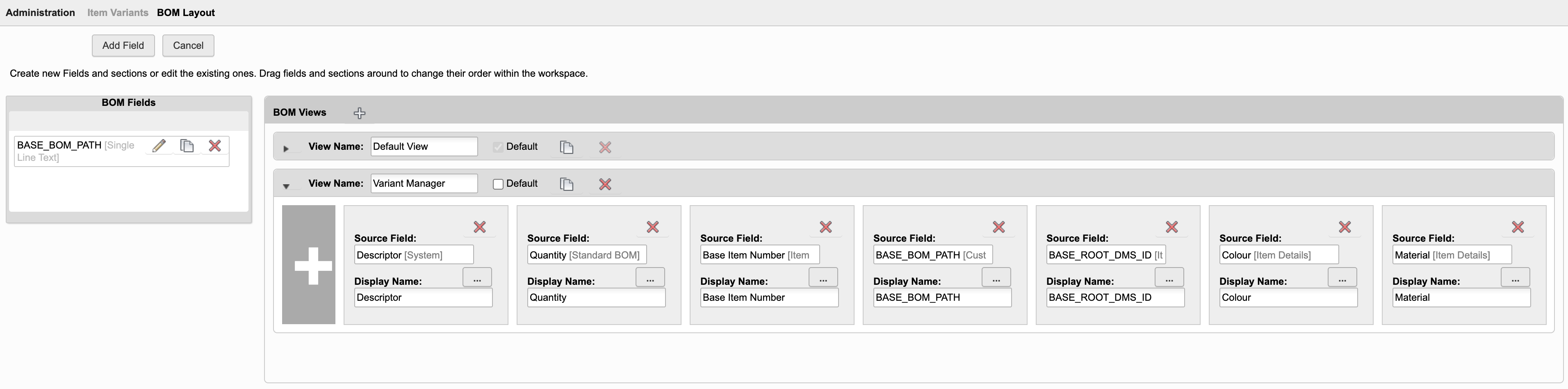
Workspace Relationships
Enable required Workspace Relationships in the BOM and Relationships tabs:
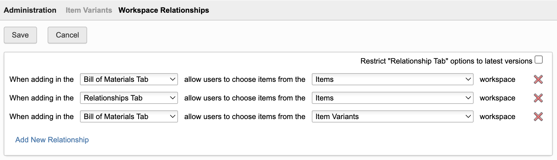
Tab Names (Optional Step)
Adjust the names and sequence of tabs as shown below.
| Tab | Recommended Label |
|---|---|
| Item Details | Item Variant |
| Attachments | Files |
| Bill of Materials | Bill of Materials |
| Where Used | Where Used |
| Sourcing | Sourcing |
| Workflow | Related Change Processes |
| Relationships | Relationships |
| Change Log | Change Log |
Access Permissions
Create a role for the new workspace enabling creation of new records, BOM management and attachments. Access to the Sourcing tab is not required, but can be granted to allow for cost comparison across variants. Make sure that users also can access the working versions of records.
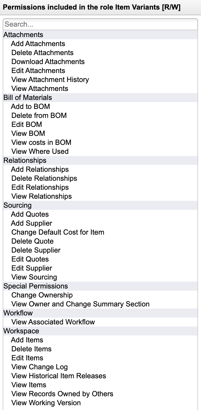
Settings Update
The Workspace ID of this new workspace Item Variants must be provided in the server settings file. Locate the property variants.workspaceItemVariants.workspaceId and update the given value.
Adjust Change Management Workspaces
As Item Variants are revision controlled, add this new workspace to the Workspace Relationships in tab Managed Items of the following workspaces:
- Problem Reports
- Change Requests
- Change Orders
Items BOM View
The application requires a BOM view in workspace Items with at least the following columns for the base BOM expansion:
| Field | Field Source |
|---|---|
| Descriptor | System Fields |
| Quantity | BOM Fields |
| Number | Item Details Fields |
With the default configuration, the application will reuse the default BOM view used by other applications as well: Tree Navigator. If you prefer to use another BOM view or cannot use this default BOM view, you can also specify another BOM view name in the server setting
variants.workspaceItems.bomViewName
While this BOM view may also contain further columns without impacting the Variant Manager, the performance of the editor will be better the less columns are contained in this BOM view.
Starting the application
Users should be able to launch the Variant Manager from any item of workspace Items in PLM. This can be achieved easily by installing the Chrome Extension that is provided with this UX package and which can be used in Mircrosoft Edge and Goolge Chrome. Click the following button to learn about the installation of this extension. Once this Chrome Extension is installed, the given button will automatically be displayed in the header of each item and you can proceed with the next chapter.
Setup Chrome ExtensionIf you cannot / don't want to use this extension, you will instead have to add a computed field in the Item Details page which renders the given button. This also requires a field to store the dmsID in a hidden field.
Add hidden field to store dmsID
If not present yet, add a new
Tenants created mid 2023 or later have this field and script already.
item.DMS_ID = dmsID;
Add Computed Field with Action Button
Enable access to the Variants Manager by adding a new computed field to your Items workspace. Use the following formula for the new field:
'<a style="border: 1px solid #bec8d2;border-radius:3px;color: #0a131c;font-weight:600;line-height:32px;padding:4px 20px;text-align:center;text-decoration:none !important;white-space:nowrap;" target="_blank" href ="LOCATIONvariants?wsId=57&dmsId='||DMS_ID||'">Variant Manager</a>'
Optional: Integrate With Products Workspace
Instead of starting the Variant Manager from an item, you can also start it from a product. In this case, the product's Engineering BOM will be used as a basis and all variants will be stored within the product's list of variants (the grid tab). Perform the following steps to enable this integrated feature.
Adjust Grid tab of workspace Products
Add a column BOM to the grid based on a pick list for workspace Item Variants:
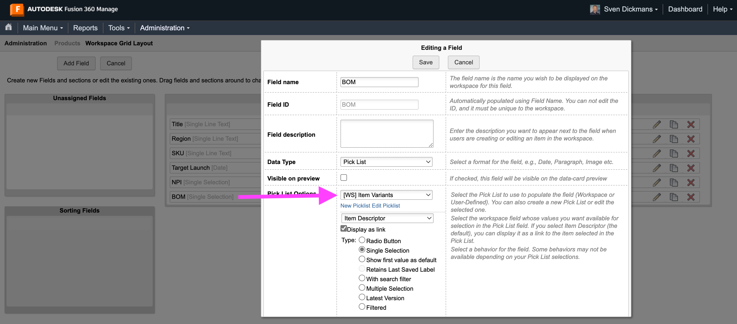
Add Button
Users should be able to launch the Variant Manager from any product. This can be achieved easily by installing the Chrome Extension that is provided with this UX package and which can be used in Mircrosoft Edge and Goolge Chrome. Once this Chrome Extension is installed, the given button will automatically be displayed in the header of each product. The default configuration of this extension will use the field ENGINEERING_BOM of workspace Products to locate the matching item. If this field does not exist, you will have to update the given button's configuration in settings.js. Click the following button to learn about the installation and configuration of this extension.
Setup and configure Chrome ExtensionIf you cannot / don't want to use this extension, you will instead have to add a computed field in the Item Details page of Products which renders the given button. This also requires a field to store the dmsID in a hidden field.
Add hidden field to store dmsID
If not present yet, add a new
Let this field be set automatically at item creation by script as shown below.
item.DMS_ID = dmsID;
Add Computed Field with Action Button
Enable access to the Variants Manager app by using the computed field formula shown below. Note that this formula must be adjusted if your product's EBOM is not stored in field ENGINEERING_BOM. You also must replace the workspace ID of 95 with the id of your Products workspace.
'<a style="border: 1px solid #bec8d2;border-radius:3px;color: #0a131c;font-weight:600;line-height:32px;padding:4px 20px;text-align:center;text-decoration:none !important;white-space:nowrap;" target="_blank" href ="LOCATIONvariants?wsId=95&dmsId='||DMS_ID||'&options=fieldIdEBOM:ENGINEERING_BOM">Variant Manager</a>'
Application Configuration Settings
The following application specific settings can be adjusted in your custom settings file in exports.applications.variants
In order to change any of these settings, copy the standard value from settings.js to your custom settings file in folder settings.
If you require usage of different field names, table names etc, please have a look at the settings.js file and locate section variants, listing all possible configurable settings as shown below. You will have to change the first option's value ( workspaceItemVariants.workspaceId ) which must contain the workspace ID of your newly created workspaceItem Variants. You can retrieve this ID from your browser's URL when navigating to this workspace using the workspaces menu. The remaining options are aligned with default tenants and the preceeding instructions already.
| Setting | Default Value | Description |
|---|---|---|
| workspaceItems.bomViewName | null | BOM view of workspace Items which contains the required (and minimal) fields, if different from the common setting exports.common.workspaces.items.defaultBOMView |
| workspaceItemVariants.workspaceId | - | Workspace ID of your new Item Variants workspace |
| workspaceItemVariants.sectionLabel | 'Variant Definition' | Name of section in the Item Variants workspace which contians all the fields that define a variant. This section will drive the columns of the Variant Manager display. |
| workspaceItemVariants.fieldIds.baseItem | 'BASE_ITEM' | Field ID of the Item Variants workspace that links to the matching base item (single select picklist) |
| workspaceItemVariants.fieldIds.title | 'TITLE' | Field ID of the Item Variants workspace that stores the title being generated automaticall |
| workspaceItemVariants.fieldIds.rootDMSId | 'BASE_ROOT_DMS_ID' | Field ID of your Item Variants workspace that stores the dmsId of the matching root item |
| workspaceItemVariants.bomFieldIdBaseBOMPath | 'BASE_BOM_PATH' | BOM Field ID of your Item Variants workspace that stores the matching item's BOM path |
| workspaceItemVariants.bomViewName | 'Variant Manager' | BOM view of workspace Item Variants which contains the required fields |
| newItemVariantsTitle.fieldsToConcatenate | ['COLOUR', 'MATERIAL'] | If this array is not empty, the given fields' values will be concatenated to generate the title of newly created item variants |
| newItemVariantsTitle.separator | [' / '] | If the previous array is not empty, this string will be used to separate the given fields' values in the title |
| maxBOMLevels | 4 | This integer defines the maximum BOM levels to be expanded in the Variant Manager |
Common Configuration Settings
This utility uses the following common configuration settings
| Setting | Default Value | Description |
|---|---|---|
| exports.common.workspaces.items.defaultBOMView | 'Tree Navigator' | The default BOM view to be used for the BOM display. |
| exports.common.workspaces.items.fieldIdNumber | 'NUMBER' | ID of field containing the item number in workspace Items |
Viewer Configuration Settings
This application enables configuration of features within the viewer by using parameter viewerFeatures. By using the settings listed below, you can control the availability of given icons in the viewer toolbar. These feaatures can be enabled and disabled for all users in general by setting the value to true or false. As an alternative, you can also provide an array of groups to grant access. Only users being assigned to any of the defined groups will then get access to the feature. Examples:
- viewerFeatures.measure = true > Measurements will be possible for all users
- viewerFeatures.measure = false > Measurements will not be possible for any user
- viewerFeatures.measure = ['Employees','Service Technician'] > The measurements button will only be shown for users in group Employees or Service Technician
| Setting | Icon | Description |
|---|---|---|
| contextMenu | Enables / disables the viewer standard context menu | |
| cube | Enables the cube / home button in top right corner of the viewer. Parameter 'views' can be used instead, providing dedicated buttons. | |
| orbit | Enables the orbit controls | |
| firstPerson | Enables first person view | |
| camera | Enables camera interactions | |
| measure | Enables the measurements toolbar | |
| section | Enables sectioning | |
| explodedView | Enables exploded views | |
| modelBrowser | Enables browsing the model hierarchy within the viewer | |
| properties | Enables access to the selected component's properties stored in the viewable file | |
| settings | Enables viewer settings | |
| fullscreen | Enables fullscreen toggle | |
| markup | Enables markup toolbar | |
| hide | Enables easy hiding of (selected) components | |
| ghosting | Enables toggling ghosting mode on/off | |
| highlight | Enables toggling highlight of selected models on/off | |
| single | Enables fitting of first instance to viewer | |
| fitToView | Enables reframing all visible items | |
| reset | Enables to deselect all, invoking viewerClickReset() | |
| views | Enables toolbar to quickly access main views | |
| selectFile | Enables switching between multiple viewable files for the given item (3D and 2D) |
The viewer can further be adjusted by using common settings that apply to all applications. All settings listed below can be changed in exports.common.viewer:
| Setting | Icon | Description |
|---|---|---|
| numberProperties | ['Part Number', 'Name', 'label', 'Artikelnummer', 'Bauteilnummer'] | List of item properties to be considered as number properties. The first property found will be used to match components in the viewable file to items in the PLM system (based on field defined in exports.common.workspaces.items.fieldIdNumber). |
| suffixPrimaryFile | ['.iam.dwf', '.iam.dwfx', '.ipt.dwf', '.ipt.dwfx'] | Defines sequence of preferred file suffixes to identify the primary viewable file if multiple viewable files are available for the given item. |
| extensionsIncluded | ['dwf', 'dwfx', 'nwd', 'ipt', 'stp', 'step', 'sldprt', 'pdf'] | List of file formats to be considered as viewable formats. |
| extensionsExcluded | [] | List of file formats not to be considered as viewable formats. |
| splitPartNumberBy | ' v' | If the number property in the viewer does not match the item number exactly, its value can be split by the given string to remove suffixes like version information. |
| splitPartNumberIndexes | [0] | If the number property in the viewer does not match the item number exactly, its value can be split and selected indizes can be contatenated. This property defines the split elements to concatenate. |
| splitPartNumberSpacer | '' | If the number property in the viewer does not match the item number exactly, its value can be split and selected indizes can be contatenated. The concatenated strings will be separated by this spacer. |
| backgroundColor | [255, 255, 255, 255, 255, 255] | Default background color of viewer instances if not specified by theme. |
| cacheInstances | false | Enables / disables caching of instances data in the viewer for improved performance. Enabling this cache will incread initial load time. |
| antiAliasing | true | Enables / disables anti-aliasing in the viewer. |
| ambientShadows | true | Enables / disables ambient shadows in the viewer. |
| groundReflection | true | Enables / disables ground reflections in the viewer. |
| groundShadow | true | Enables / disables ground shadow in the viewer. |
| lightPreset | 4 | Changes the default light preset of the viewer. |
| conversionAttempts | 10 | If viewables need to be converted, this number of attempts will be made to check for the conversion completion status. |
| conversionDelay | 3000 | If viewables need to be converted, this delay (in milliseconds) will be applied before starting to check for the conversion completion status. |
Variant Manager Change Log
| 25. January 2026 | Quality | Save logic has been reworked to make the application more robust and reliable |
| 12. January 2026 | Documentation | Documentation has been updated to match the new custom settings and environments management |
| 28. October 2025 | Quality | The quality and reliability of this solutions has been further enhanced. Review the updated setup instructions and the new settings.js properties before using this new update. |
| 7. May 2025 | Quality | The quality and reliability of this solutions has been enhanced. Please follow the revised setup instructions before using this solution. |
| 28. June 2024 | Viewer Features Configuration | Additional settings were added to settings.js enabling to select the features available in the viewer |
| 7. July 2023 | Initial Release | This is the very first version of this application |
Features
- Can be launched in context of an Asset
- Reuse the Engineering BOM and viewable for a best in class user experience
- Configurable framework allows reuse of this editor for multiple use cases
- The editor is preconfigured for the management of Serial Numbers as reference
- Automatic sync of instance data with the Engineering BOM ensures data integrity
Preconfigured use case of Serial Numbers
This solution's preconfiguration requires installation of the new template Assets Lifecycle & Projects which is available for testing only (as of December 2025). This template includes the required workspaces of Assets and Serial Numbers Lists. As the configuration settings of this application eanble use of custom workspaces and fields, similar workspaces also can be created manually. With the preconfiguration, the solution can immediately manage the Serial Numbers List of an Asset within the list's grid. The solution also requires the Chrome Extensions of this package to be installed on the clients, providing access to the editor in context of an Asset.
Learn about the Chrome ExtensionsIf both prerequisites are met, users can launch the given editor using the button in the item header as shown below. This button will be displayed in the header of each Asset and use the related Serial Numbers List referenced in the item details page.
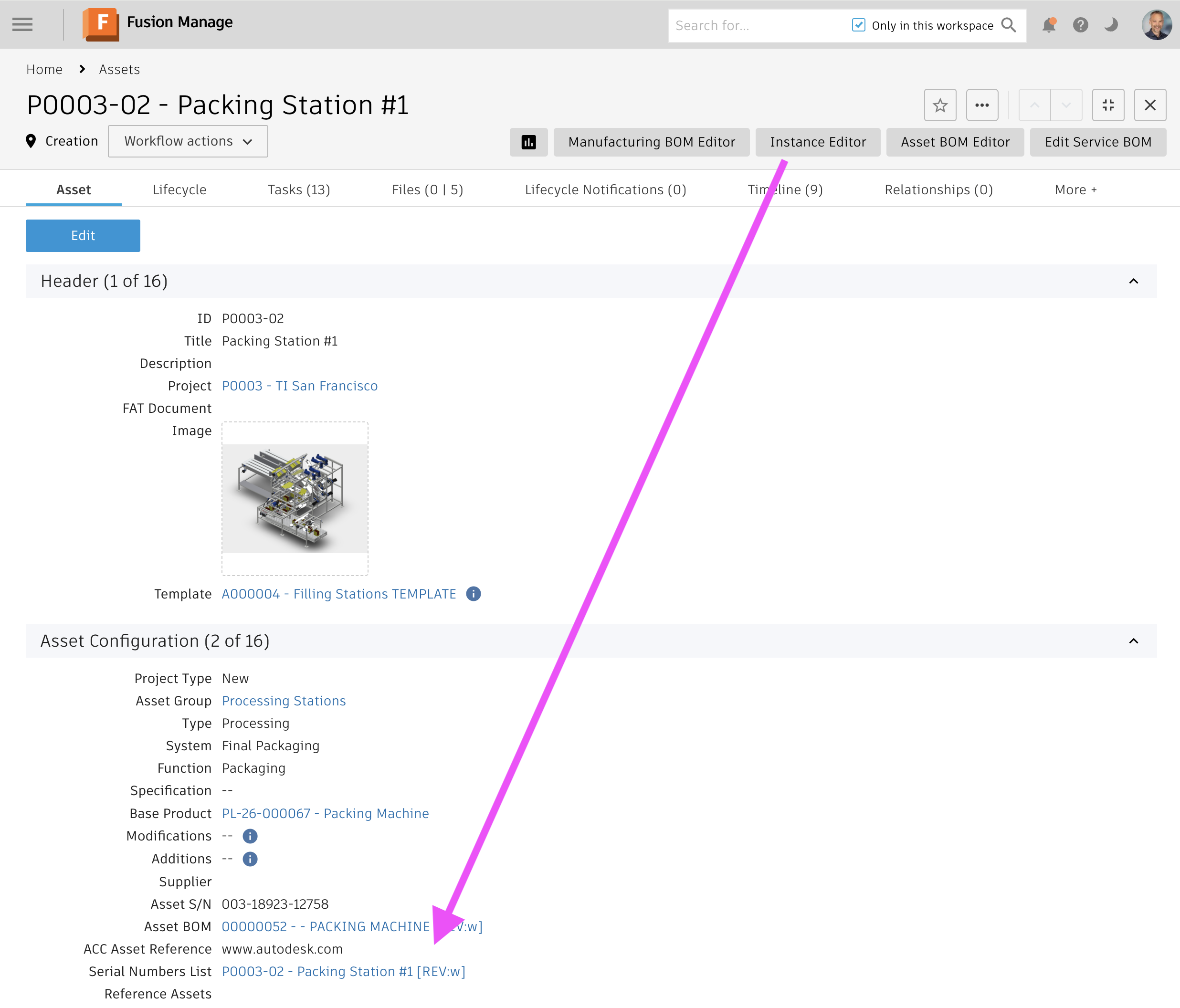
Once launched, the editor will display the Asset's Engineering BOM on the left side and its root item's viewable on top. The main action button in the main toolbar then can be used to retrieve all items in the Engineering BOM that match the defined property filtes. The default configuration profle for example will locat all items being flagged as item with serial number (per workspace configuration described in next chapter).
For each of these items, the system will create one entry per instance in the grid table below the viewer, allowing to manage instance specific data for each of these items. Users can select these table rows to have the matching component highlighted in the viewer and to have the BOM structure displayed accordingly. The BOM also can be used to filter the list of table entries by the instances within the selected context.
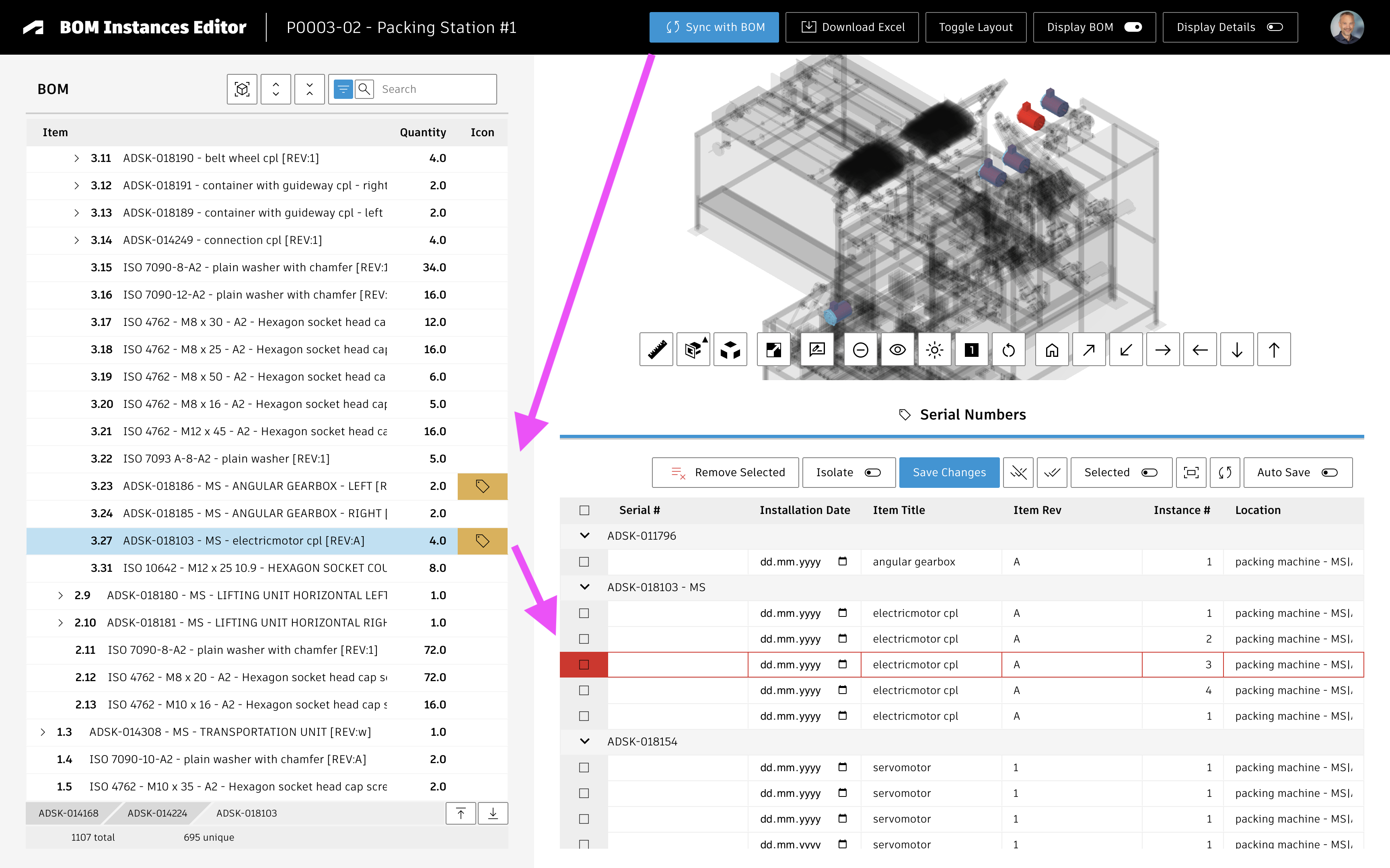
When users hit the Save button, the given data will be stored in the grid tab of the related Serial Nunbers List item:
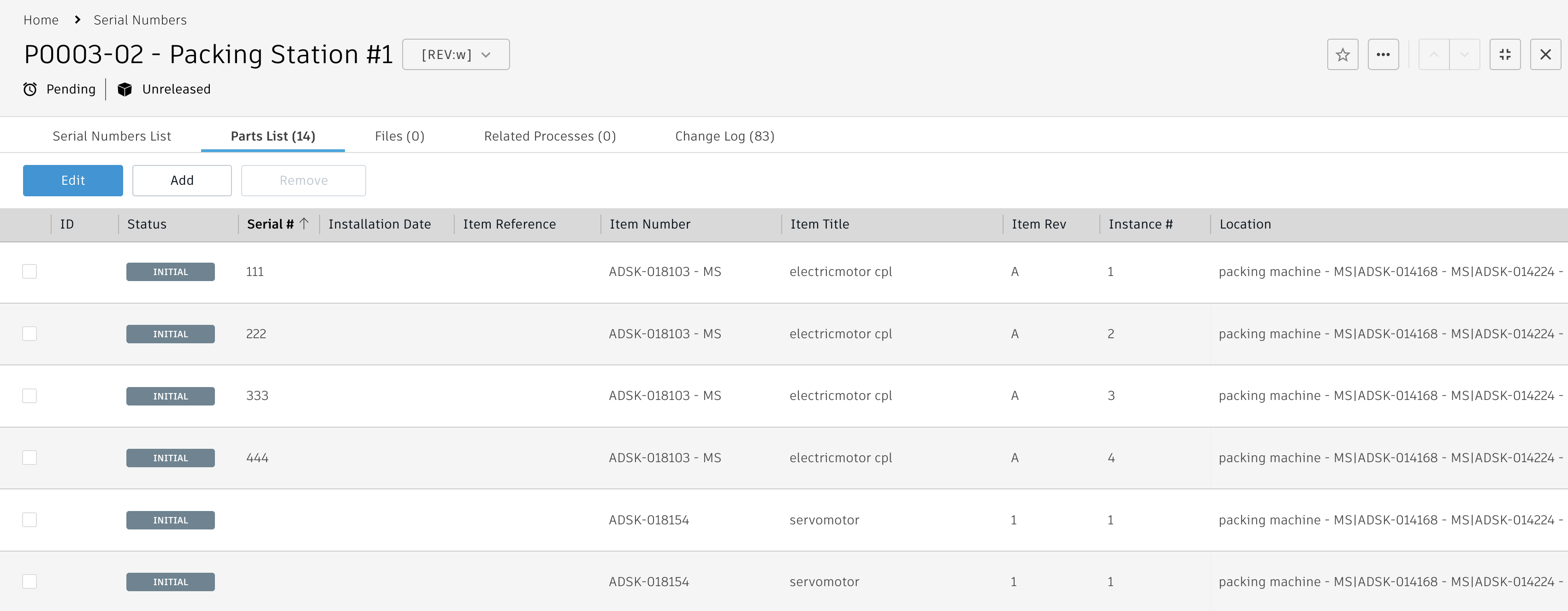
Enable Preconfigured Use Case
Setup Items Workspace Details
The default configuration requires the field Serial Number which must be added to your Items workspace.
Add this new field as shown below and place this field in any of your item workspace's sections:
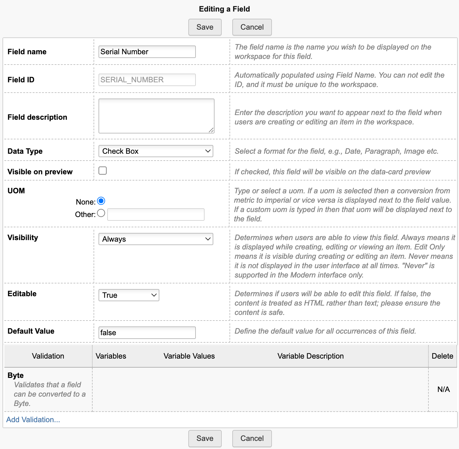
Setup Items Workspace BOM View
The utility requires a BOM view that contains all the fields listed below. According to default configuration, this utility will access the BOM view named Instance Editor - which you will also have to create if it does not exist yet. However, you can also use an existing BOM view (name) instead. If you have another BOM view with (at least) all the required fields defined, provide its name in the configuration setting instances.bomViewName (see later chapter for details on configuration settings).
| Source | Source Field | Display Name |
|---|---|---|
| System Fields | Descriptor | Descriptor |
| System Fields | Revision | Revision |
| BOM Fields | Quantity | Quantity |
| Item Details Fields | Serial Number | Serial Number |
| Item Details Fields | Title | Title |
| Item Details Fields | Number | Number |
Replacing Context Workspace
In order to use another workspace than the Assets as context element (i.e. Products), provide this workspace's ID in setting instances.assets.workspaceId. If this workspace connects the matching EBOM in a field other than the default field ENGINEERING_BOM, you also will have to update the setting instances.assets.fieldIdBOM accordingly.
Setup Additional Use Cases
While the default configuration is preconfigured for the management of Serial Numbers of Assets, you can easily adapt this solution to other use cases. For example, you can replace Assets with another workspace but also use other worksapces than the Serial Numbers List for the management of instance specific properties. You can also use multiple workspaces with dedicated properties to manage a list of motors and a list of sensors as well as a list of control elements at the same time. When configured properly, the editor then will display one tab for each of these workspaces with a unique set of properties:
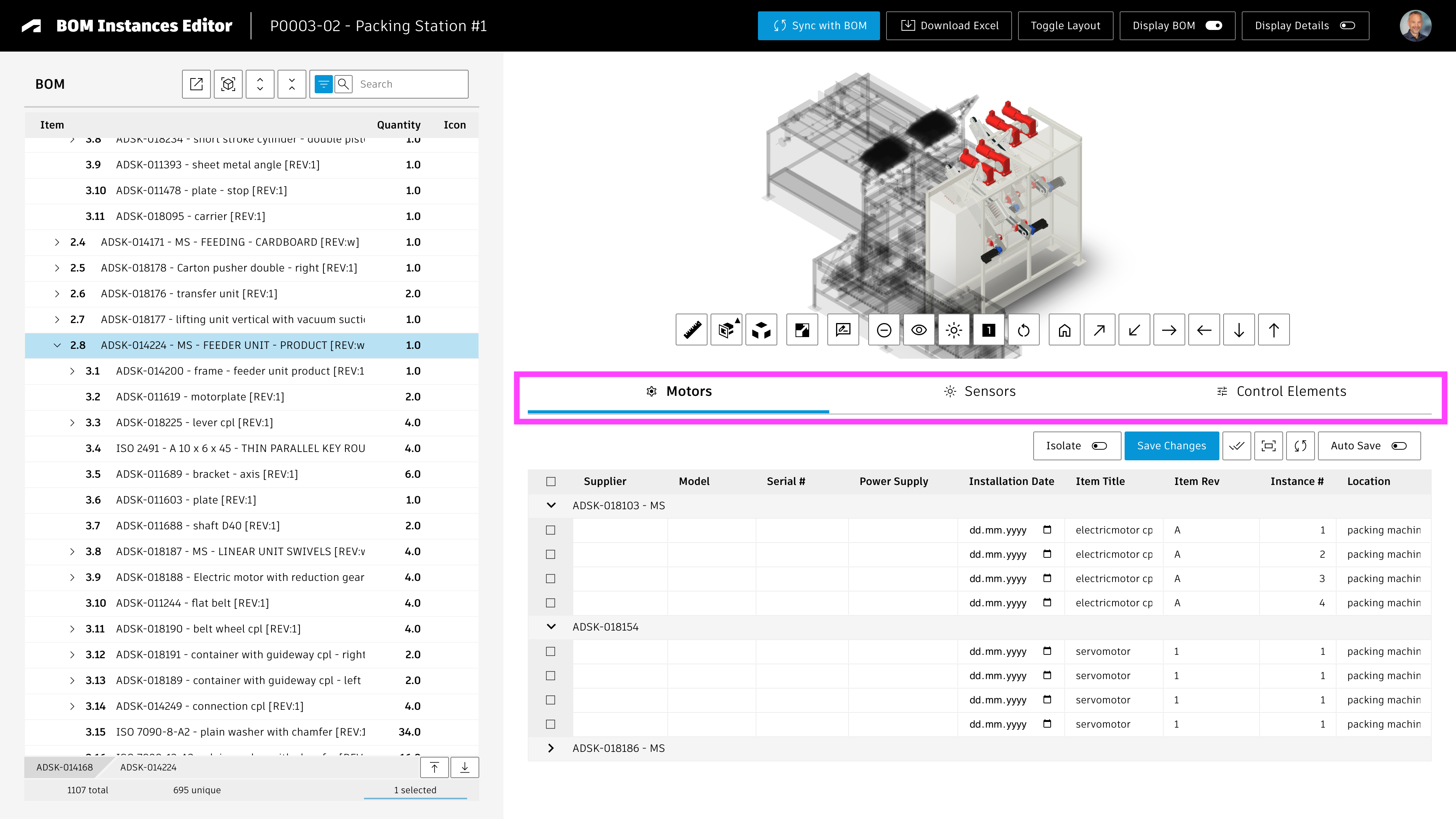
Adding further tabs / workspaces
As can be seen in the application screenshot above, the schema can be adjusted to allow for management of other information other than Serial Numbers. There can even be multiple tabs to split information by instance and to manage dedicated properties within defined columns.
For this, you will have to create the new workspaces that will store the instance specific data for each item in your BOM. You may clone the existing Serial Number Lists workspace as a starting point as it has all required information already. Your new workspaces must contain the following columns in their grid tabs to enable location of matching instances in the viewer and BOM:
| Field Name | Field ID | Type | Details | Visibility | Editable |
|---|---|---|---|---|---|
| Item Number | NUMBER | String | Length : 50 | Always | True |
| Location | LOCATION | String | Length : 500 | Always | True |
| Instance # | INSTANCE_ID | Integer | Length : 5 | Always | True |
| Instance Path | INSTANCE_PATH | String | Length : 1000 | Always | True |
| Bounding Box | BOUNDING_BOX | String | Length : 1000 | Never | True |
Do not forget to configure the matching access permissions for your new workspaces. Include permission to adjust the Grid tab entries as well as they will be adjusted by the editor.
Once the custom workpaces are available, you must add linking picklist fields on your context element (i.e. the Asset) for each of them. There must be one field per workspace.
The editor can add the BOM entries to the matching tab automatically. However, this requires a property on the BOM items to identify the entries of interest. Add a property in the Items workspace which can be used later to filter for the items of interest. For example, the capability of Serial Numbers management uses the checkbox field SERIAL_NUBMER. You can also add specific checkboxes, but can also use pick list fields for example.
Once the workspaces have been configured properly, you must update the configuration settings of this application to take these workspaces into account. The setting instances.tabs can be used to provide a list of tabs to be displayed. It is recommended to copy the existing configuration profile of serial numbers and to adopt it for the additional workspaces. The standard settings.js file even contains further templates that were commented out. They also can be used as a starting point.
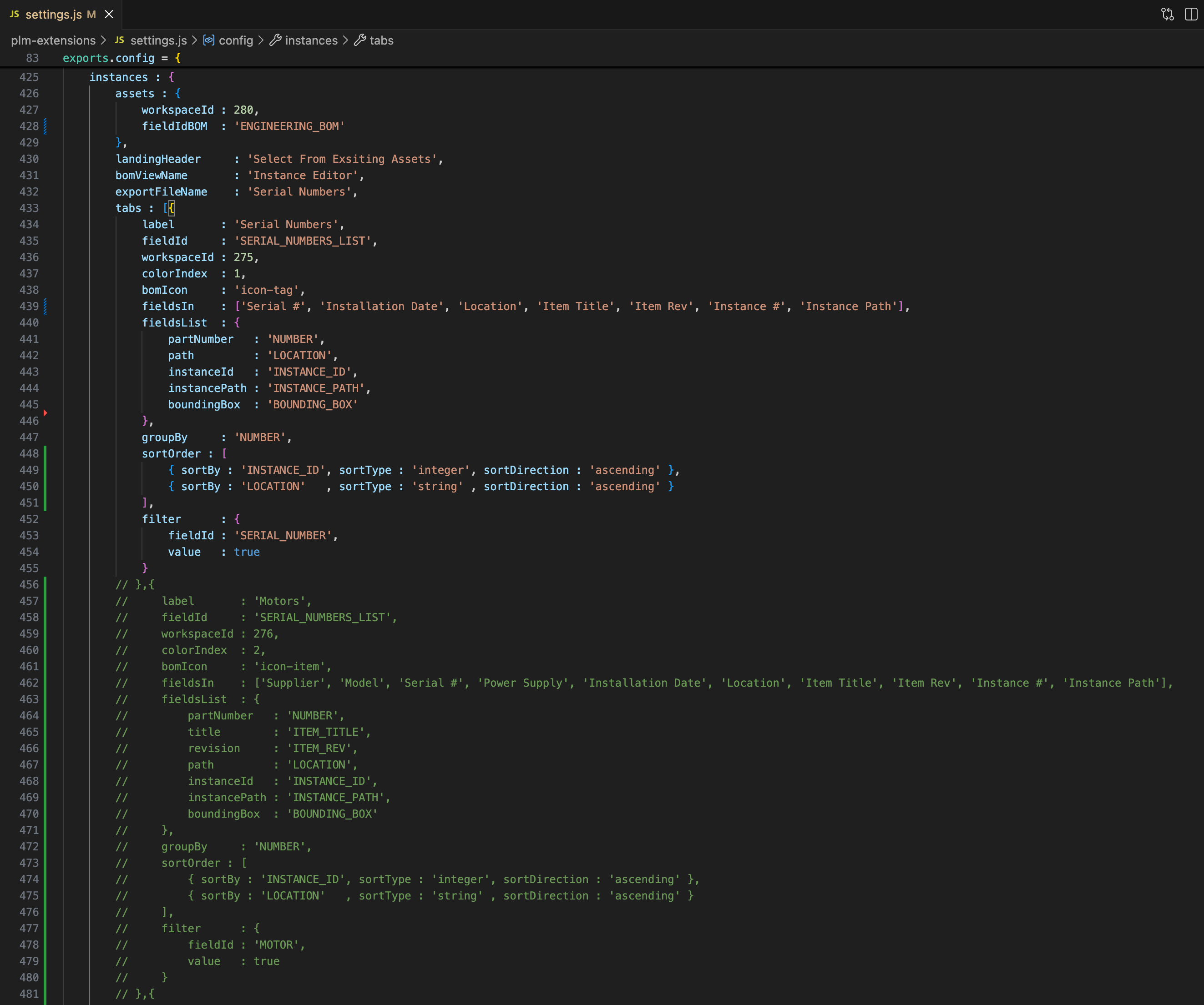
All settings listed below must be provided for each tab / workspace. The default values in this table refer to the Serial Numbers setup.
| Setting | Description | Type | Default Value |
|---|---|---|---|
| label | Label to display for the tab within the editor | String | 'Serial Numbers' |
| fieldId | The linking picklist field of context item to access the given record with the grid columns | String | 'SERIAL_NUMBERS_LIST' |
| workspaceId | ID of the related workspace (ie. the Serial Number Lists) | Integer | 275 |
| colorIndex | The index of the color to use for the highlight of matching items in the BOM ( refers to colors.list defined in settings.js as well ) | integer | 1 |
| bomIcon | The icon to use for the given tab and for the BOM highlight; use any icon provided by this framework (see the Developer Guide for the given gallery of icons included) | String | 'icon-tag' |
| fieldsIn | Defines the grid columns to be displayed by column names | Array | ['Serial #', ..] |
| fieldsList | Map you grid field IDs to the key fields required for the instance mapping. This includes partNumber, path, instanceId, instancePath and boundingBox. | JSON | {..} |
| groupBy | Select the grid column for row grouping | String | 'NUMBER' |
| sortOrder | Set the sort order for the grid row entries | Array | [2] |
| filter | This setting is used to determine the EBOM items of relevance when performing the automatic sync. Provide the Items workspace field to use as well as the field value that indicates a match. This field must be included in the Items BOM view defined by instances.bomViewName. | JSON | { fieldId : 'SERIAL_NUMBER', value true } |
Application Configuration Settings
The following application specific settings can be adjusted in your custom settings file in exports.applications.instances
In order to change any of these settings, copy the standard value from settings.js to your custom settings file in folder settings.
| Setting | Description | Type | Default Value |
|---|---|---|---|
| assets.workspaceId | The ID of the context workspace form which the editor will be launched | Integer | 280 |
| assets.fieldIdBOM | The linking picklist field of the context workspace with the EBOM reference | String | 'ENGINEERING_BOM' |
| landingHeader | If the editor is launched from an EBOM item instead of the context element, a landing page will prompt the user for the related asset to open. This setting defines the header label of this select dialog which is skipped if the editor is opened from the context element (i.e. the Asset). | String | 'Select From Exsiting Assets' |
| bomViewName | The BOM view to use when expanding the EBOM of the context element. This view must contain the part number and all the fields defined by the filter settings of each of the tabs. | String | 'Instance Editor' |
| exportFileName | Users can export the tab data into an Excel file. This setting defines the given file's prefix. | String | 'Serial Numbers' |
| tabs | This array defines the list of tabs to be displayed and the given workspaces / fields to use. See the previous chapter for details. | Array | [] |
Common Configuration Settings
This utility also uses the following common configuration settings
| Setting | Default Value | Description |
|---|---|---|
| exports.common.workspaceIds.assets | 280 | ID of workspace Assets |
Viewer Configuration Settings
This application enables configuration of features within the viewer by using parameter viewerFeatures. By using the settings listed below, you can control the availability of given icons in the viewer toolbar. These feaatures can be enabled and disabled for all users in general by setting the value to true or false. As an alternative, you can also provide an array of groups to grant access. Only users being assigned to any of the defined groups will then get access to the feature. Examples:
- viewerFeatures.measure = true > Measurements will be possible for all users
- viewerFeatures.measure = false > Measurements will not be possible for any user
- viewerFeatures.measure = ['Employees','Service Technician'] > The measurements button will only be shown for users in group Employees or Service Technician
| Setting | Icon | Description |
|---|---|---|
| contextMenu | Enables / disables the viewer standard context menu | |
| cube | Enables the cube / home button in top right corner of the viewer. Parameter 'views' can be used instead, providing dedicated buttons. | |
| orbit | Enables the orbit controls | |
| firstPerson | Enables first person view | |
| camera | Enables camera interactions | |
| measure | Enables the measurements toolbar | |
| section | Enables sectioning | |
| explodedView | Enables exploded views | |
| modelBrowser | Enables browsing the model hierarchy within the viewer | |
| properties | Enables access to the selected component's properties stored in the viewable file | |
| settings | Enables viewer settings | |
| fullscreen | Enables fullscreen toggle | |
| markup | Enables markup toolbar | |
| hide | Enables easy hiding of (selected) components | |
| ghosting | Enables toggling ghosting mode on/off | |
| highlight | Enables toggling highlight of selected models on/off | |
| single | Enables fitting of first instance to viewer | |
| fitToView | Enables reframing all visible items | |
| reset | Enables to deselect all, invoking viewerClickReset() | |
| views | Enables toolbar to quickly access main views | |
| selectFile | Enables switching between multiple viewable files for the given item (3D and 2D) |
The viewer can further be adjusted by using common settings that apply to all applications. All settings listed below can be changed in exports.common.viewer:
| Setting | Icon | Description |
|---|---|---|
| numberProperties | ['Part Number', 'Name', 'label', 'Artikelnummer', 'Bauteilnummer'] | List of item properties to be considered as number properties. The first property found will be used to match components in the viewable file to items in the PLM system (based on field defined in exports.common.workspaces.items.fieldIdNumber). |
| suffixPrimaryFile | ['.iam.dwf', '.iam.dwfx', '.ipt.dwf', '.ipt.dwfx'] | Defines sequence of preferred file suffixes to identify the primary viewable file if multiple viewable files are available for the given item. |
| extensionsIncluded | ['dwf', 'dwfx', 'nwd', 'ipt', 'stp', 'step', 'sldprt', 'pdf'] | List of file formats to be considered as viewable formats. |
| extensionsExcluded | [] | List of file formats not to be considered as viewable formats. |
| splitPartNumberBy | ' v' | If the number property in the viewer does not match the item number exactly, its value can be split by the given string to remove suffixes like version information. |
| splitPartNumberIndexes | [0] | If the number property in the viewer does not match the item number exactly, its value can be split and selected indizes can be contatenated. This property defines the split elements to concatenate. |
| splitPartNumberSpacer | '' | If the number property in the viewer does not match the item number exactly, its value can be split and selected indizes can be contatenated. The concatenated strings will be separated by this spacer. |
| backgroundColor | [255, 255, 255, 255, 255, 255] | Default background color of viewer instances if not specified by theme. |
| cacheInstances | false | Enables / disables caching of instances data in the viewer for improved performance. Enabling this cache will incread initial load time. |
| antiAliasing | true | Enables / disables anti-aliasing in the viewer. |
| ambientShadows | true | Enables / disables ambient shadows in the viewer. |
| groundReflection | true | Enables / disables ground reflections in the viewer. |
| groundShadow | true | Enables / disables ground shadow in the viewer. |
| lightPreset | 4 | Changes the default light preset of the viewer. |
| conversionAttempts | 10 | If viewables need to be converted, this number of attempts will be made to check for the conversion completion status. |
| conversionDelay | 3000 | If viewables need to be converted, this delay (in milliseconds) will be applied before starting to check for the conversion completion status. |
Variant Manager Change Log
| 12. January 2026 | Documentation | Documentation has been updated to match the new custom settings and environments management |
| 4. December 2025 | Initial Release | This is the very first version of this application |
Features
- Can be launched in context of an Asset
- Reuse the Engineering BOM and viewable for a best in class user experience
- Create the derived Asset Items BOM with single clicks
- Creates asset items for all intermediate parents automatically
- Colors indicate the levels containing asset specific items
- Manage instance specific properties and derive information from the referenced base item
Prerequisites
This solution requires installation of the new template Assets Lifecycle & Projects which is available for testing only (as of December 2025). This template includes the required workspaces of Assets and Asset Items. The solution also requires the Chrome Extensions of this package on each client, providing access to the editor in context of Assets.
Learn about the Chrome ExtensionUser Guide
Launching the editor
Once the prerequisites are met, users can launch the editor using the button in the Asset's header as shown below. If the editor is launched for the first time for an asset, it will create and connect the given root Asset BOM item automatically. This item can be found in section Asset Configuration and will be reused when the editor is launched next time.
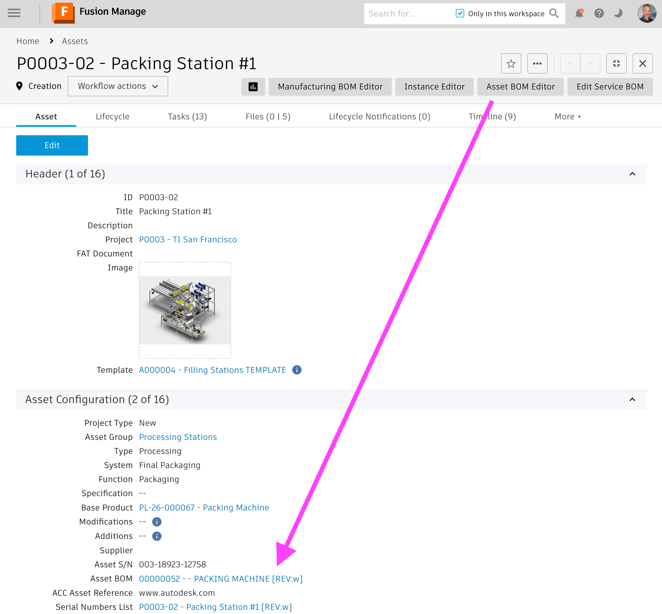
Deriving the Asset BOM
Once launched, the editor will display the Asset's Engineering BOM and its root item's viewable.
The column Asset Item is added to the EBOM display, enabling the derivation of the Asset BOM.
At the very beginning, there will be no Asset Items at all and users can create the required Asset Items within this BOM column by simply clicking the Create Item button. This can be done on any level, the system will automatically create Asset Items for all the intermediate parents in the Asset BOM if needed. Once an Asset Item has been created, the given item's number will be displayed and the color indicator of the BOM row will turn to green. For proper lifecycle management on all levels, the editor will always create a new Asset Item for each BOM row, even if an item is reused within the same assembly. With this, users can later on document the replacement of a given component in a speciic location only.
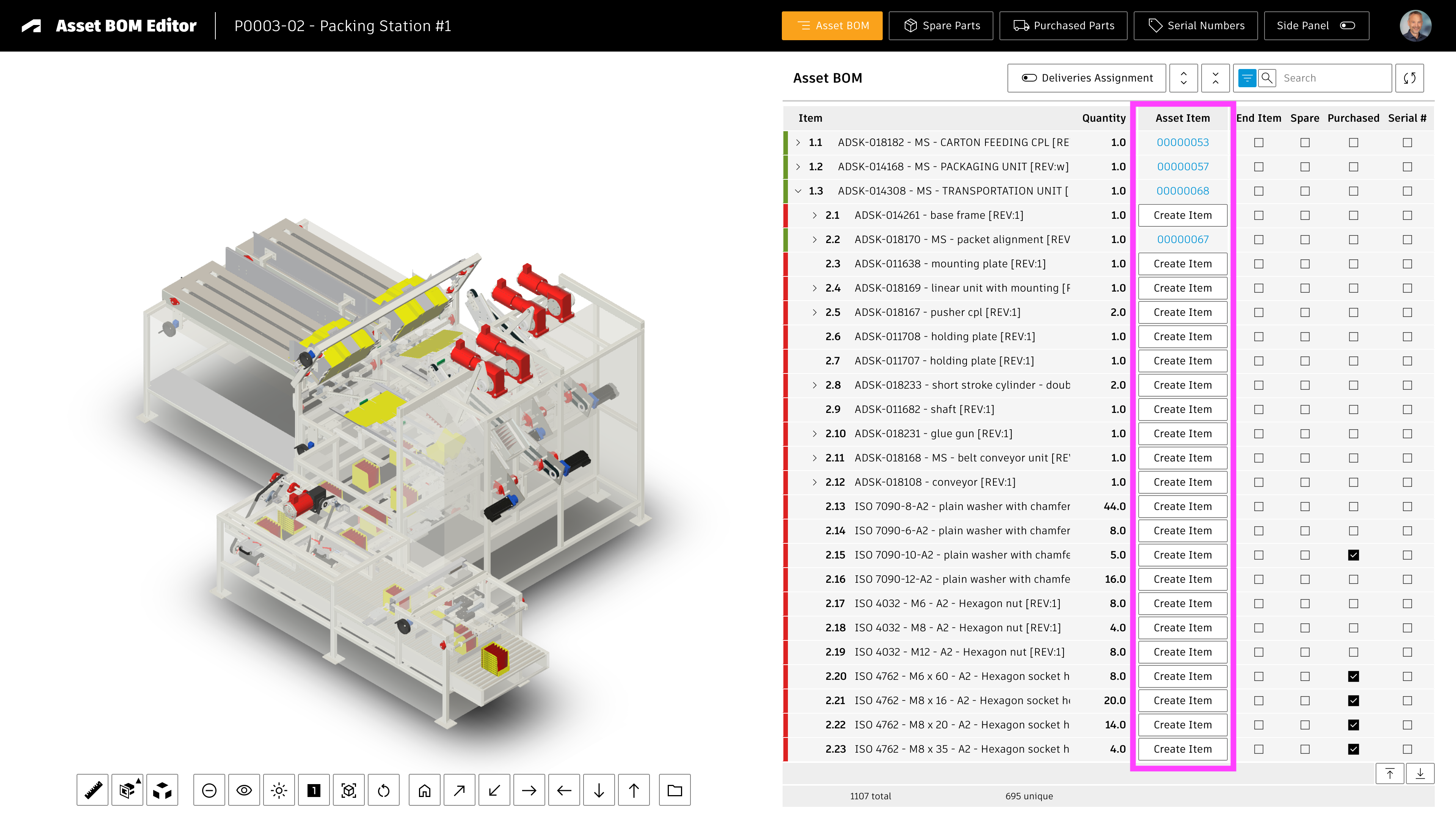
Next to this column, key properties can be managed for each Asset Item, including Spare Part and Serial Number indicators. While the Asset Item has not been created, these columns indicate the given EBOM item's defaults. When the Asset Item gets created with the given button, this default will be copied to the new Asset Item. Aftewrwards, users can still modify this property for the given Asset Item using the checkboxes if needed.
Advanced Features
Once the Asset Items got created, users benefit from additional features provided by the buttons in the main toolbar as well as the BOM's toolbar. The buttons Spare Partsand Purchased Partswill list all Asset Items that were flagged accoridingly. With button Serial Numbers user can access the Serial Numbers List entries connected with the context Asset.
The button Side Panel can be used to toggle the details panel for the selected component on/off. When users select a row with an Asset Item, this will display this item's details. If the Asset Item has not been created yet for the selected BOM row, the Engineering BOM item's details will be displayed instead. If no BOM row is selected, the Asset's details will be displayed.
If there are Order Project Deliveries defined for the context Asset, the toggle Deliveries Assignment can be used to easily connect the Asset Items with the given deliveries. These deliveries then will be used for the lifecycle management of the given items, similar to the Change Orders for Engineering BOM items.
Setup Step #1 : Adjust workspace Asset Items
As mentioned in the prerequisites, this solution requires installation of the template Assets Lifecycle & Projects which is available for testing only (as of December 2025). Amongst others, this template provides the workspace Asset Items which is required by this application. Once this template has been downloaded from the library, the configuration steps of this chapter must be performed to make this application work properly.
Item Details Tab
Change the field Reference Item to type single picklist, referencing your Items workspace:
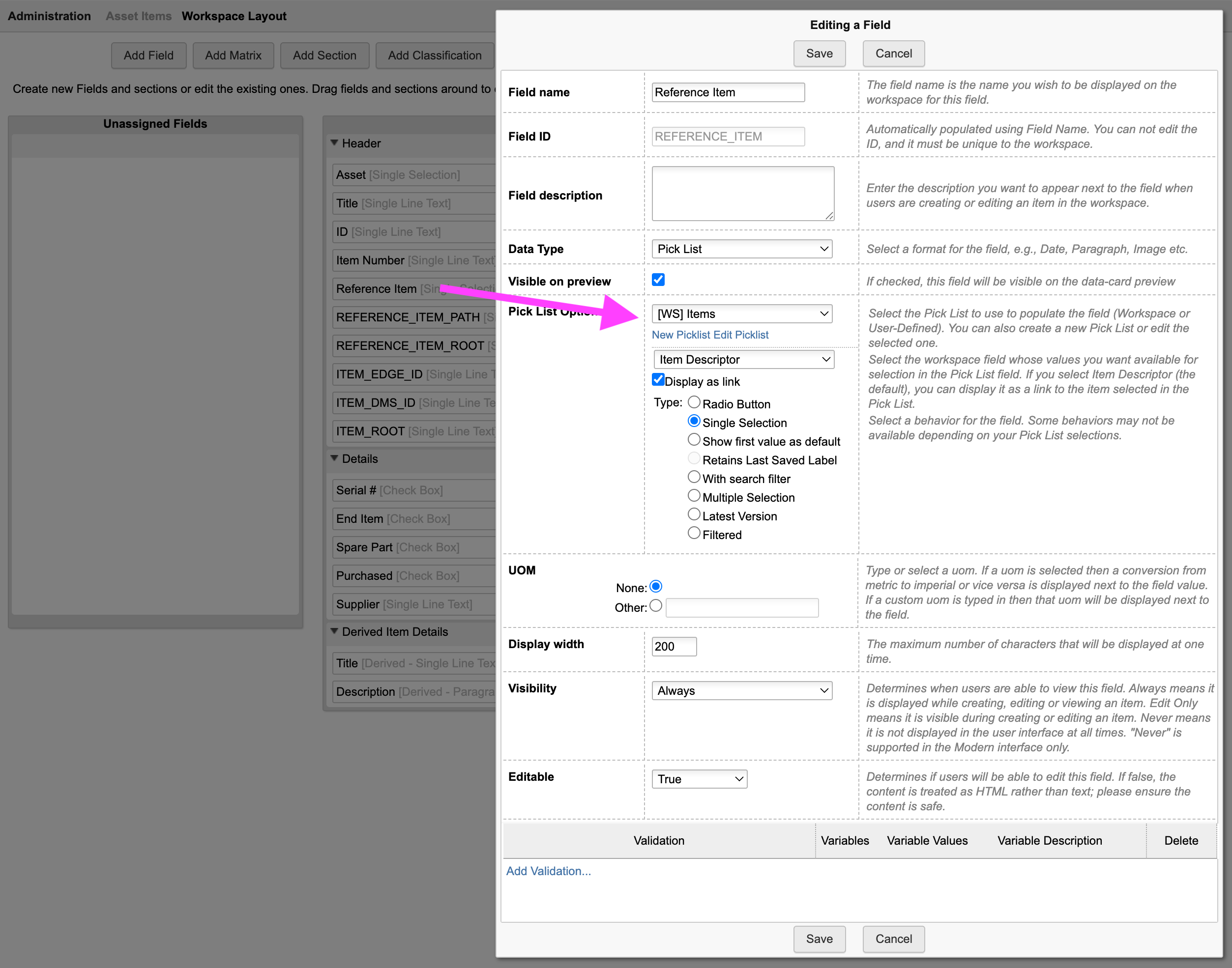
BOM View
A BOM view with a defined list of fields is required in the Asset Items workspace. Per default configuration, these fields must be added to the BOM Default View , but you can also choose another BOM view name if needed by changing the given configuration setting (see configuration settings overview further down below).
| Field Label | Field ID | Source | Type | Details | Editable |
|---|---|---|---|---|---|
| Descriptor | System Fields | Standard Field | - | ||
| Quatity | BOM Fields | Standard Field | True | ||
| ID | ID | Item Details Fields / Header | Single Line Text | Length : 20 | Creation Only |
| Asset | ASSET | Item Details Fields / Header | Single Picklist | Referencing Workspace Assets | Creation Only |
| Item Number | ITEM_NUMBER | Item Details Fields / Header | Single Line Text | Length : 100 | Creation Only |
| Reference Item | REFERENCE_ITEM | Item Details Fields / Header | Picklist | Referencing Workspace Items | True |
| REFERENCE_ITEM_ROOT | REFERENCE_ITEM_ROOT | Item Details Fields / Header | Single Line Text | Length : 1000 (required for EBOM matching) | True |
| REFERENCE_ITEM_PATH | REFERENCE_ITEM_PATH | Item Details Fields / Header | Single Line Text | Length : 1000 (required for EBOM matching) | True |
| Serial # | SERIAL | Item Details Fields / Details | Check Box | True | |
| END_ITEM | END_ITEM | Item Details Fields / Details | Check Box | True | |
| Spare Part | SPARE_PART | Item Details Fields / Details | Check Box | True | |
| Purchased | PURCHASED | Item Details Fields / Details | Check Box | True | |
| Supplier | SUPPLIER | Item Details Fields / Details | Single Line Text | Length : 100 | True |
Setup Step #2 : Adjust workspace Assets
The workspace Assets also is provided by the template Assets Lifecycle & Projects.
Launching the editor from records in this workspace is only possible if the field ENGINEERING_BOM is set to type single picklist referencing your Items workspace:
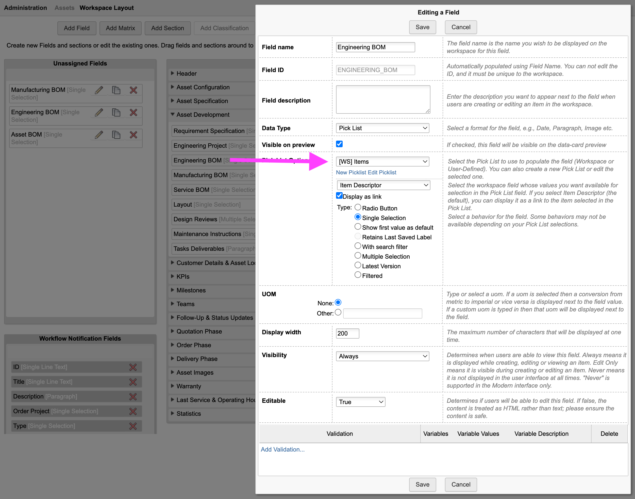
Setup Step #3 : Adjust workspace Items
BOM View
For the alignment of EBOM and Asset BOM, the editor requires a BOM view in the Items workspace with all the fields listed below. Per default configuration, this BOM view must be named Asset BOM Editor , but this name can be changed using the given configuration setting (see further down below). This also allows to reuse an existing BOM view as long as the view contains at least all the fields listed below.
| Field Label | Field ID | Description | Field Type | Details | Custom Field |
|---|---|---|---|---|---|
| Spare / Wear Part | SPARE_WEAR_PART | Used to indicate the default Spare Parts | Single Line Text | Length : 50 | No |
| Serial Number | SERIAL_NUMBER | Used to indicate the items requiring a Serial Number per default | Checkbox | Yes | |
| PDM Category | PDM_CATEGORY | Stores the item category provided by the Vault connector | Single Line Text | Length : 50 | No |
Derived Fields
This editor uses the workspace Asset Items provided by the template Assets Lifecycle & Projects. These items not only are connected to the context Asset, but also the EBOM's source item. This connection to the Refernce Item can be used to derive properties from the source EBOM item. Use the Workspace Manager to configure these derived fields if needed.
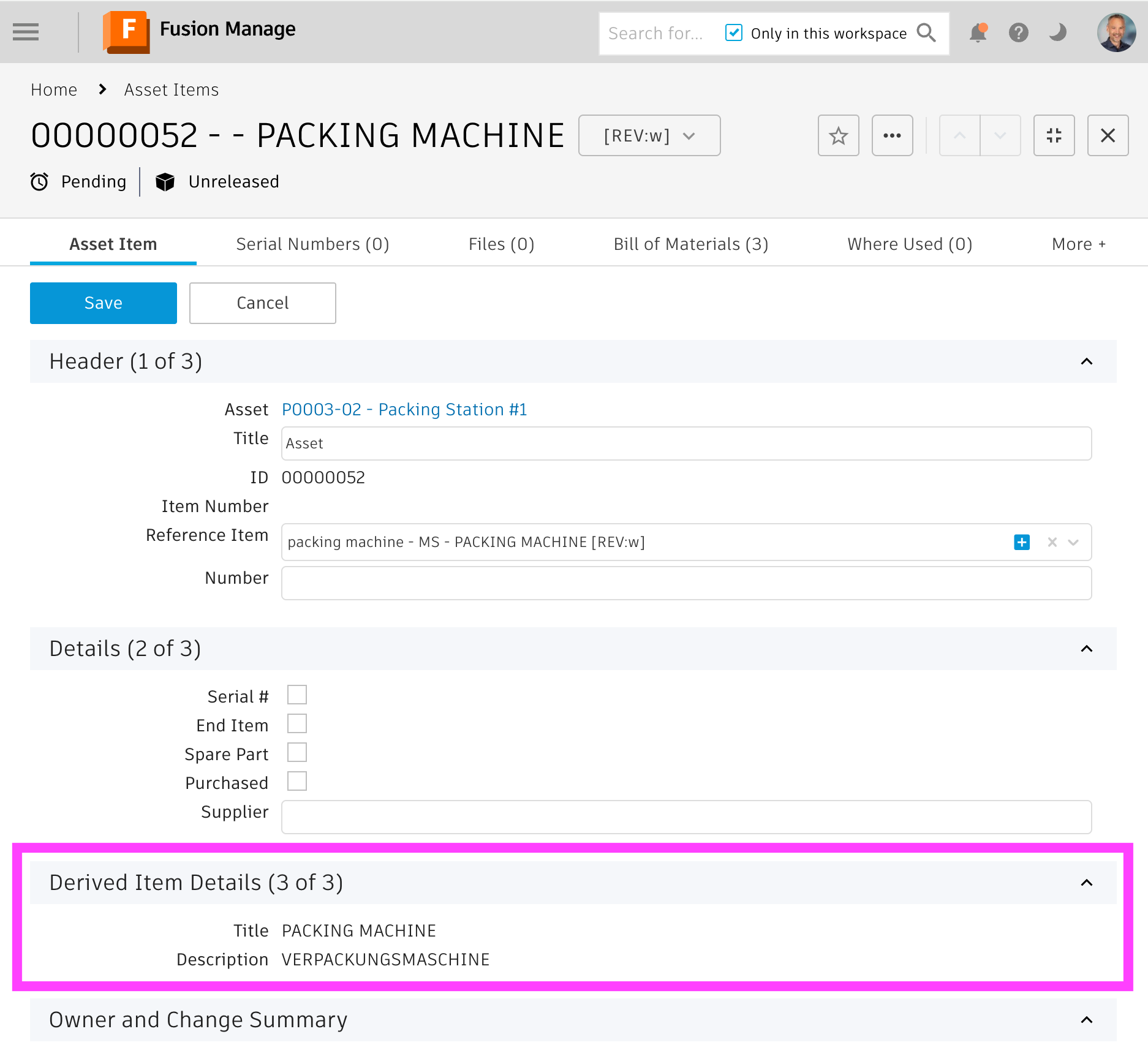
Setup Step #4 : Workspace IDs in settings file
Update the IDs for the workspaces being used by this application in your server's settings file (i.e. /settings/custom.js):
- assets
- assetItems
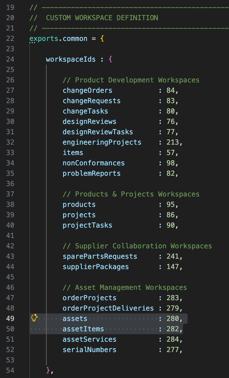
Application Configuration Settings
The following application specific settings can be adjusted in your custom settings file in exports.applications.abom
In order to change any of these settings, copy the standard value from settings.js to your custom settings file in folder settings.
These settings allow for adoption to your environment if needed. Note that changes to this file require a restart of your server.
| Setting | Description | Type | Default Value |
|---|---|---|---|
| bomLabel | Sets the label on top of the BOM display and the given main toolbar button | String | 'Asset BOM' |
| assetFieldIDs.ebom | The linking picklist field of the context workspace (Assets) with the EBOM reference | String | 'ENGINEERING_BOM' |
| assetFieldIDs.abom | The linking picklist field of the context workspace (Assets) with the Asset Items BOM reference | String | 'ASSET_BOM' |
| assetFieldIDs.serialNumbers | The linking picklist field of the context workspace (Assets) with the Serial Numbers List reference | String | 'SERIAL_NUMBERS_LIST' |
| assetItems.workspaceId | ID of the Asset Items workspace | Integer | 282 |
| assetItems.workspaceName | Name of the Asset Items workspace | String | 'Asset Item' |
| assetItems.bomViewName | BOM view of the Asset Items workspace to use for the BOM retrieval. This BOM view must contain all the fields referenced by the next setting assetItems.fieldIDs. | String | 'Default View' |
| assetItems.fieldIDs | This setting can be used to map the Asset Items workspace fields to the key properties required by the editor. The default settings are aligned with the standard Asset Items workspace already. Note that all these fields must be contained in the BOM view defined in the previous setting assetItems.bomViewName. | JSON | {..} |
| items.bomViewName | BOM view of the Items workspace to use for the EBOM display. This BOM view must contain all the fields referenced by the next setting items.fields. | String | 'Asset BOM Editor' |
| items.fields | Use this setting to define the key fields required by the editor in the Items workspace. For each field, define the fieldID and also the possible values that will evaluate to true. These values are used to determine the default values for the checkboxes displayed in the editor. | JSON | {..} |
| orderProjectDeliveries.workspaceId | Provide the workspace ID of your Order Projects Deliveries workspace for the Deliveries Assignment feature | Integer | 279 |
Common Configuration Settings
This utility also uses the following common configuration settings
| Setting | Default Value | Description |
|---|---|---|
| exports.common.workspaceIds.assetItems | 282 | ID of workspace Asset Items |
| exports.common.workspaceIds.orderProjectDeliveries | 279 | ID of workspace Order Project Deliveries |
Viewer Configuration Settings
This application enables configuration of features within the viewer by using parameter viewerFeatures. By using the settings listed below, you can control the availability of given icons in the viewer toolbar. These feaatures can be enabled and disabled for all users in general by setting the value to true or false. As an alternative, you can also provide an array of groups to grant access. Only users being assigned to any of the defined groups will then get access to the feature. Examples:
- viewerFeatures.measure = true > Measurements will be possible for all users
- viewerFeatures.measure = false > Measurements will not be possible for any user
- viewerFeatures.measure = ['Employees','Service Technician'] > The measurements button will only be shown for users in group Employees or Service Technician
| Setting | Icon | Description |
|---|---|---|
| contextMenu | Enables / disables the viewer standard context menu | |
| cube | Enables the cube / home button in top right corner of the viewer. Parameter 'views' can be used instead, providing dedicated buttons. | |
| orbit | Enables the orbit controls | |
| firstPerson | Enables first person view | |
| camera | Enables camera interactions | |
| measure | Enables the measurements toolbar | |
| section | Enables sectioning | |
| explodedView | Enables exploded views | |
| modelBrowser | Enables browsing the model hierarchy within the viewer | |
| properties | Enables access to the selected component's properties stored in the viewable file | |
| settings | Enables viewer settings | |
| fullscreen | Enables fullscreen toggle | |
| markup | Enables markup toolbar | |
| hide | Enables easy hiding of (selected) components | |
| ghosting | Enables toggling ghosting mode on/off | |
| highlight | Enables toggling highlight of selected models on/off | |
| single | Enables fitting of first instance to viewer | |
| fitToView | Enables reframing all visible items | |
| reset | Enables to deselect all, invoking viewerClickReset() | |
| views | Enables toolbar to quickly access main views | |
| selectFile | Enables switching between multiple viewable files for the given item (3D and 2D) |
The viewer can further be adjusted by using common settings that apply to all applications. All settings listed below can be changed in exports.common.viewer:
| Setting | Icon | Description |
|---|---|---|
| numberProperties | ['Part Number', 'Name', 'label', 'Artikelnummer', 'Bauteilnummer'] | List of item properties to be considered as number properties. The first property found will be used to match components in the viewable file to items in the PLM system (based on field defined in exports.common.workspaces.items.fieldIdNumber). |
| suffixPrimaryFile | ['.iam.dwf', '.iam.dwfx', '.ipt.dwf', '.ipt.dwfx'] | Defines sequence of preferred file suffixes to identify the primary viewable file if multiple viewable files are available for the given item. |
| extensionsIncluded | ['dwf', 'dwfx', 'nwd', 'ipt', 'stp', 'step', 'sldprt', 'pdf'] | List of file formats to be considered as viewable formats. |
| extensionsExcluded | [] | List of file formats not to be considered as viewable formats. |
| splitPartNumberBy | ' v' | If the number property in the viewer does not match the item number exactly, its value can be split by the given string to remove suffixes like version information. |
| splitPartNumberIndexes | [0] | If the number property in the viewer does not match the item number exactly, its value can be split and selected indizes can be contatenated. This property defines the split elements to concatenate. |
| splitPartNumberSpacer | '' | If the number property in the viewer does not match the item number exactly, its value can be split and selected indizes can be contatenated. The concatenated strings will be separated by this spacer. |
| backgroundColor | [255, 255, 255, 255, 255, 255] | Default background color of viewer instances if not specified by theme. |
| cacheInstances | false | Enables / disables caching of instances data in the viewer for improved performance. Enabling this cache will incread initial load time. |
| antiAliasing | true | Enables / disables anti-aliasing in the viewer. |
| ambientShadows | true | Enables / disables ambient shadows in the viewer. |
| groundReflection | true | Enables / disables ground reflections in the viewer. |
| groundShadow | true | Enables / disables ground shadow in the viewer. |
| lightPreset | 4 | Changes the default light preset of the viewer. |
| conversionAttempts | 10 | If viewables need to be converted, this number of attempts will be made to check for the conversion completion status. |
| conversionDelay | 3000 | If viewables need to be converted, this delay (in milliseconds) will be applied before starting to check for the conversion completion status. |
Variant Manager Change Log
| 12. January 2026 | Documentation | Documentation has been updated to match the new custom settings and environments management |
| 5. December 2025 | Initial Release | This is the very first version of this application |
Features
You can use this solution with any workspace that has the Classification section enabled. When opened as standalone application, users can browse the classification tree and search within the classes. In addition, if the Chrome Extension is installed (or a matching computed fields is added), users can also open the browser from an item that has been classified and see all items that share the same class as the source item.
Starting the Application
Users can access this application standalone using the /classes endpoint, but also in context of a given item. It can be opened in context by passing either the item number or both the wsId and dmsId. The latter capability can be used to launch the application from PLM in context of an item.
Opening the application from an item in PLM can be achieved in two ways:
- By using the framework's Chrome Extension that adds a button in the PLM item's header toolbar.
This option is recommneded and does not require any further configuration. - If the Chrome Extension cannot be used, a computed field must be added to the details page to render the given button instead.
See the required configuration steps below only if this option is needed.
Adding the button to Item Details page
If the field DMS_ID does not exist yet in your context workspace, add it as Single Line Text (length 20, not visible) in the item details tab.
Let this field be set upon item creation using the following script code in your item creation script. If your workspaces uses a workflow, you may add this script also to the initial workflow transition.
item.DMS_ID = dmsID;
In addition, add a computed field Actions to Item Details that renders a button to open this application for the current record. Use the formula shown below.
In this formula, adjust the workspace ID (57) to match your workspace's ID.
'<a style="border: 1px solid #bec8d2;border-radius:3px;color: #0a131c;font-weight:600;line-height:32px;padding:4px 20px;text-align:center;text-decoration:none !important;white-space:nowrap;" target="_blank" href =" classes?wsId=57&dmsId='||DMS_ID||'">Explorer</a>'
Application Configuration Settings
The following application specific settings can be adjusted in your custom settings file in exports.applications.classes
In order to change any of these settings, copy the standard value from settings.js to your custom settings file in the settings folder.
| Setting | Default Value | Description |
|---|---|---|
| fieldsIncluded | ['DESCRIPTOR', 'WORKSPACE', 'REVISION'] | This array defines the default columns being included in the class browser results table |
Class Browser Change Log
| 11. March 2026 | Addin Mode | The Class Browser now switches to addin mode if the host parameter is included in the URL (i.e. ../classes?host=inventor) |
| 12. January 2026 | Documentation | Documentation has been updated to match the new custom settings and environments management |
| 28. November 2025 | Enhancement | Enable Class Browser as standalone solution |
| Enhancement | Reduce implementation efforts and increase flexibility by supporting the Chrome Extension | |
| 7. July 2023 | Enhancement | New default tenant now contains required fields of this extension to reduce implementation efforts and provide value for all users |
Prerequisites
You must have the Design Reviews template installed from the Template Library. If your tenant is based on a template past April 2021, this given app is included already. To check if your tenant contains this latest app, please verify that the workspace Design Review Tasks is available in your tenant.
Workspaces Configuration
Workspace Design Reviews
Use the Workspace Manager to perform the following changes to your workspace Design Reviews:
- Add section Design Data if it does not exist
- Add the field Item (id ITEM) to it if it does not exist yet.
Make this a single selection picklist field referring to workspace Items (or Items and BOMs). - Also, add the field Image (id IMAGE) as derived field of the previous field and let it derive the image field
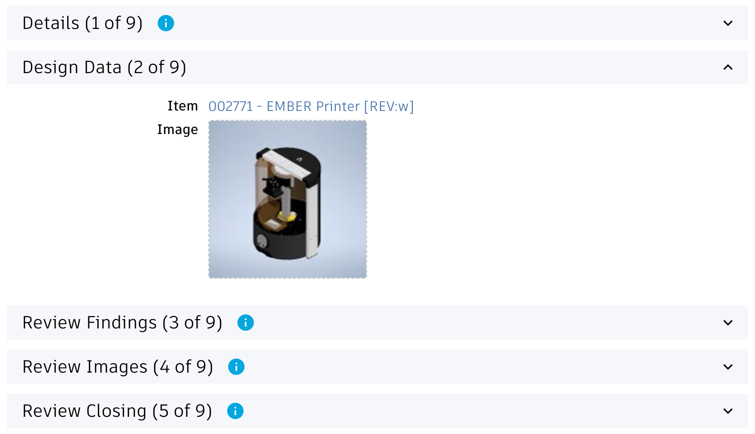
Workspace Design Review Tasks
Use the Workspace Manager to perform the following changes to your workspace Design Review Tasks:
- Add an image field MARKUP to the first section
- Add two fields of type paragraph: MARKUPSTATE and MARKUPSVG.
Set maximum length of 1.000.000 for both fields and set their visibility to Never.
Set them to be editable and add them to the first section of Item Details.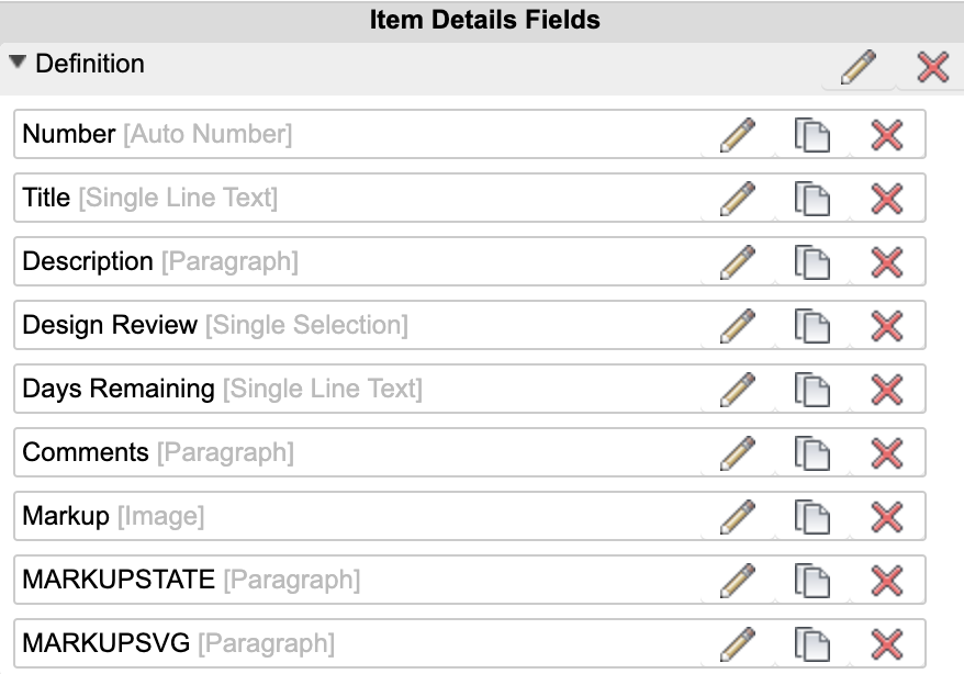
- The following fields must be editable:
- TITLE
- DESCRIPTION
- DESIGN_REVIEW (editable at creation only)
- TARGET_COMPLETION_DATE
- Field ASSIGNEE must NOT be mandatory
- Disable Workflow Locking for all sections
- Enable transition Return also for the Owner. If this permission is not granted, the creation of tasks will fail as the given user cannot upload the markup image after task creation.
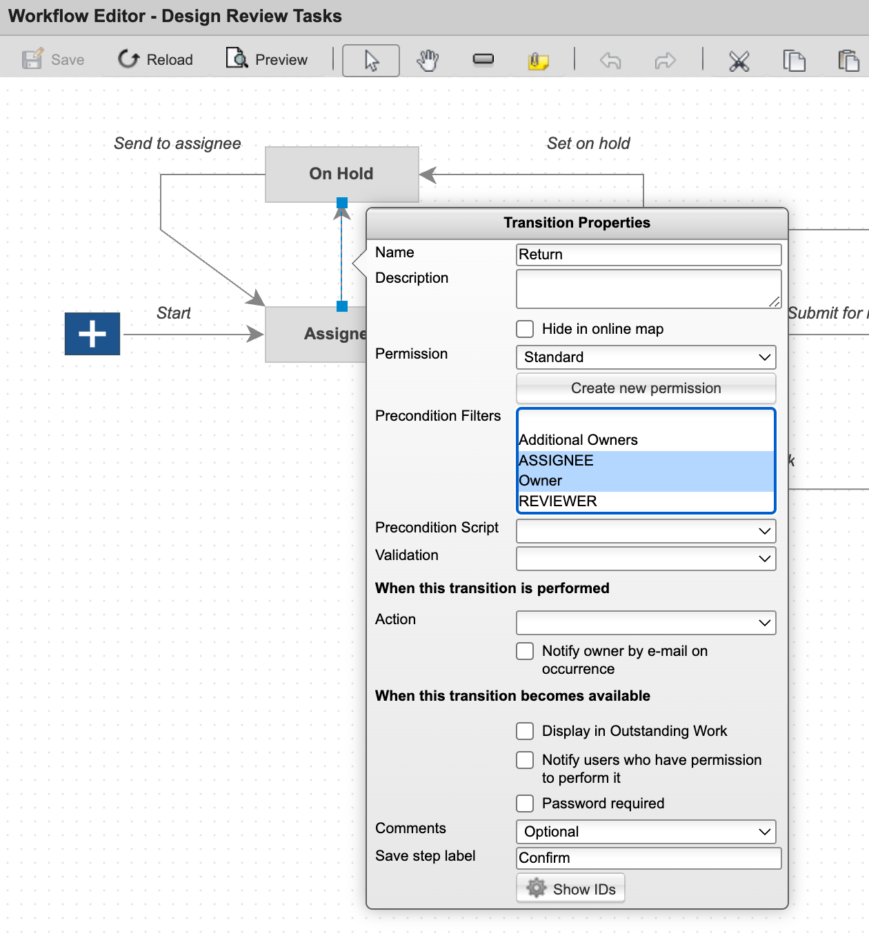
Grant permission to Add Items in workspace Design Review Tasks for all the users which will use the Design Review Portal.
Script Changes
Let new Design Review Tasks be connected to the related Design Review by adding the following script to the initial workflow transition (from the Start Node) in workspaces Design Review Tasks:
if(item.DESIGN_REVIEW !== null) { item.DESIGN_REVIEW.project.addTask(item); }
Adjust the script Design Reviews WF Actions by extending the if statement with the following condition as shown in the screenshot below:
item.project.children.length === 0
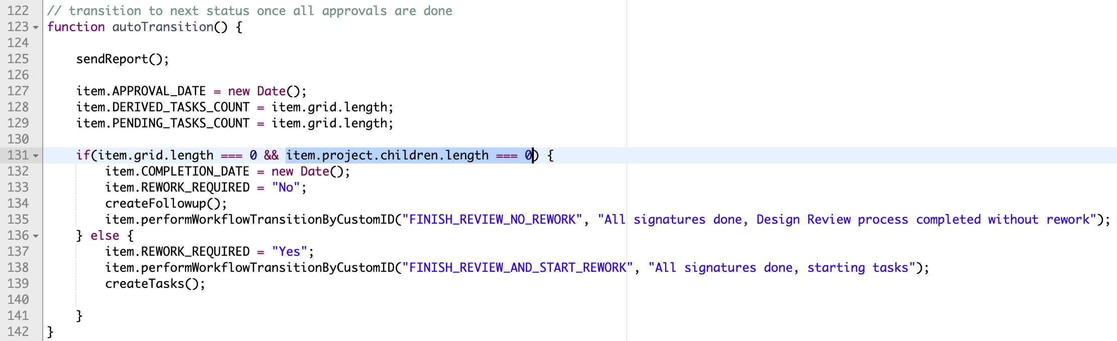
Application Configuration Settings
The following settings can be adjusted in your custom settings file within exports.applications.reviews to adjust the application's behavior. In order to change any of these settings, copy the standard value from settings.js to your custom settings file in folder settings.
| Setting | Default Value | Description |
|---|---|---|
| fieldIdItem | 'ITEM' | Defines the Design Review's fieldID used to link the Item to be reviewed |
| fieldIdImage | 'IMAGE' | Defines the Design Review's fieldID used to store the linkede Item's preview image |
| fieldIdMarkup | 'MARKUP' | FieldID of Design Review Task to use for storing the Markup image |
| transitionId | 'CLOSE_REVIEW' | Defines the workflow action ID that can be used to close / finish a given design review. If the user has permission to perform this defined transition, the given button Finish will be displayed when opening a design review. |
| bomDepth | 3 | Restrict the BOM expansion to the defined levels when opening a Design Review |
| workspaces | The workspaces parameter enables to align this solution with your workspace configuation:
| |
Common Configuration Settings
This utility also uses the following common configuration settings
| Setting | Default Value | Description |
|---|---|---|
| exports.common.workspaces.items.defaultBOMView | 'Tree Navigator' | The default BOM view to be used for the BOM display. If the defined view does not exist, the default BOM view will be used instead. For best performance, it is recommended to use a BOM view containing only the columns Descriptor, Number and Quantity. |
Viewer Configuration Settings
This application enables configuration of features within the viewer by using parameter viewerFeatures. By using the settings listed below, you can control the availability of given icons in the viewer toolbar. These feaatures can be enabled and disabled for all users in general by setting the value to true or false. As an alternative, you can also provide an array of groups to grant access. Only users being assigned to any of the defined groups will then get access to the feature. Examples:
- viewerFeatures.measure = true > Measurements will be possible for all users
- viewerFeatures.measure = false > Measurements will not be possible for any user
- viewerFeatures.measure = ['Employees','Service Technician'] > The measurements button will only be shown for users in group Employees or Service Technician
| Setting | Icon | Description |
|---|---|---|
| contextMenu | Enables / disables the viewer standard context menu | |
| cube | Enables the cube / home button in top right corner of the viewer. Parameter 'views' can be used instead, providing dedicated buttons. | |
| orbit | Enables the orbit controls | |
| firstPerson | Enables first person view | |
| camera | Enables camera interactions | |
| measure | Enables the measurements toolbar | |
| section | Enables sectioning | |
| explodedView | Enables exploded views | |
| modelBrowser | Enables browsing the model hierarchy within the viewer | |
| properties | Enables access to the selected component's properties stored in the viewable file | |
| settings | Enables viewer settings | |
| fullscreen | Enables fullscreen toggle | |
| markup | Enables markup toolbar | |
| hide | Enables easy hiding of (selected) components | |
| ghosting | Enables toggling ghosting mode on/off | |
| highlight | Enables toggling highlight of selected models on/off | |
| single | Enables fitting of first instance to viewer | |
| fitToView | Enables reframing all visible items | |
| reset | Enables to deselect all, invoking viewerClickReset() | |
| views | Enables toolbar to quickly access main views | |
| selectFile | Enables switching between multiple viewable files for the given item (3D and 2D) |
The viewer can further be adjusted by using common settings that apply to all applications. All settings listed below can be changed in exports.common.viewer:
| Setting | Icon | Description |
|---|---|---|
| numberProperties | ['Part Number', 'Name', 'label', 'Artikelnummer', 'Bauteilnummer'] | List of item properties to be considered as number properties. The first property found will be used to match components in the viewable file to items in the PLM system (based on field defined in exports.common.workspaces.items.fieldIdNumber). |
| suffixPrimaryFile | ['.iam.dwf', '.iam.dwfx', '.ipt.dwf', '.ipt.dwfx'] | Defines sequence of preferred file suffixes to identify the primary viewable file if multiple viewable files are available for the given item. |
| extensionsIncluded | ['dwf', 'dwfx', 'nwd', 'ipt', 'stp', 'step', 'sldprt', 'pdf'] | List of file formats to be considered as viewable formats. |
| extensionsExcluded | [] | List of file formats not to be considered as viewable formats. |
| splitPartNumberBy | ' v' | If the number property in the viewer does not match the item number exactly, its value can be split by the given string to remove suffixes like version information. |
| splitPartNumberIndexes | [0] | If the number property in the viewer does not match the item number exactly, its value can be split and selected indizes can be contatenated. This property defines the split elements to concatenate. |
| splitPartNumberSpacer | '' | If the number property in the viewer does not match the item number exactly, its value can be split and selected indizes can be contatenated. The concatenated strings will be separated by this spacer. |
| backgroundColor | [255, 255, 255, 255, 255, 255] | Default background color of viewer instances if not specified by theme. |
| cacheInstances | false | Enables / disables caching of instances data in the viewer for improved performance. Enabling this cache will incread initial load time. |
| antiAliasing | true | Enables / disables anti-aliasing in the viewer. |
| ambientShadows | true | Enables / disables ambient shadows in the viewer. |
| groundReflection | true | Enables / disables ground reflections in the viewer. |
| groundShadow | true | Enables / disables ground shadow in the viewer. |
| lightPreset | 4 | Changes the default light preset of the viewer. |
| conversionAttempts | 10 | If viewables need to be converted, this number of attempts will be made to check for the conversion completion status. |
| conversionDelay | 3000 | If viewables need to be converted, this delay (in milliseconds) will be applied before starting to check for the conversion completion status. |
Design Reviews Change Log
| 12. January 2026 | Documentation | Documentation has been updated to match the new custom settings and environments management |
| 2. December 2025 | Enhancement | Added new setting bomDepth configuring the BOM levels to expand when opening a Design Review |
| April 1st, 2025 | Enhancement | Added main toolbar toggle to hide / unhide the revivew panel |
| Enhancement | New features now are available in the BOM tab (path, counters, toggles) | |
| Quality | Multiple bugfixes and style improvements | |
| 26. April 2024 | Enhancement | Added setting viewer.hide to support easy hiding of components in viewer |
| 18. April 2024 | Enhancement | Replaced Flat BOM display with BOM Tree display (offering search capabilities, position numbers and quantitiy information) |
| Enhancement | Viewer features now can be configured in settings.js, enabling to hide / show toolbar icons of interest. Documentation has been extended accordingly. | |
| Enhancement | Latest viewer enhancements get enabled per default: Fokus on single instance, toggle component highlight and more | |
| Documentation | Added instructions for BOM view configuration which is required for proper component highlight in viewer | |
| Quality | Some styling issues got fixed | |
| 30. August 2023 | CONFIG CHANGE | Formerly, the field IMAGE_1 was used to store the markups of Design Review Tasks. This has been changed and field MARKUP will be used instead now. Please review the installation instructions once again and compare it with your setup. |
| Documentation | Adjusted installation instructions to ease deployment | |
| 3. August 2023 | Bugfix | Improved behavior of markup toolbar at lower resolutions |
| Bugfix | Width of markups and font size of markup text can now be set properly | |
| 7. July 2023 | Enhancement | Better alignment of installation instructions with new default tenant |
Troubleshooting
Missing coordinator in demo data sets
Features
With this application, users can by far better assess the impact of changes by reviewing all details of the given change processes's list of Affected Items.
To do so, multiple information is retrieved in parallel and accessible using tabbed navigation So for each affected item, users can easily review the following information:
- 3D view of the attached dwf
- Change Log tab reveals the item's change log
- The Item tab shows details defined in the affected items tab itself
- All Item Details can be reviewed in the Details tab
- The flat BOM can be listed in the BOM tab, where items that got changed will be highlighted by color.
- Users can select items in the BOM tab and have the given component highlighted in the 3D view
- The Where Used tab will be used to retrieve all End Items of an item (the root item nodes not having any further parents). In this view, users can also add the given nodes to the CO's list of Affected Items.
- In tab Impacted, users can see all records linked to the affected item within its Relationships tab. This tab also will show all BOM root nodes which are neither managed in the 'Items and BOMs' nor in the 'Vault Items and BOMs' workspace. The latter one will for example show if a component is used within a product's BOM.
- Inside the Impacted tab, users can easily link given records of interest to the current Change Order's References tab for later reuse
- In tab Changed Items, users can get the list of all BOM sub items where the working version got modified and which are not listed in the list of Affected Items yet
- The item's Attachments can be opened in the Files tab
- All item related change processes are listed in tab Processes
Set Workspace Relationships (optional)
The impact analysis dashboard enables to connect records of interest to the current change process. For example, the dashboard will retrieve related Requirements of each affected item - which then can be connected to the change process inside the dashboard for reference. This helps to create a comprehensive list of all data being impacted by a change. This mechanism requires definition of addditional workspace relationships within the Workspace Manager. For example, you may want to enable Relationships from the change proceses to the workspaces Requirements and Supplier Packages. The dashboard will take this workspace configuration into account and only offer to connect workspaces that are valid.
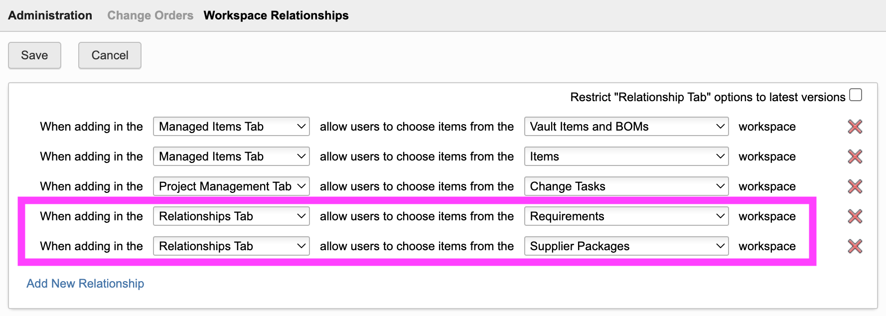
With the configuration shown above, if an Affected Item is linked to a requirement or a supplier package, users can connect these records to the current change process in the relationships tab.
Starting the Application
This application can be started from any business process having affected items enabled (Change Order, Change Requests, Problem Reports). It can be opened in context by passing both the wsId and dmsId of the given change process. The latter capability can be used to launch the application from PLM in context of a change process.
Opening the application from a change process in PLM can be achieved in two ways:
- By using the framework's Chrome Extension that adds an Impact Analysis button in the PLM processes header toolbar.
This option is recommneded and does not require any further configuration. - If the Chrome Extension cannot be used, a computed field must be added to the details pages of the given change processes to render a button opening the dashboard.
See the required configuration steps below only if this option is needed.
Adding action buttons to details pages
For each workspace of interest (i.e. Change Order, Change Requests, Problem Reports), perform the following steps to add a button opening the impact analysis dashboard in context of the given record.
If the field DMS_ID does not exist yet in the workspace, add it as Single Line Text (length 20, not visible) in tab Item Details.
Let this field be set upon process creation using the following script code (either in your on create script or attached to the initial workflow transition):
item.DMS_ID = dmsID;
In addition, add a computed field Actions to theItem Details tab that renders a button to open the dashboard for the current record. Use the formula shown below. In this formula, adjust the workspace ID to match the given processes' workspace ID.
'<a style="border: 1px solid #bec8d2;border-radius:3px;color: #0a131c;font-weight:600;line-height:32px;padding:4px 20px;text-align:center;text-decoration:none !important;white-space:nowrap;width:160px;" target="_blank" href ="LOCATIONimpactanalysis?wsId=84&dmsId='||DMS_ID||'">Impact Analysis</a>'
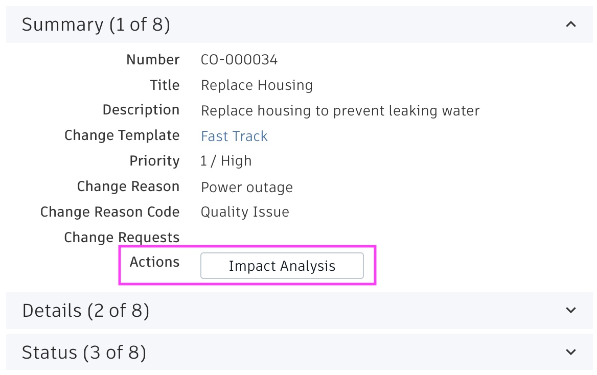
Application Configuration Settings
The following settings can be adjusted in your custom settings file within exports.applications.impactanalysisto adjust the application's behavior. In order to change any of these settings, copy the standard value from settings.js to your custom settings file in folder settings.
These settings contain various Field IDs of the context processes' Managed Items tab. These fields values will be used to highlight given information in the Affected Items list.
| Setting | Default Value | Description |
|---|---|---|
| fieldIdStockQuantity | 'STOCK_QUANTITY' | Field in Managed Items tab containing stock quantity information |
| fieldIdNextProductionOrderQantity | 'NEXT_PO_QUANTITY' | td Field in Managed Items tab containing next production order date |
| fieldIdPendingSupplies | 'PENDING_SUPPLIES' | Field in Managed Items tab containing pending supplies information |
| fieldIdProductionOrdersData | 'PO_DATA' | Field in Managed Items tab containing production orders information |
Viewer Configuration Settings
This application enables configuration of features within the viewer by using parameter viewerFeatures. By using the settings listed below, you can control the availability of given icons in the viewer toolbar. These feaatures can be enabled and disabled for all users in general by setting the value to true or false. As an alternative, you can also provide an array of groups to grant access. Only users being assigned to any of the defined groups will then get access to the feature. Examples:
- viewerFeatures.measure = true > Measurements will be possible for all users
- viewerFeatures.measure = false > Measurements will not be possible for any user
- viewerFeatures.measure = ['Employees','Service Technician'] > The measurements button will only be shown for users in group Employees or Service Technician
| Setting | Icon | Description |
|---|---|---|
| contextMenu | Enables / disables the viewer standard context menu | |
| cube | Enables the cube / home button in top right corner of the viewer. Parameter 'views' can be used instead, providing dedicated buttons. | |
| orbit | Enables the orbit controls | |
| firstPerson | Enables first person view | |
| camera | Enables camera interactions | |
| measure | Enables the measurements toolbar | |
| section | Enables sectioning | |
| explodedView | Enables exploded views | |
| modelBrowser | Enables browsing the model hierarchy within the viewer | |
| properties | Enables access to the selected component's properties stored in the viewable file | |
| settings | Enables viewer settings | |
| fullscreen | Enables fullscreen toggle | |
| markup | Enables markup toolbar | |
| hide | Enables easy hiding of (selected) components | |
| ghosting | Enables toggling ghosting mode on/off | |
| highlight | Enables toggling highlight of selected models on/off | |
| single | Enables fitting of first instance to viewer | |
| fitToView | Enables reframing all visible items | |
| reset | Enables to deselect all, invoking viewerClickReset() | |
| views | Enables toolbar to quickly access main views | |
| selectFile | Enables switching between multiple viewable files for the given item (3D and 2D) |
The viewer can further be adjusted by using common settings that apply to all applications. All settings listed below can be changed in exports.common.viewer:
| Setting | Icon | Description |
|---|---|---|
| numberProperties | ['Part Number', 'Name', 'label', 'Artikelnummer', 'Bauteilnummer'] | List of item properties to be considered as number properties. The first property found will be used to match components in the viewable file to items in the PLM system (based on field defined in exports.common.workspaces.items.fieldIdNumber). |
| suffixPrimaryFile | ['.iam.dwf', '.iam.dwfx', '.ipt.dwf', '.ipt.dwfx'] | Defines sequence of preferred file suffixes to identify the primary viewable file if multiple viewable files are available for the given item. |
| extensionsIncluded | ['dwf', 'dwfx', 'nwd', 'ipt', 'stp', 'step', 'sldprt', 'pdf'] | List of file formats to be considered as viewable formats. |
| extensionsExcluded | [] | List of file formats not to be considered as viewable formats. |
| splitPartNumberBy | ' v' | If the number property in the viewer does not match the item number exactly, its value can be split by the given string to remove suffixes like version information. |
| splitPartNumberIndexes | [0] | If the number property in the viewer does not match the item number exactly, its value can be split and selected indizes can be contatenated. This property defines the split elements to concatenate. |
| splitPartNumberSpacer | '' | If the number property in the viewer does not match the item number exactly, its value can be split and selected indizes can be contatenated. The concatenated strings will be separated by this spacer. |
| backgroundColor | [255, 255, 255, 255, 255, 255] | Default background color of viewer instances if not specified by theme. |
| cacheInstances | false | Enables / disables caching of instances data in the viewer for improved performance. Enabling this cache will incread initial load time. |
| antiAliasing | true | Enables / disables anti-aliasing in the viewer. |
| ambientShadows | true | Enables / disables ambient shadows in the viewer. |
| groundReflection | true | Enables / disables ground reflections in the viewer. |
| groundShadow | true | Enables / disables ground shadow in the viewer. |
| lightPreset | 4 | Changes the default light preset of the viewer. |
| conversionAttempts | 10 | If viewables need to be converted, this number of attempts will be made to check for the conversion completion status. |
| conversionDelay | 3000 | If viewables need to be converted, this delay (in milliseconds) will be applied before starting to check for the conversion completion status. |
Change Impact Analysis Change Log
| 12. January 2026 | Documentation | Documentation has been updated to match the new custom settings and environments management |
| 20. June 2024 | Enhancement | Improved the root items report listing all root items (and intermediate items) being impacted |
| 27. September 2023 | Enhancement | Indicate pending supplies, production orders and available stock for Affected Items (requires given columns) |
| 14. September 2023 | Enhancement | If CR or CO is locked, changes to affected items are no longer possible |
| 30. August 2023 | New Feature | If the Affected Items tab contains columns to manage current stock, pending production orders and pending deliverables, this information will be shown and highlighted. |
| 15. August 2023 | Enhancement | When opened from a Change Request, the list of Affected Items will display the Proposed Change property value |
| 7. July 2023 | Enhancement | Styling has been adjusted to improve usability |
Features
This utility enables various batch operations in order to fix inconsistencies of the data in PLM. This includes setting standard values for existing records, transitioning defined records or running a defined script against a selected set of records. Administrators can select the datasets to be processed by using workspaces views or search filters. The batch process can be tracked in the console, providing information about the success and failure of operations.
The following batch processes are provided with this utlity:
| Action | Description |
|---|---|
| Store DMSID | Stores the given record's dmsId in a selected property. This is useful if computed fields must access the dmsId of a record. |
| Set Field Value | Set a standard value for a selected field in item details |
| Copy Field Value | Copy the value of one item details field to another one |
| Clear Field | Clear a selected field in item details |
| Change Owner | Replace ownership of records with the selected user |
| Add Additional Owner | Adds selected user / group from list of additional users |
| Remove Additional Owner | Removes selected user / group from list of additional users |
| Clear Additional Owners | Removes all additional owners |
| Peform Workflow Transition | Change the status of records by performing a selected workflow action |
| Change Lifecycle | Change the releasae status of revision controlled items without the need of release processes. Use this action at your own risk! |
| Import Files | Import the files stored in /storage/imports to existing items based on file/folder name and matching field property value |
| Export Files | Downloads all or selected files in the attachments tab to a server folder (use the dynamic button being displayed to access the files). Provide file name patterns to include / exclude defined files (i.e. '.dwf'). |
| Delete Files | Delete all or selected files in the attachments tab. Provide file name patterns to restrict deletion or provide another pattern to exclude defined files (i.e. '.dwf'). |
| Run Script | Execute a selected onDemand script against the defined records |
| Archive | Archive the defined records |
Using the utility
Select Data
First, you have to select the data to be processed. As the utility can only process data within a single workspace only, you have to select the given workspace first. Once the workspace selector changes, the screen will reload to reflect the given workspace's configuration.
Next, you have to filter for the data in this workspace by either using one of your workspace views or search filters. Once you select a workspace view, the filters will be hidden as it is not possible to combine both mechanism. Note that you can use any workspace view, the columns do not matter as the utility will only make use of the view's filters.
If you do not select a workspace view, the following filter sections will be available (depending on the selected workspace's type):
- Workflow Status
- Lifecycle Status
- Item Details Field Value
- Item Summary Data (creation, modification, owner)
As you change the options in the data selection panel, the console will continuously determine the number of matching records and display the counter. This counter update may take some time, but helps validating the filter settings:
Choose Action
The list of possible actions gets refreshed upon workspace selection as it takes into account the user's permission as well as the workspace's configuration.
You can only select on action at a time and must proivde the given inputs shown within the selection action (i.e. select the impacted field).
If you do not find an action that meets your requirement, you can use the action Run Script enabling you to run your custom onDemand script of the given workspace. The utility will launch the script for you per record and you can perform the required changes within your script. The usage of scripts is also recommended if the batch processes fail to perform the required update due to permission restrictions. As scripts are executed as super user, they may be able to perform the changes that might not be possible with the API in your user context.
Options : Selected Data
Before launching the batch job, you may want to adjust the options allowing you to perform follow-up actions per record and to adjust the runtime settings. While you will most probably never adjust most of the options, the first settings is very important:
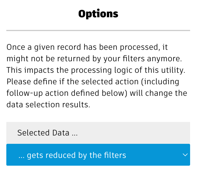
The setting for Selected Data impacts the data retrieval: In order to run the batch jobs, the utility will search for the next set of (100) records which will then be processed before the next set of (100) records will be retrieved. The data retrievel will be based on the filters or workspace view that you selected in section Select Data . Once the inintial set of records got processed, these filters might return different results. For example, if you filter by items which do not have a value in field Type and then set a value for this field using this utility, the items which got processed already won't be returned by the intial filters any longer. This is important as the data retrieval will always continue retrieving the next records in sequence - and this sequence might change.
So if the batch processing modifies the records in a way so that they would no longer be retrieved, you must select the option ... gets reduced by filters . Only if the search results do not change by the batch operations, you can keep the default setting ... does not change at runtime .
Options : Expand & Include BOMs
If the user has access to the BOM tab in the select workspace, an additional option will be displayed next. By selecting from the options listed below, the user can also let the BOM items be processed by the same action.
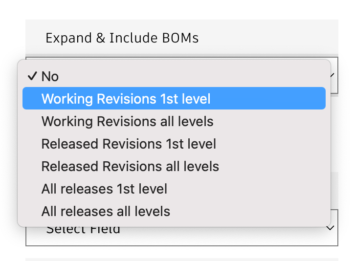
| Option | Description |
|---|---|
| No | The BOM tab data will be ignored, only the search / workspace entries will be processed |
| Working Revisions 1st level | The BOM will be expanded by one level using the Working Revisions configuration. All items of this next / first BOM level will be included. |
| Working Revisions all levels | The BOM will be expanded by 10 levels using the Working Revisions configuration. All items of all these levels will be included (duplicates will be skipped automatically). |
| Released Revisions 1st level | The BOM will be expanded by one level using the Released Revisions configuration. All items of this next / first BOM level will be included. |
| Released Revisions all levels | The BOM will be expanded by 10 levels using the Released Revisions configuration. All items of all these levels will be included (duplicates will be skipped automatically). |
| All releases 1 level | The BOM will be expanded by one level using the Released Revisions configuration. All items of this next / first BOM level will be included. In addition, all revisions of these items will be processed as well. |
| All releasess all levels | The BOM will be expanded by 10 levels using the Released Revisions configuration. All items of all these levels will be included. In addition, all revisions of these items will be processed as well. Duplicates will be skipped automatically. |
If the BOM items will be included, the Search Size option mentioned further below will be set to 1 automatically.
Options : Follow-Up Action
Once the records got processed, you can let the utility update one or multiple checkbox or date properties. This can be used to trigger a follow-up edit event or to set a flag that helps filtering out the given record during the next run.
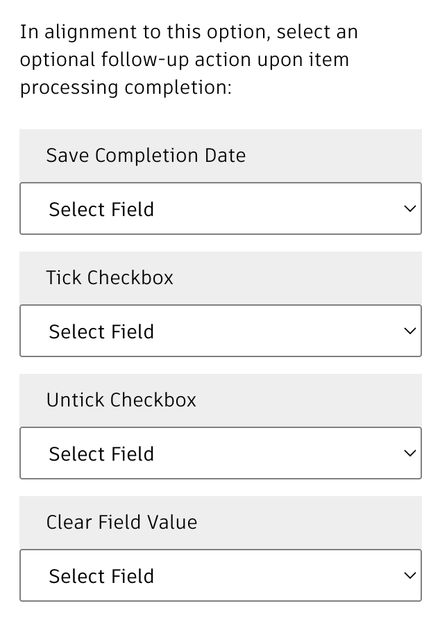
Options : Runtime Settings
Finally, multiple settings can be used to adjust the batch process execution:
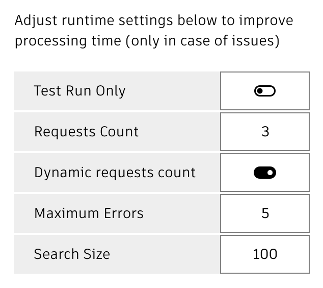
| Setting | Default Value | Description |
|---|---|---|
| Requests Count | 3 | For performance reasons, the utility can process mutiple records in parallel. This counter determines the number of parallel requests. Please note that you must keep the workload of your tenant in a defined range before it might be considered a DDoS attack. |
| Dynamic Requests Count | on | As stated before, the utility processes multiple records in parallel and you must keep the workload at a reasonable limit. This toggle will let the utility adjust the Requests Count dynamically by measuring the request processing time and increasing / decreasing the requests in single steps when possible / needed. |
| Maximum Errors | 5 | Once the utility encounters more errors than the given threshold limit, it will stop processing. |
| Search Size | 100 | This identifies the total number of records to be searched before processing them in smaller packages (based on the Requests Count value). |
The Console & Controls
While the processes are running, the console will indicate the progression and display success and error messages.
Please note that the item names can be clicked to open the given record in PLM for validation or troubleshooting purposes.
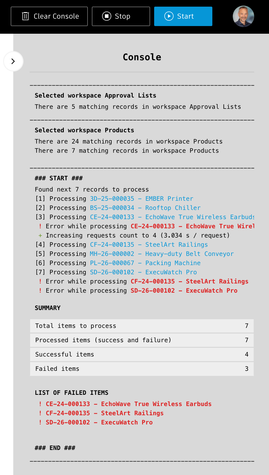
Once the processes finish, a summary will be displayed, indicating the total number of records and failures.
Using the button in the main toolbar, you can stop running processes (when the stop button is shown in red) at anytime. Use Clear Console to clear the contents of the console panel. This does not impact the data processing.
Access the utility
You can access the utlity with the /data endpoint, just click this link:
Data Manager Change Log
| 23. June 2025 | Enhancement | A new action has been added, enabling upload of files to existing items |
| 12. June 2025 | Enhancement | Revision controlled workspaces now provide the capability to filter by lifecycle status name |
| June 1st, 2025 | Enhancement | A new option has been added to action Change Owner, enabling mail notifictions for the new owners |
| May 20, 2025 | Enhancement | The new action Change Lifecycle enables release of items without the need of Change Orders. This action uses the V1 REST API which might be depreciated in future. |
| May 14, 2025 | Enhancement | The action Export Files now can optionally include the record's dmsId in the folder name as suffix or prefix |
| Enhancement | The export action now also creates the file list.txt in the export folder with detail information about each file being exported | |
| Quality | Styling of the actions list has been improved to decrease complexity | |
| May 2nd, 2025 | Enhancement | The new action Export Files enables download of all or selected files to a server folder |
| April 16, 2025 | Enhancement | New actions enable changes to the Additional Owoners (add, remove, clear) |
| March 26, 2025 | Enhancement | The utility now requires system admin access to launch |
| March 24, 2025 | New Feature | A new option enables to process the BOM tab contents as well, not only the items being retrived by the search or workspace view. |
| Enhancement | The option to perform a test run has been replaced by a dedicated action button in the global toolbar for easier accessibility | |
| Enhancement | Before starting data processing, the utility now will validate a proper action selection and definition | |
| March 20, 2025 | New Feature | The new action Delete Files now enables deletion of all or selected files of the matching records. Users can provide filename patterns to include or exclude defined files. |
| March 7, 2025 | Initial Release | The very first version of this utility |
Prerequisites
Your user must have admin privileges to use this dashboard as it uses the system log entries which are hidden for standard users. This privilege will be validated during startup and an error message is shown if permissions are missing. Your user also must have access to the given workspaces that should be taken into account in the insights dashboard.
Please note that the dashboard will retrieve the system log information in small packages. This process takes some time. There is a progress inidicator in top right corner and on top of the header to inform you about the data retrieval progress. You can also review the total number of log entries being processed in tab 'System'.
Application Configuration Settings
The following settings can be adjusted in your custom settings file within exports.applications.insights to adjust the application's behavior. In order to change any of these settings, copy the standard value from settings.js to your custom settings file in folder settings.
| Setting | Default Value | Description |
|---|---|---|
| hideUserNames | false | When set to true, real user names will not be displayed |
| maxLogEntries | 500000 | This defines the maximum total number of log entries that will be retrieved. If this setting applies to your report, you will find a given remark in tab System. |
| maxEventLogEntries | 10000 | This defines the maximum entries in tab Event Log. This tab will show the most recent entries first. Increasing this value may impact the performance of the dashboard badly as your browser will slow down. Therefore a total maximum of 50.000 entries will never be exceeded, no matter what limit is defined in settings.js By setting this value to 0 you can hide the tab Event Log in the dashboard |
| usersExcluded | ['Administrator', 'Import User', 'Job User', 'Integration User'] | The users defined in this array will be exclueded from the reports |
| workspacesExcluded | ['Change Approval Templates', 'Approval Lists', 'Project Templates'] | The workspaces defined in this array will be exclueded from the reports |
Access the Dashboard
You can access the dashboard with the /insights endpoint, just click this link:
Tenant Insights Change Log
| 12. January 2026 | Documentation | Documentation has been updated to match the new custom settings and environments management |
| 18. August 2025 | Enhancement | New setting hideUserNames can be used to hide real user names in the dashboard (default will still display the user names). If names should not be displayed any longer, just set it to true and restart your server. |
| 17. July 2024 | Enhancement | Last Login chart now can be sorted by 'Username' or 'Days since last login'. In addition, counters to the right indicate the total logins in difined timeframes. These counters also can be clicked to filter the chart. |
| Enhancement | The chart 'Item Count' has been changed from columns to bars. Entries now get sorted by item count to enable better analysis. | |
| Enhancement | Tab 'Event Log' now offers a new filter to display all entries of all users. This filter is selected per default and indicates the maximum number of records being displayed. | |
| Enhancement | The button 'Review Settings' has been added to the header toolbar, enabling to review the configuration settings defined in settings.js (i.e. to review users and workspaces being excluded) | |
| Enhancement | The System tab now indicates the number of entries that have been processed so far. The labels in this tab have been adjusted, for example to reflect the maximum number of records being taken into account. | |
| Enhancement | The new configuration setting 'maxEventLogEntries' can be used to limit the number of Event Log entries being displayed. For performance reasons, a maximum limit of 100.000 gets applied automatically. You can set this limit to 0 also to hide the tab Event Log completely. | |
| Enhancement | The new configuration setting 'workspacesExcluded' can be used to hide defined workspaces from the charts. | |
| Enhancement | A new progress indicator has been added on top of the screen | |
| 12. July 2024 | Enhancement | Added zoom / pan features to the charts, enabling better handling and analysis |
| 18. March 2024 | Enhancement | Improved the scale of the User Activity bubble chart |
| Enhancement | Disabled (startup) animations of charts (except for the charts in the initial tab) | |
| 9. January 2023 | Library Update | The charting library chart.js has been update to most recent version |
| 7. July 2023 | Enhancement | Improved styling with tabs at bottom |
| Enhancement | User's image is shown in top right corner for consistency with other apps | |
| Bugfix | User 'Tenant Admin' now is excluded from reports | |
| New Feature | An error messags is shown if the user does not have admin privileges |
Features & Base Instructions
Using the PLM REST API, this utility will analyze the configuration of two defined tenants and help aligning their configuration. The utility provides two different modes of operation:
- Comparison of all tenant configuration settings
- Comparison of all settings driving a selectd workspace only
With using option #1, the analysis will take much longer and provide a high level summary. When using option #2, admins will get more information about all the differneces found. The utitlity will even provide instructions and shortcuts to perform the given action, for example by using the standard Workspace Manager. You can find more information about these modes in the following chapters.
In both modes, key configuration settings will be compared in both tenants:
- Workspace Settings
- Workspace Tabs
- Item Details Tab
- Grid Tab
- BOM Tab
- Managed Items Tab
- Picklists
- Relationships
- Advanced Print Views
- On Create & On Edit script
- Workflow States
- Workflow Transitions
- Workflow Scripts
As the REST API does not reveal all details about the workspace configuration, some information cannot be compared automatically (for example the formulas of computed fields). Please see the given details about such limitations within this utility.
Before starting any comparison, you must define the tenants to compare. To do so, enter the given tenant names (without the autodeskplm360.net domain) in the given input fields on top. The default tenant of the UX extensions server will be set automatically at startup. As you enter the tenant names, their list of worksapces will be retrieved in order to populate the workspaces drop downs below the tenant names. When using option #2, you may also use the same tenant name in order to compare two different workspaces within the same tenant.
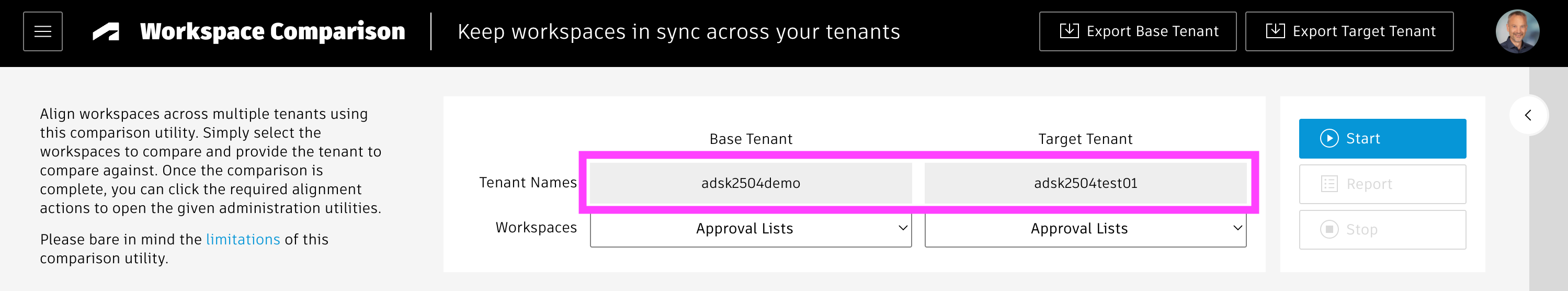
Once the tenants have been defined, you can already export key configuration information of your tenants using the given buttons in the global header toolbar:
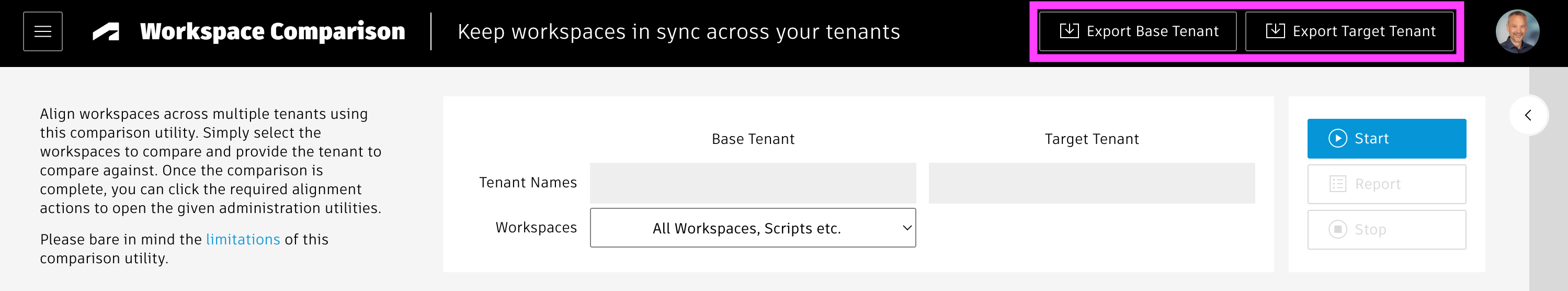
Startup Parameters
You can use the options parameter in the URL to predefine key options and to let the comparison start automatically. The following parameters are supported:
- source can be used to define the source tenant name
- target can be used to define the target tenant name
- workspace can be used to select the workspace to be compared by providing the workspace ID
- start can be set to true in order to let the comparison start once the initial workspace list has been loaded for both the source and target tenant.
This option requires the previous options target and workspace.
As an example, you can set the target tenant, the workspace name and let the comparison start automatically like this:
../comparison?options=target:adsk2504test01,workspace:WS_CHANGE_ORDERS,start:true
Mode #1: Comparing Full Tenants
The full tenant comparison can be started immediately, as this is the default option. If you do not select a specific workspace in the base tenant's list of workspaces, the system will automatically perform a comparison of all
- Workspaces
- Scripts
- Picklists
- Roles and
- Groups
Simply click the Start button to the right to start the comparison. If you are interested in only one of these configuration areas, you can also click the button Update Comparison in the given tab of interest. In any case, the system will first get the list of all elements from both tenants to reveal missing elements (like missing workspaces) before comparing the details by using additional requests.
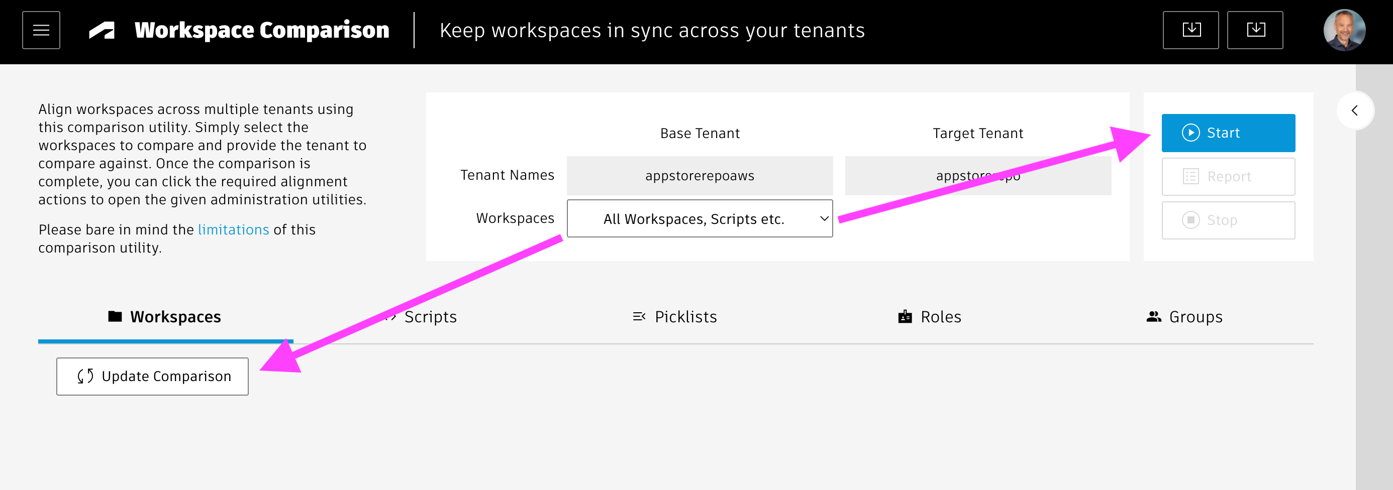
You can track the comparison progression in the console panel to the right, highlighting the differences being found. If needed, you can disable the automatic scrolling by using toggel in the console's top right corner. You can also clear the console contents with the given actioni button when needed.
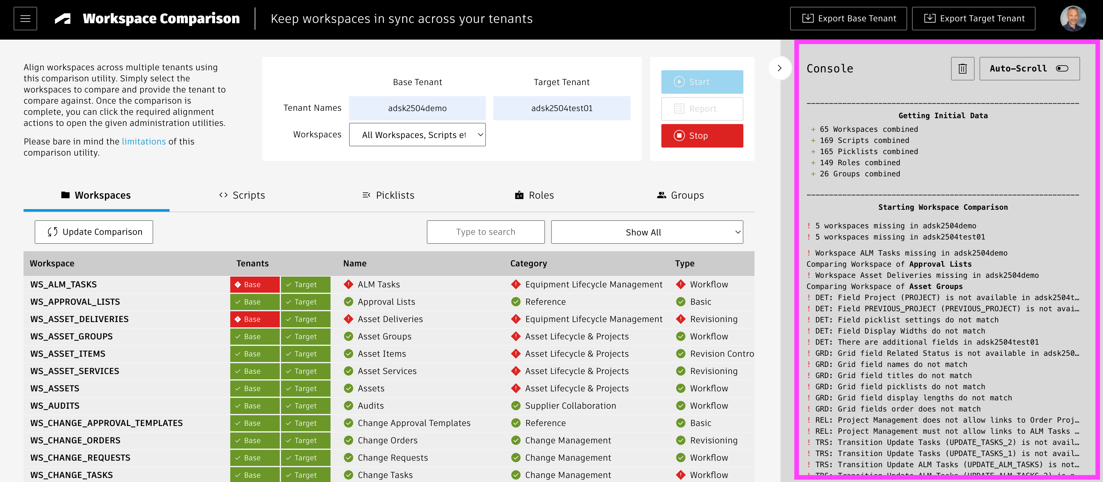
Each tab (Workspaces, Scripts, Picklists ...) indicates if the given elements exist in both or only one of the defined tenants in column Tenants. In all tabs (except the Workspaces tab), you can click the green elements of column Tenants to open the given admin utility. However, in the Workspaces tab, you can instead click the counters in columns TAB, DET etc to open the given workspace manager utility of both tenants side by side.

The columns with counters in the first tab Workspaces indiciate differences in the given workspace manager utility by color:
- TAB = Workspace Tabs configuration settings, counters indicate number of visible tabs
- DET =Item Details tab configuration settings, counters inidicate number of sections
- GRD = Grid configuration settings, counters inidicate number of fields
- AFF = Affected / Managed items tab, counters indicate number of fields
- BOM = BOM tab configuration setings, counters inidicate number of BOM views
- REL = Workspace Relationships settings, counters indicate number of relationship types defined
- APV = Advanced Print Views, counters inidicate number of views defined
- BEH = Behaaviors, counters inidicated number of scripts defined in the Behaviors tab
- WFL = Workflow States, counters inidicate the total number of workflow steps
- TRS = Workflow Transitions, counters inidicate the number of workflow transitions
Free-text filters and predefined filters are available in all of the tabs. They get applied automatically as the table refreshes, so you do not need to wait for the comparison to finish.
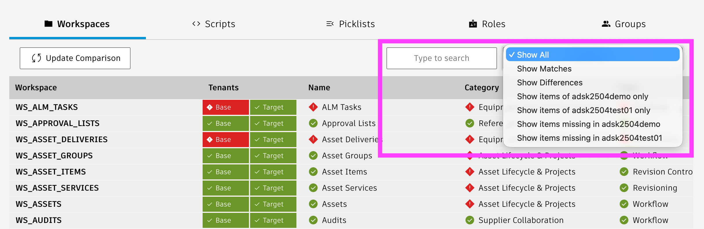
Mode #2: Comparing Selected Workspaces
In order to launch the detaile workspace based comparion, simply select the workspaces to compare in each tenant's workspaces drop donw. As you select a workspace in the Base Tenant, the utility will automatically unhide the workspaces list of the target tenant and select the matching entry if available. You can always return to mode #1 and its results by selecting the first entry of the base tenant's workspaces list named All Workspaces, Scripts, etc. You can run the comparison by clicking the blue Start button. Once the comparison is running, you can click the Stop button to end the process whenever needed.
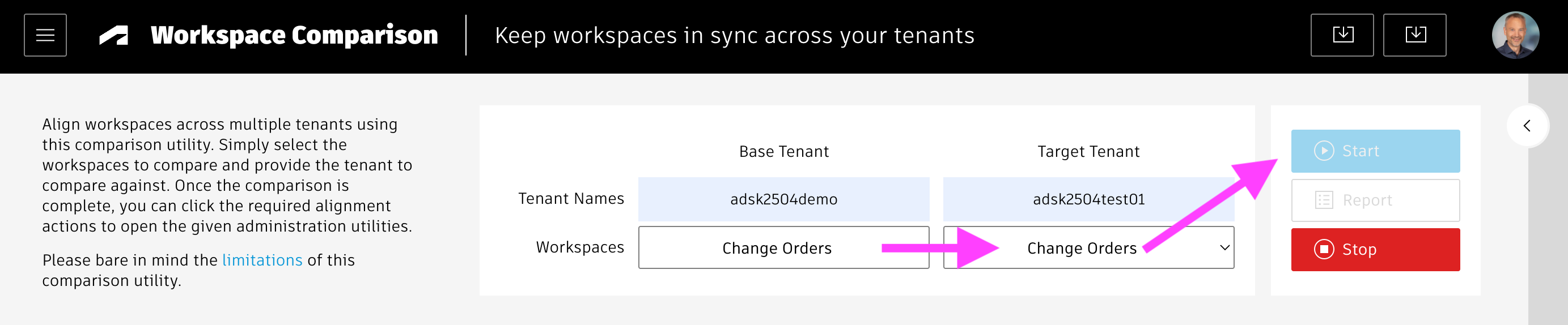
While the comparison is running, summary information will be added to the sections at bottom. These counters relate to the Base Tenant and show the nubmer of field being found for example. The color indicator reveals if the given configuration settings match with the Target Tenant.
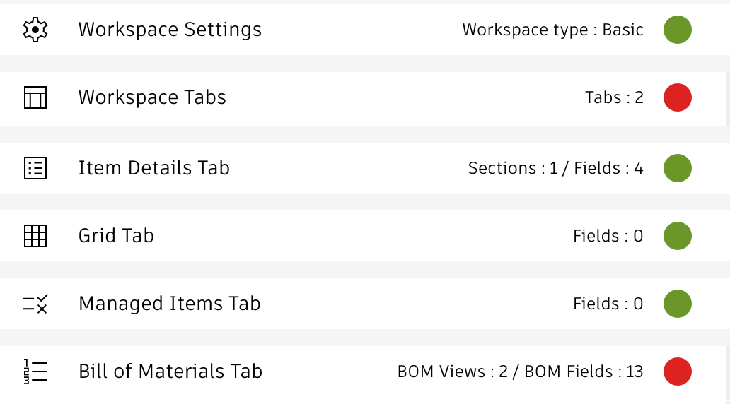
Next to these indicators, you will find instructions about how to sync the given workspaces. These instructions refer to the field and setting to be changed and provide the given details. You can click these instructions to open the given administration utility for the Target Tenant. Once the given change has been applied, you can click the checkbox to remind yourself about your progress.
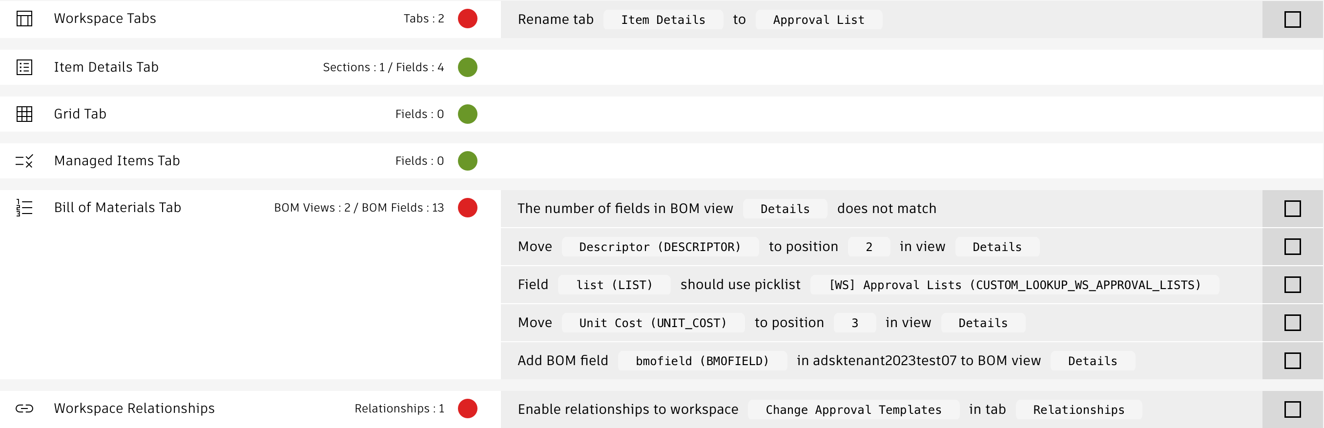
If you prefer a graphic report about matches and differences, click the Report button which gets enabled once the comparison is complete. This report may be helpful to when reviewing the differences.
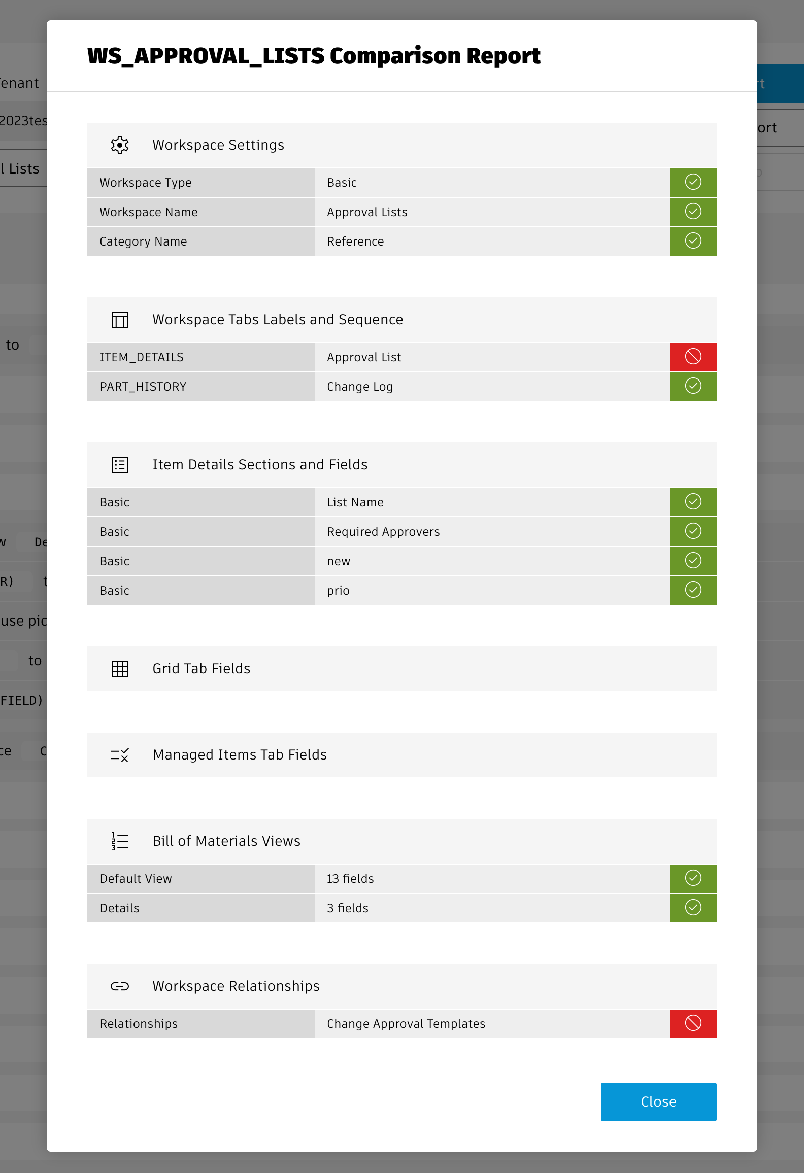
Tenant Insights Change Log
| 30. March 2026 | Enhancement | The export buttons in the main toolbar now also download all script files of the given tenant |
| 9. February 2026 | Update | Renamed endpoint of this solution to /comparison to better reflect its new set of capabilities |
| 2. February 2026 | Enhancement | New toggle in the Scripts tab enables automatic download of modified script source codes |
| 30. January 2026 | Enhancement | Updated the options URL parameter to target the 2nd tenant and workspace drop down directly. One can now also start the comparison automatically. |
| Enhancement | As the current user's workspace permissions impact the comparison results, the given comparison has been moved to the beginning of the process | |
| Enhancement | Workflow permissions now get compared by name as well, not only by ids | |
| 19. January 2026 | Enhancement | Added 2nd mode allowing full tenant comparison |
| 14. January 2026 | Enhancement | Added export feature to extract base tenant definition of workspaces, picklists and scripts |
| 5. August 2025 | Enhancement | Icons beside the comparison results now enable to compare the settings of both tenants side by side (the first click opens one tab only, this is a known issue) |
| March 26, 2025 | Enhancement | The utility now requires system admin access to launch |
| September 20, 2024 | Bugfix | Space characters at beginning and the end of section names will be ignored during comparison ('Basic ' now is considered equal to 'Basic' and ' Basic') |
| Bugfix | Fixed the instructions text when default values must be corrected for picklists | |
| Bugfix | Fields of type BOM UOM Pick List threw an error | |
| September 17, 2024 | New | Initial release of this solution |
Features
On a single page, this utility provides access to all the workspace manager utilities, but also to all scripts, roles and picklists of your tenant. Clicking the given items will launch the matching utility in PLM. Administrators also can acces the where used information for scripts and pick lists.
Users can filter all the lists in this panel using the search input in the global header toolbar. This helps locating all worksapces, scripts, picklists and roles that belong together, for example everything that relates to 'Change'.
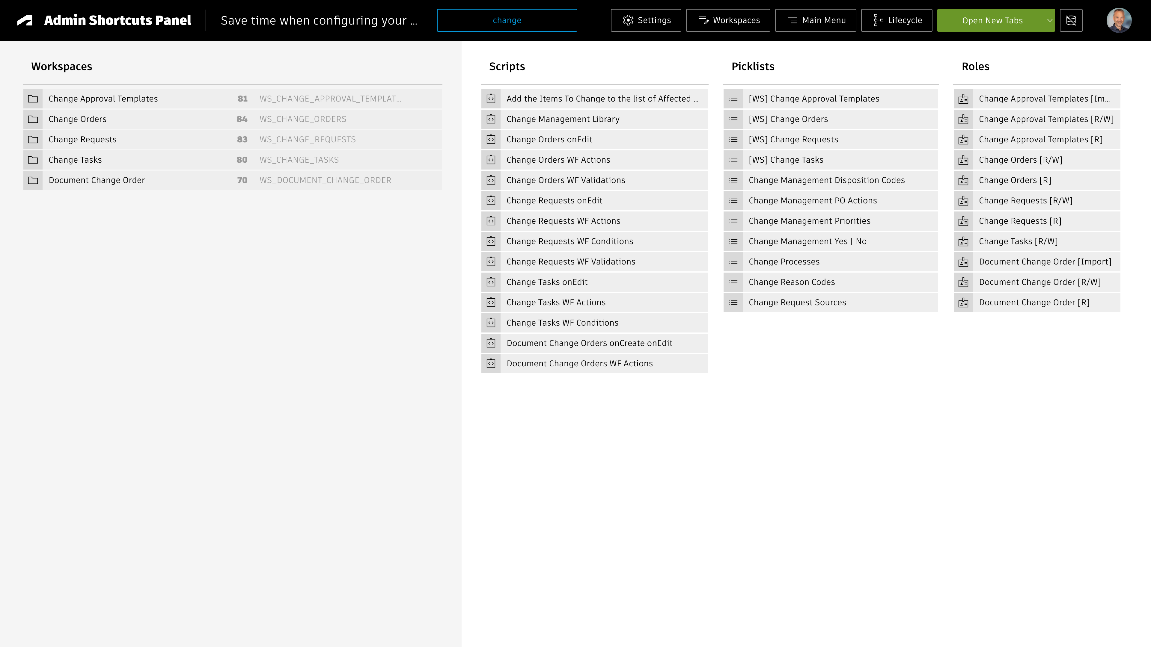
When a workspaces is selected, all lists to the right will be filtered automatically to only show items being related to the selected workspace. The text filter entered in the global header also still applies (if used).
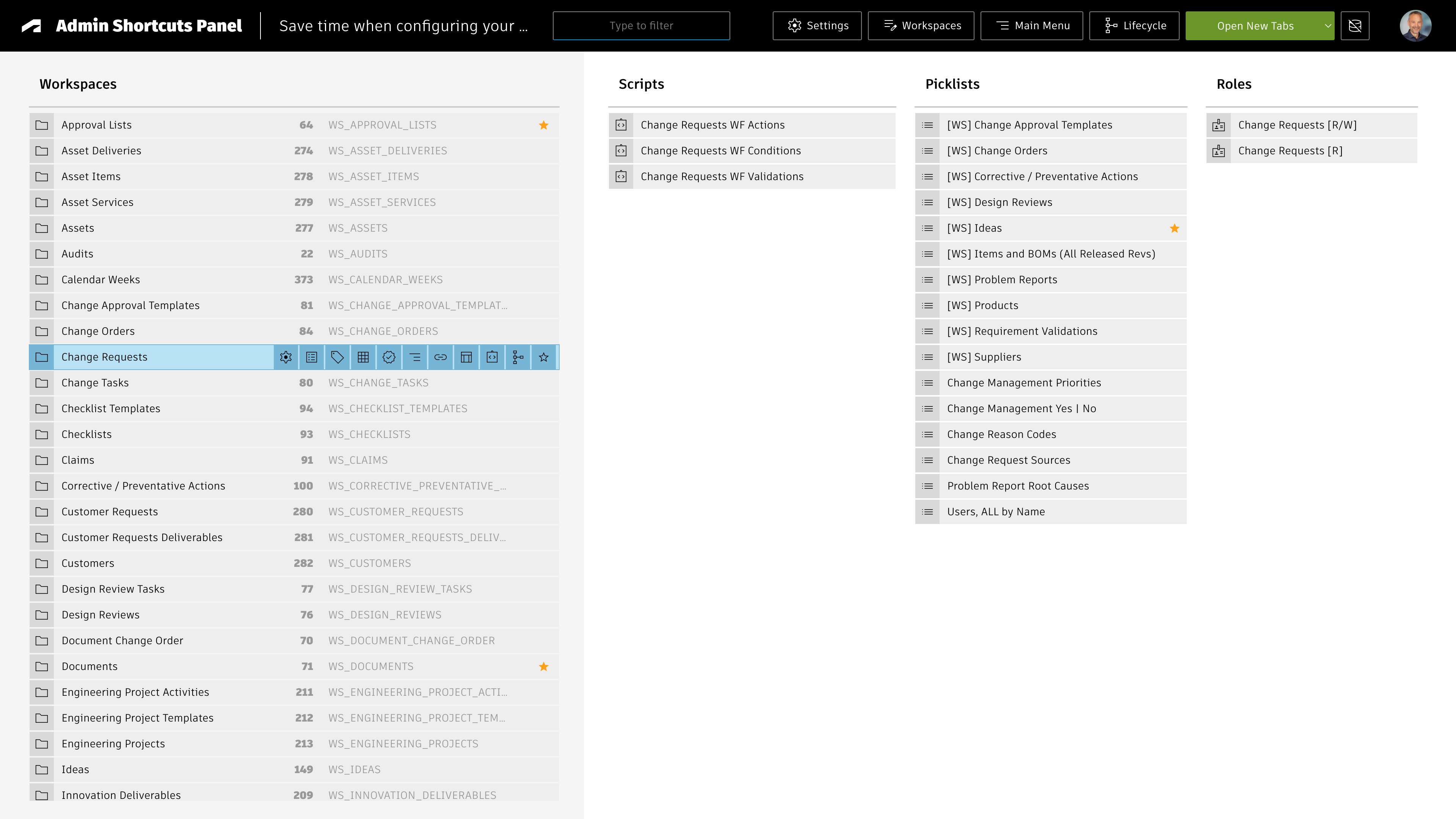
Per default, the links will be opened in new browser tabs. As an alternative, users can select to open the links in dedicated browser panels / instances. When positioning this application with such panels side-by-side, admins get direct access to required panels easily:
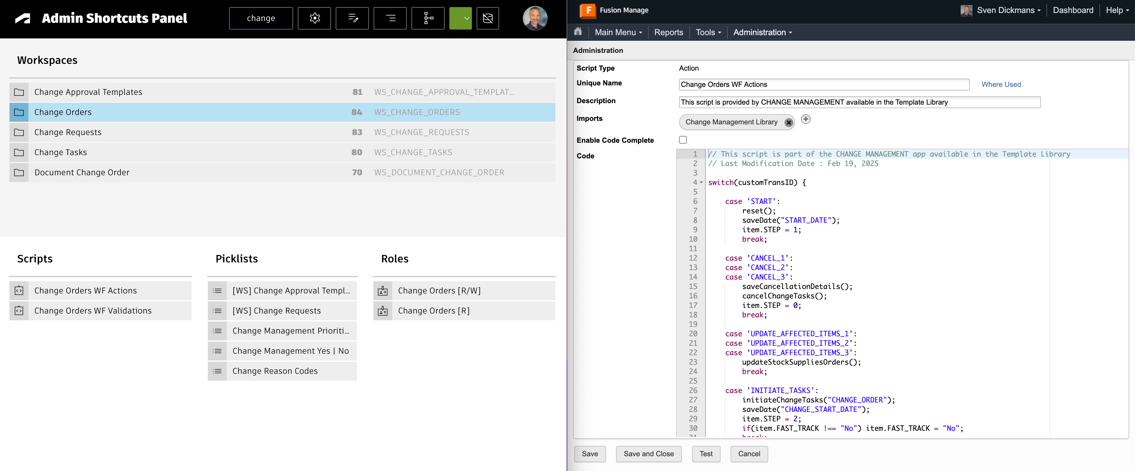
Access the utility
You can access the utlity with the /shortcuts endpoint, just click this link:
Administration Shortcuts Change Log
| 24. September 2025 | Enhancement | Added controls to quickly filter workspaces by main menu category and scripts / picklists by type |
| 4. August 2025 | Enhancement | When a workspace is selected, the lists of scripts, picklists and roles are filtered automatically, only showing items related to the selected workspace |
| Enhancement | Links can be opened in new browser tabs but also a single or multiple panels | |
| Enhancement | Caching has been enabled for better response times. Users can enforce a cache reset when access to latest schema configuration is needed. | |
| CSS | Application is now more responsive, providing a better experience for lower resolutions | |
| 29. July 2025 | Initial Release | The very first version of this utility |
Important
This utility makes use of impersonation to get the outstanding work lists of other users. This requires a 2-legged-authentication with an APS application based on Client ID and Client Secret. As this weakenes the security, it is recommended to proivde the additional settings required by this utility only if it is going to be used. You may want to use this utility witih a local instance of the UX server only to not have the Client Secret stored on a server being accessible globally.
To enable this utility, you must create an additional APS application of type Traditional Web App, providing a Client ID and a Client Secret. The given Client ID must be whitelisted in your tenant. Next, provide the ID and the Secret in your environment file in variables adminClientId and adminClientSecret. Do not change the standard Client ID being used by the other applications.
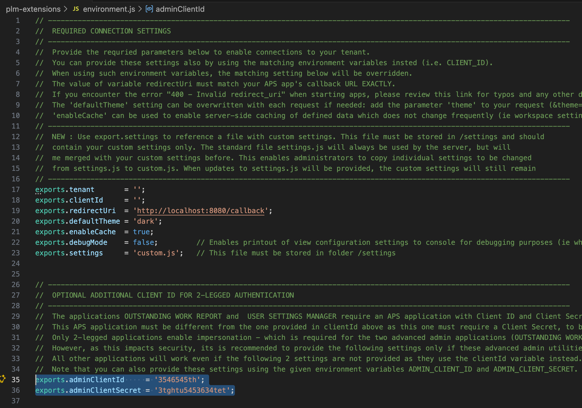
If these two setting are left blank, the UX server will work anyway and you can use all utilities except for the User Settings Manager .
Features
Open the outstanding work list for any active user of your PLM tenant and update each of the given processes to ensure that they progress.
Outstanding Work Report Change Log
| 12. January 2026 | Documentation | Documentation has been updated to match the new custom settings and environments management |
| 1. June 2024 | New | Initial release of this utility |
Important
This utility makes use of impersonation to adjust the views and preferences of other users. This requires a 2-legged-authentication with an APS application based on Client ID and Client Secret. As this weakenes the security, it is recommended to proivde the additional settings required by this utility only if it is going to be used. You may want to use this utility witih a local instance of the UX server only to not have the Client Secret stored on a server being accessible globally.
To enable this utility, you must create an additional APS application of type Traditional Web App, providing a Client ID and a Client Secret. The given Client ID must be whitelisted in your tenant. Next, provide the ID and the Secret in your environment file in variables adminClientId and adminClientSecret. Do not change the standard Client ID being used by the other applications.
If these two setting are left blank, the UX server will work anyway and you can use all utilities except for the User Settings Manager .
Set User Defaults
Once you selected groups and users on the left hand side to receive the updated settings, you can use the tabs in center to select the settings to be updated.
Groups
Select the groups to be assigned or unassigned from the selected users / group members. Use the Skip option in order to not perform any changes to the given group. Note that you can apply the default action to all roles using the icons in the group list header toolbar.
Workspace Views
Select from your list of workspaces views the ones to be shared with the selected groups and users. Double-click a view to automatically select all views of the same workspace. You can also set one view per workspace as default view using the given toggle next to the view.
If users do not have access to the given workspace, there will be a matching output in the console and the utility will continue processing the remaining views and users.
If a matching view already exists, it will only be updated if you select the Force Update option.
Charts
From the list of charts available to you, select the ones to be shared with the selected groups and users. If a user does not have access to a given chart, the utility will continue with the next chart and user.
If you select to update the user's chart, this will ALWAYS overwrite the current user preferences, the current chart selection will be cleared before the new selection gets applied.
As the user dashboards can only contain a maximum of 9 charts, if you select more than 9 charts, only the first 9 once will be applied. A console output will list the charts being ignored.
Theme
Set the light or dark theme for the user. If you select the option No Change , the given setting will not be changed and the theme selected by the user remains active. Users can still use the standard controls to toggle the theme, this cannot be prevented with this utility.
Manage Users and Assignments
Use the icons in the main toolbar to manage your tenant's users and their group assignment before setting the default settings in the main screen. The following features are available:
- Add New User: Add single users one by one and assign the selected groups in the same step
- Add Multiple Users: To onboard multiple users, use this utility allowing to easily apply the same group assignment to multiple users. You can enter single mail addresses in the given input fields for the creation of new users or paste a list of mail addresses (separated by semicolon, comma, space or line break).
- Group Assignment: Once users have been created, review and update their group assignment. Using the Shift key while clicking, you can also select a range of users and groups.
Tenant Insights Change Log
| 12. January 2026 | Documentation | Documentation has been updated to match the new custom settings and environments management |
| 19. September 2025 | New Feature | Admins can create new user accounts with selected rows in this utility now |
| New Feature | Admins can create multiple users with selected roles in one step now | |
| New Feature | Groups can be assigned to / unassigned from selected users | |
| Enhancement | The list of users now can be filtered by selected group and for users who never logged in yet | |
| Enhancement | The list of users now can be filtered by mail addresses as well and indicates new user accounts | |
| December 16, 2024 | Enhancement | Easily copy your default views and disable all default view toggles with single clicks using the new icons in the Views list icon tooblar |
| Enhancement | Easily select the charts in your own dashboard using the new icon in the Charts list icon tooblar | |
| December 4, 2024 | New Feature | When copying workspace views, the utility now also can delete existing views in the workspaces being updated if they do not match a view to be copied. |
| September 26, 2024 | New | Initial release of this utility |
The addins listed below are provided with this package and can be adjusted by using the configuration settings shown at bottom of this page. They are ready to use and compliant with the PLM Desktop Extensions provided by Markus Koechl on Github. His extensions embed these interactive panels in your Vault and Inventor applications for a best in class user experience.
Download the PLM Desktop ExtensionsOpen the PLM Desktop Extensions Setup Instructions
In order to use these addins with the PLM Desktop Extensions mentioned above, you must provide bour your Vault Gateway and Vault Name in your environment file.
You can also use the given environment variables instead.
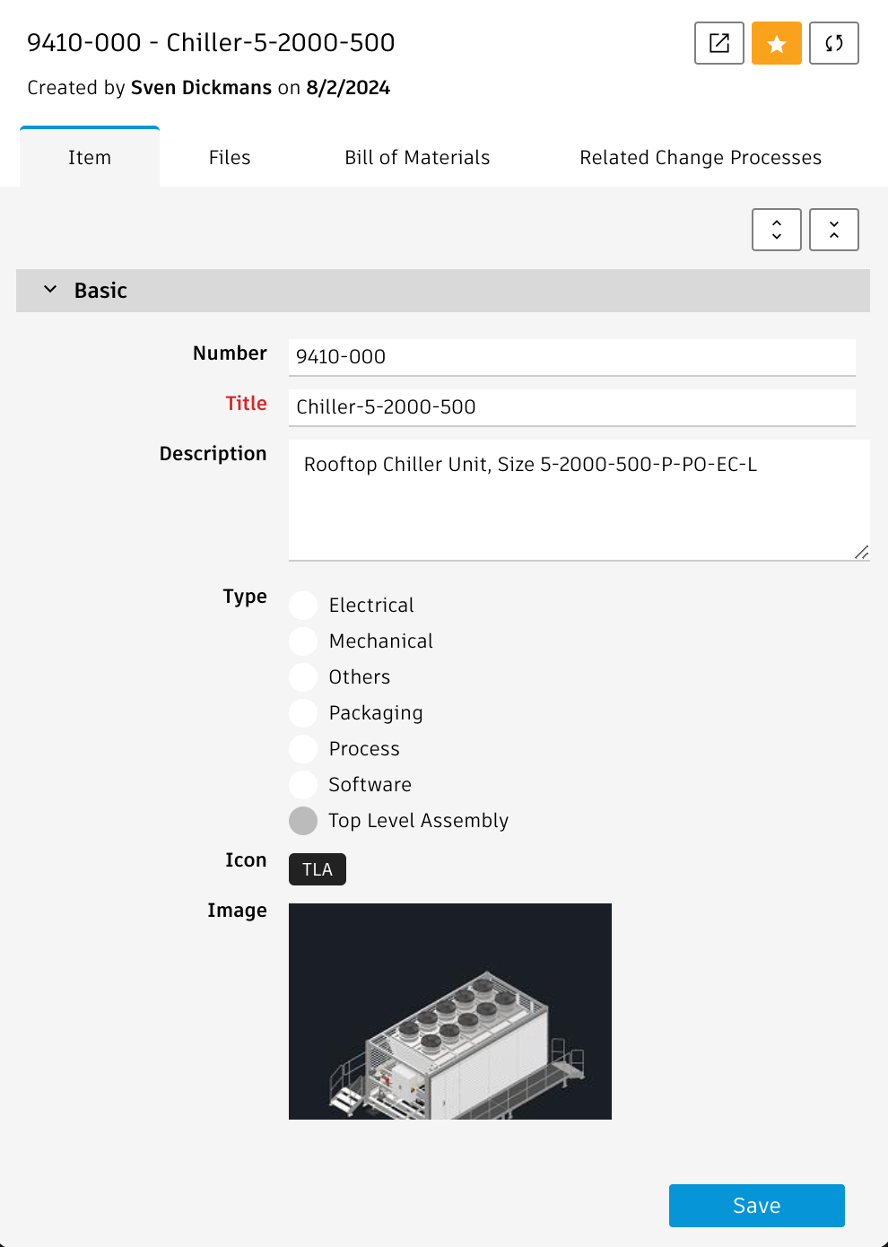
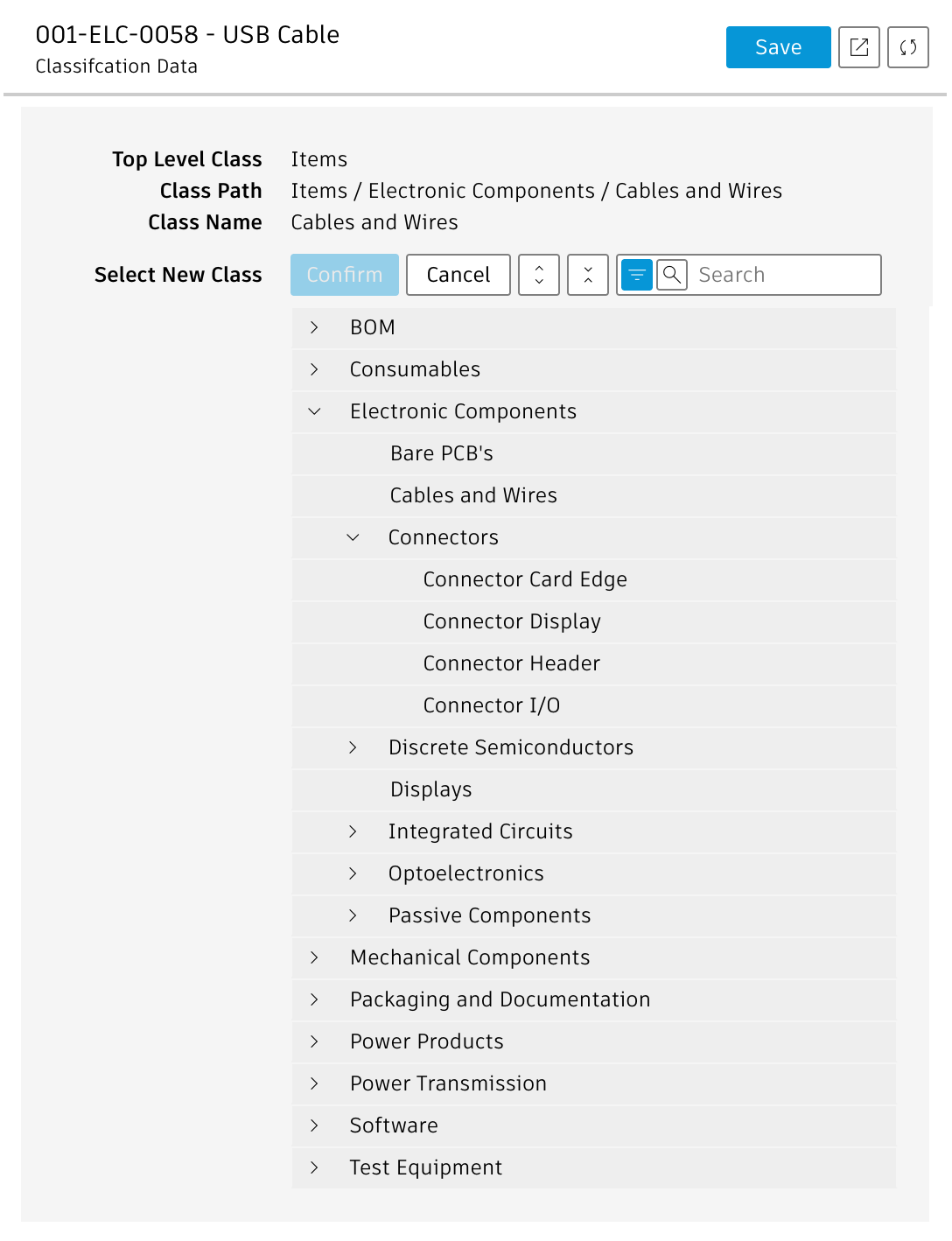
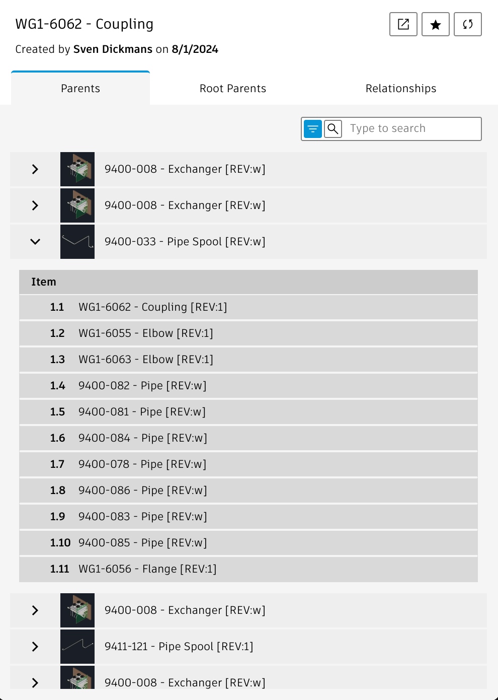
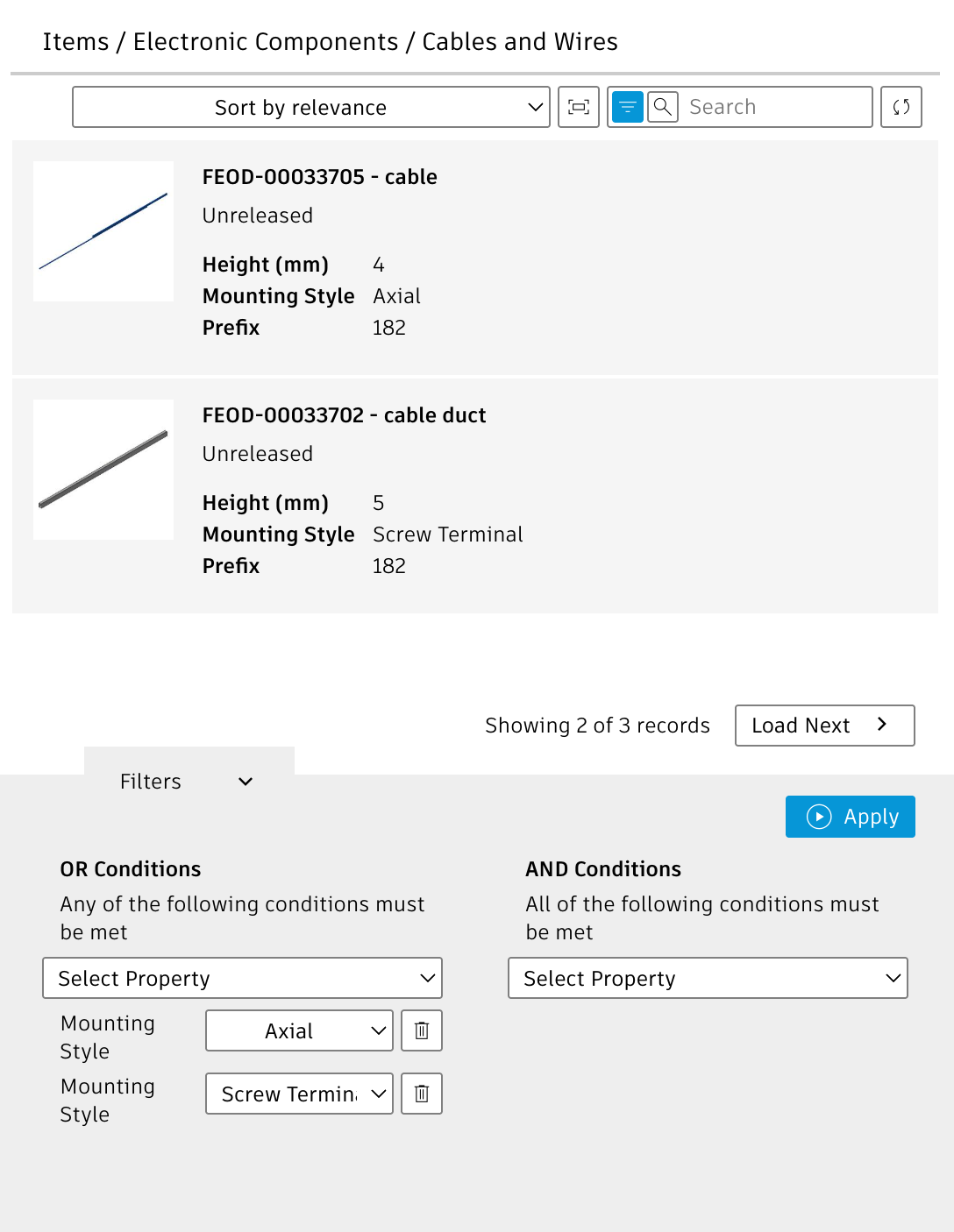
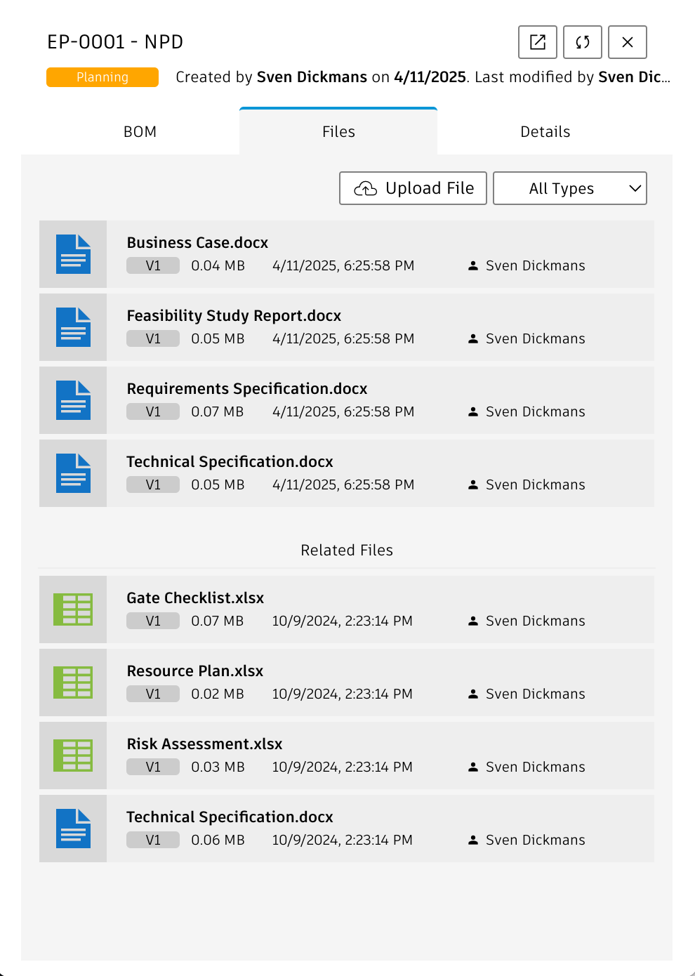
Application Configuration Settings
The following settings can be adjusted in your custom settings file within exports.applications.addins to adjust the addins' behavior.
In order to change any of these settings, copy the standard value from settings.js to your custom settings file in folder settings.
| Addin | Setting | Default Value | Description |
|---|---|---|---|
| Item Master Data | item.expandSections | [ 'Basic', 'Technical Details' ] | Select the sections to be expanded in the Item Details. All sections not contained will be collapsed. |
| item.sectionsEx | [ 'Others' ] | Defines sections to be excluded in the Item Details page. Leave this array blank to show all sections. | |
| item.fieldsEx | [ 'ACTIONS' ] | Defines fieldIDs to exclude in the Item Details page. Leave this array blank to show all fields. | |
| Engineering Projects | projects.workspaceId | null | The workspace ID of your Engineering Projects workspace. If no value is provided, the default ID will be used per definitio in exports.common.workspaceIds.engineeringProjects |
| projects.stateCompleted | 'Completed' | The final state of your Engineering Projects. Projects in this status will not be displayed. | |
| projects.headerLabelProjects | 'Engineering Projects' | Sets the label being displayed on top of the list of Engineering Projects | |
| projects.fieldIdBOM | 'DELIVERABLE_4' | The fieldId of Engineering Projects that stores the link to the Engineering BOM | |
| projects.tabNameBOM | 'BOM' | Label of the tab providing access to the Engineering Project's BOM | |
| projects.tabNameDetails | 'Details' | Label of the tab with the Engineering Project details | |
| projects.projectDetailsSectionsEx | [ 'Project Schedule', 'Closure' ] | Defines sections to be excluded in the Item Details page. Leave this array blank to show all sections. | |
| projects.projectDetailsExpandSections | [ 'Task Details', 'Header', 'Details' ] | Defines sections to be expanded in the Item Details page. | |
| My Tasks List | tasks.headerLabelTasks | 'My Work List' | Sets the label being displayed on top of the list of tasks |
| tasks.columnsExTasks | [ 'State Set On', 'State Set By', 'State' ] | Columns to be hidden in the tasks list | |
| tasks.workspacesInTasks | [ 'Change Tasks', 'Change Requests', 'Change Orders', 'Problem Reports' ] | List of workspaces to be included in the tasks list. Workspaces not contained in this list will not be displayed. | |
| tasks.expandSectionsTask | [ 'Task Details', 'Header', 'Details' ] | Sections to be expanded when details of a task are displayed |
PLM Addin Change Log
| 25. March 2026 | NEW | A new addin was added, enabling management of classifcation data of an item |
| NEW | The new Similar Items addin lets users browse the class of an item to locate similar items | |
| Enhancement | The Item Master Data addin now also includes a classification tab, enabeling users to manage classification data for an item. It also includes the Similar tab in which users can browse the item's class to locate similar parts. | |
| 13. March 2026 | Configuration Settings | The new setting exports.applications.addins.hostApplicationActions now can be used to enable/disable the action icons being displayed for items |
| 11. March 2026 | New Addin | The new Item Classification addin can be used to manage classification data of an item |
| 11. March 2026 | New Addin | The new Similar Itemms addin can be used to locate alternate items based on classification data |
| 12. January 2026 | Documentation | Documentation has been updated to match the new custom settings and environments management |
| April 16, 2025 | Initial Release | The very first version of this application |
This addin provides quick access to Vault data by using a quick search for folders, files and items. It also provides actions when hovering a search result. These actions enable interactions which must be implemented by the host application using the Chrome Webview library.
The panel uses the Vault Data API and requires proper configuration of the following settings in file settings.js:
- vaultGateway
- Vault Name
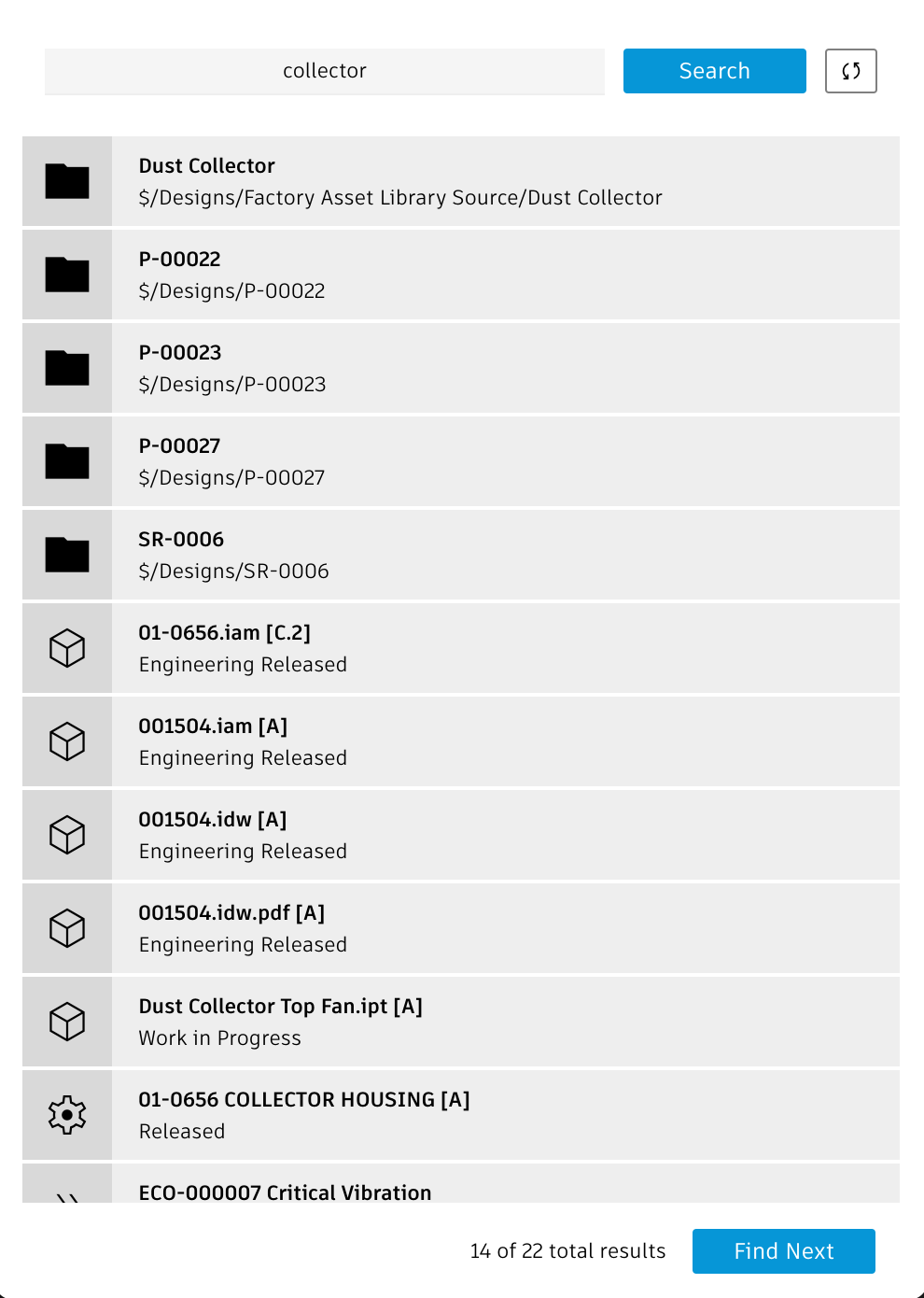
Access the utility
You can access the utlity with the /addins/pdm-search endpoint, just click this link:
Vault Addin Change Log
| April 16, 2025 | Initial Release | The very first version of this application |